If you love bright shades, and have been wanting to use it for a long time, yet do not dare to put it into the color palette, then our interior designers have a great solution. Just use bright colors in the hallway!
Firstly, it’s not scary to make a mistake here, because it’s easy to quickly repaint the space. Secondly, the size of the hallway is usually small, which means that the active palette will not constantly distract attention.
This is a strategy that suits everyone and always leaves dynamic and catchy colors for those areas where you spend little time (entrance, bathroom, balcony), and a discreet palette is better for the main rooms. Consider a number of the most suitable colors for decorating the hallway area.
Saturated Blue
The first in this list will be saturated blue. The palette of blue tones is different in that even when we take a very bright shade, it does not visually overload the space. This is because, unlike, for example, red or yellow, blue creates a feeling of harmony and lightness. 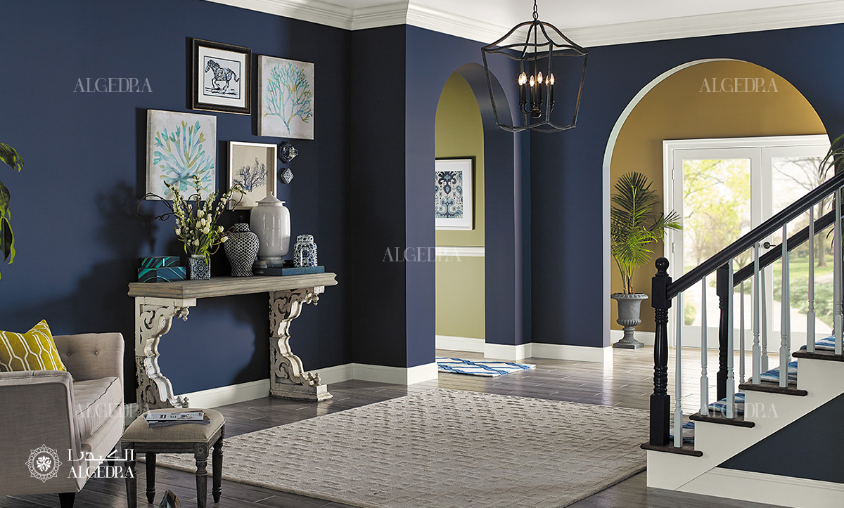
Take a look at how unusual you can use a bright shade. Here it was used to finish the ceiling, which immediately "revived" the entrance area.
Fresh Green
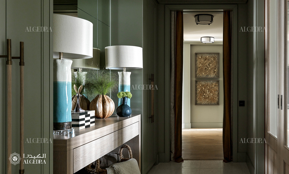
Fresh green is a light, but still very exclusive tone. Green tones are at the peak of popularity today, which is in line with the general trend for environmental friendliness and a desire for nature. It is difficult to make a mistake with green, it is always appropriate and causes only positive emotions.
Rich Yellow - Orange
One of the main problems with the interior of the hallway is that there is very little light in this area. There are almost no windows here, so at any time of the day you have to use artificial light. Just to level this minus, you can use the next shade in the list - rich yellow-orange. It is ideal both for finishing the ceiling and for painting all walls. 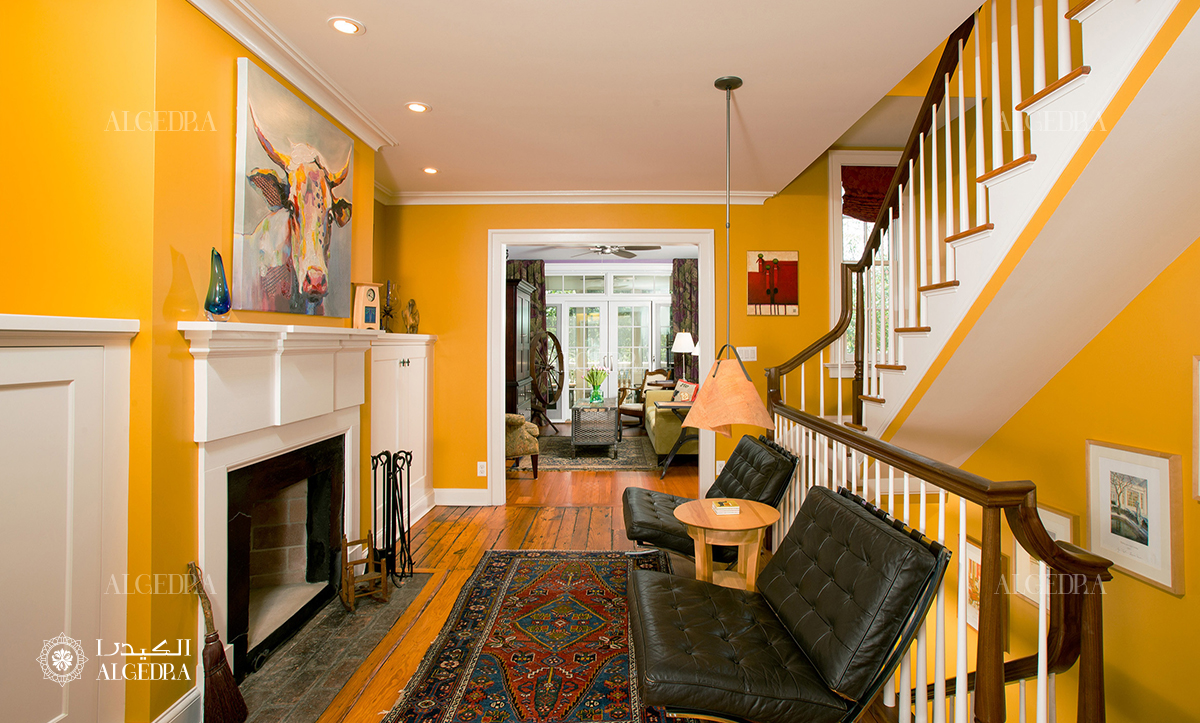
Complex Shade of Blue
Another great choice is a complex shade of blue that combines both hints of gray and a dash of greenish undertones. Such a blue color will be the perfect solution for any hallway, but if you are faced with the task of making the space lighter, it is better to combine a rich shade with white or light beige. 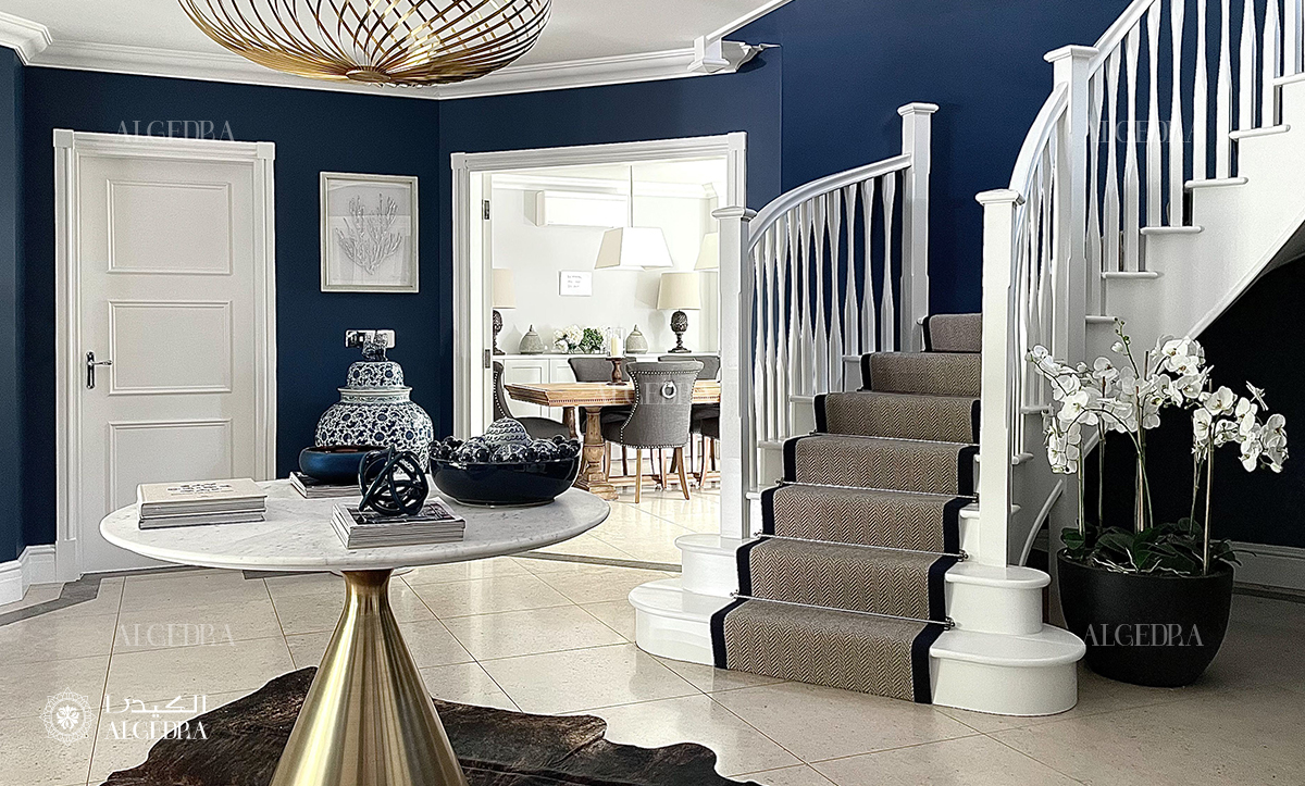
If you're ready for even bolder color schemes, then take a look at this shade of blue. It is very similar to turquoise, but more saturated and deeper, which makes it possible to use it for painting large areas. The refreshing and invigorating tone will definitely not leave your hallway unnoticed. 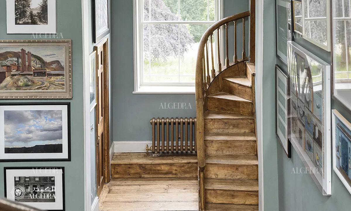
However, even more restrained variations of blue are good for the interior of the hallway. Moderately saturated, strict, refined blue color has an amazing property: it simultaneously works both as an accent and as a base tone.
However, speaking of bright colors, one cannot fail to mention orange. This color literally symbolizes the optimism and energy of the sun, so it is always in demand in interior design projects. Use orange to create accents in the hallway area or decorate all the walls with it, an excellent result is guaranteed. 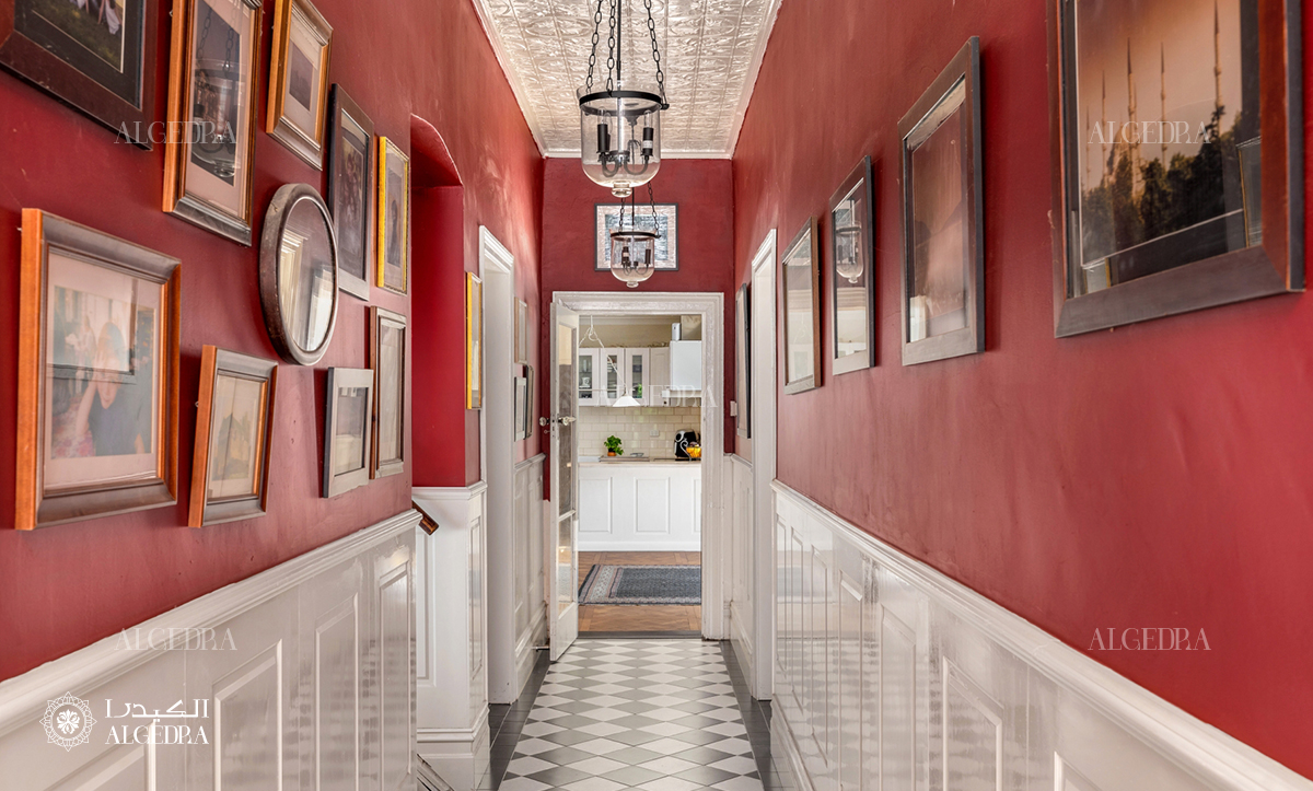
Red and all the variety of its halftones are not so often used to decorate residential spaces; for many, this color seems too active. But it is in the hallway that you can safely use it, especially such a warm, slightly muted shade.