
In interior design, color has the power to influence mood, create atmosphere, and shape the way we experience a space. As summer reaches its peak, one palette continues to rise with charm and depth—Floral Summer. This month’s featured color theme evokes the sensation of warm gardens, breezy air, and effortless elegance.
Floral Summer isn’t just about pink petals and sunny yellow accents. It’s a rich blend of soft botanical tones and delicate vibrant hues, drawing from nature’s most artful moments. Interior spaces designed using this palette feel fresh yet comforting—ideal for seasonal homes, hospitality interiors, and sophisticated urban settings alike.
Whether used as the focal color or blended through textiles and accessories, Floral Summer breathes life into any room. This direction beautifully complements other seasonal styles explored in our color inspirations for blue interiors, providing a wider range of serene palettes.
1- The Essence of Floral Summer
Subtle Warmth in Every Tone
Floral Summer colors often lean toward warm pastels and toned-down brights. Think blush rose, muted lavender, chamomile cream, and marigold. These shades carry a cheerful softness that doesn’t overwhelm, allowing spaces to feel cheerful without becoming overstimulating.
Inspired by Seasonal Blooms
Drawing from summer’s blossoms, this color story includes references to peony pink, iris blue, and dahlia red. The connection to living forms brings visual texture and gentle movement, even when presented through static surfaces like upholstery or paint.
Versatile Across Styles
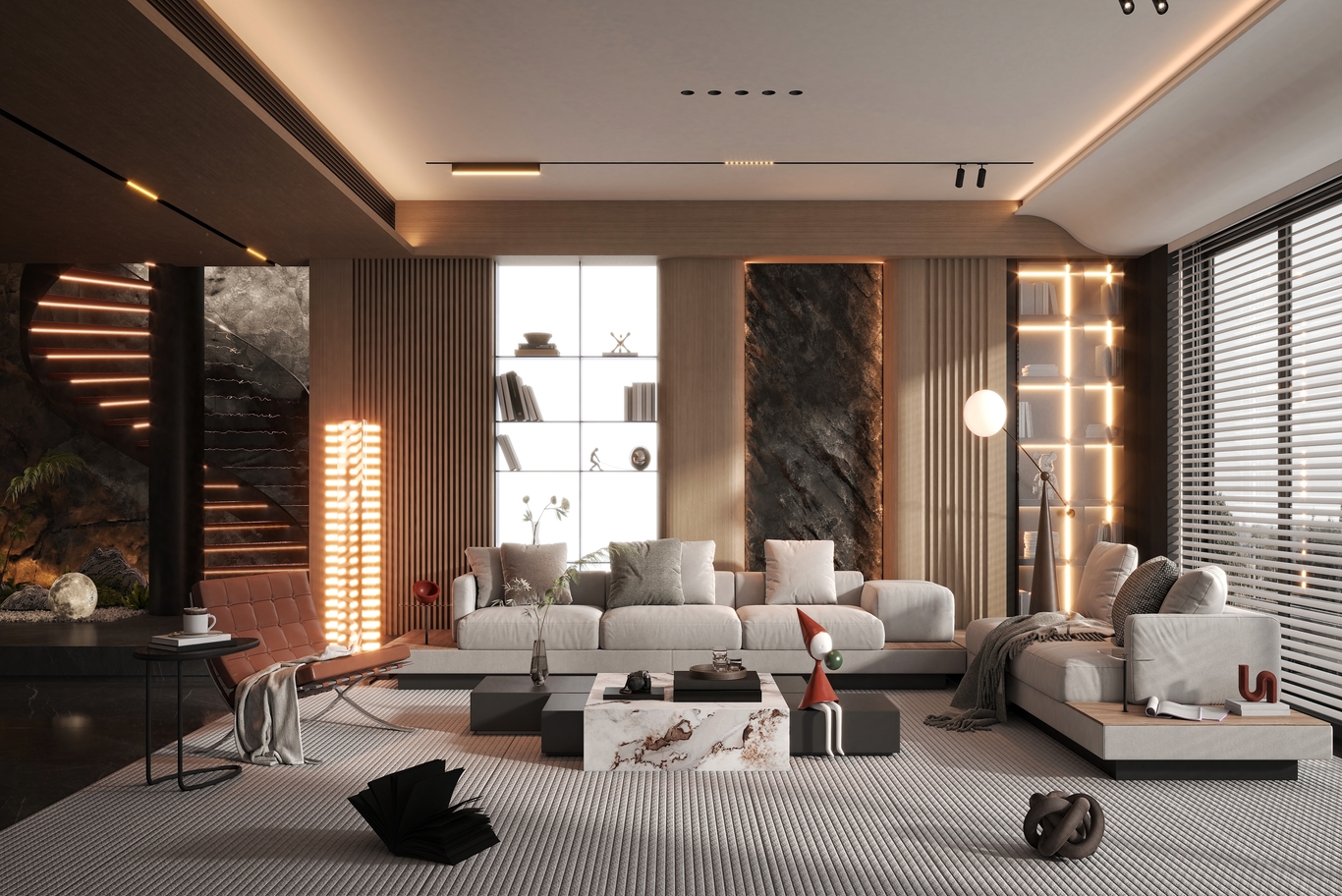
Although Floral Summer feels whimsical, it translates surprisingly well in both traditional and contemporary interiors. It softens structured spaces and adds sophistication to casual layouts. Whether framing a minimalist setting or accenting ornate decor, the palette adapts effortlessly.
For examples of how we’ve adapted seasonal themes into real homes and commercial spaces, view our interior design projects in Turkey.
2- Color Application Across Interior Elements
2.1. Walls and Surfaces
Paint Finishes
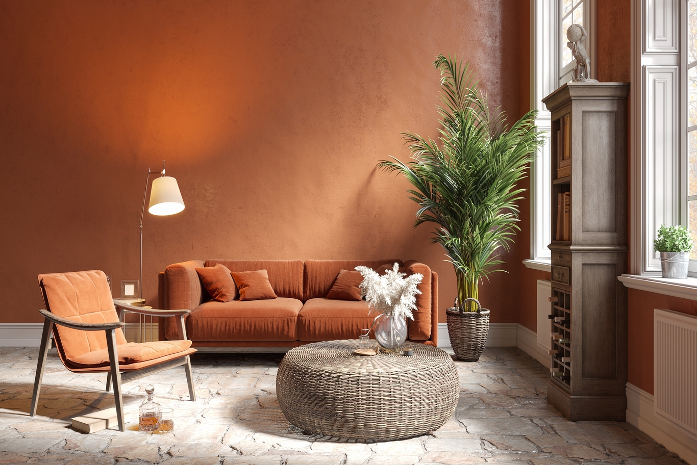
A single accent wall painted in dusty rose or pale terracotta can shift the feel of a room. Lighter shades open up small spaces, especially when paired with natural light. These tones serve as both a background and a personality layer.
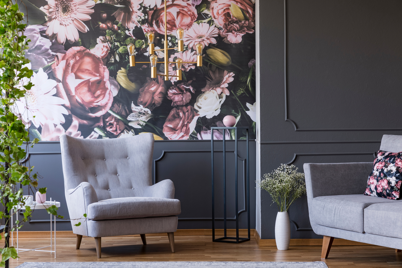
Wallpaper Details
Botanical wallpapers with restrained floral prints, combined with soft mauves or sun-faded reds, bring depth without visual noise. Subtle metallic infusions in wallpapers elevate the effect when natural light hits.
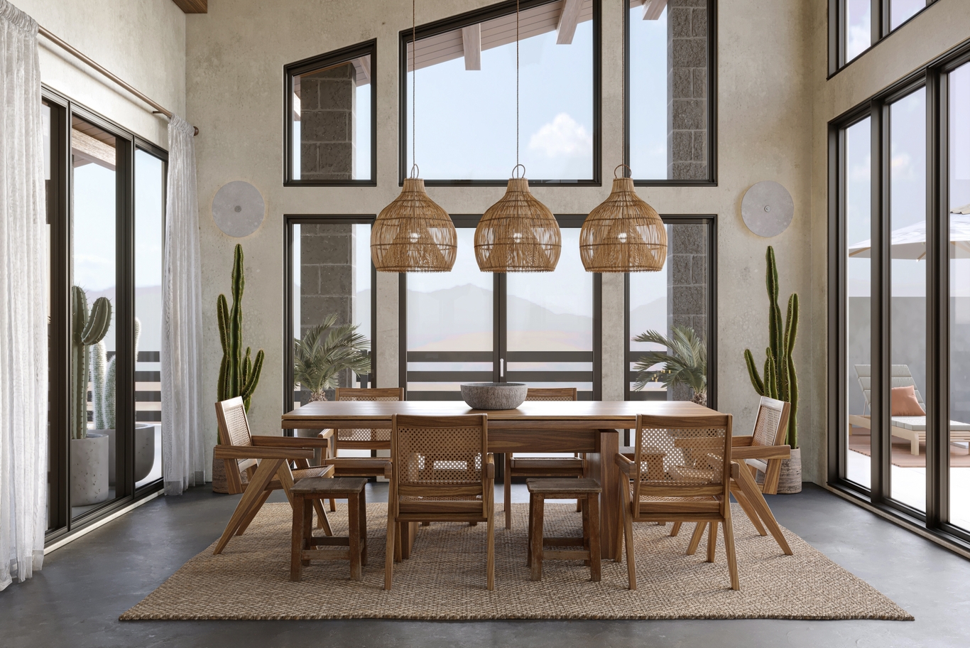
3- Furniture and Upholstery
Statement Pieces
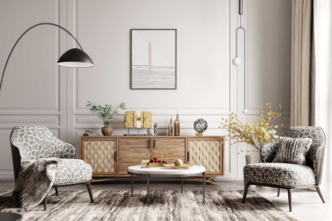
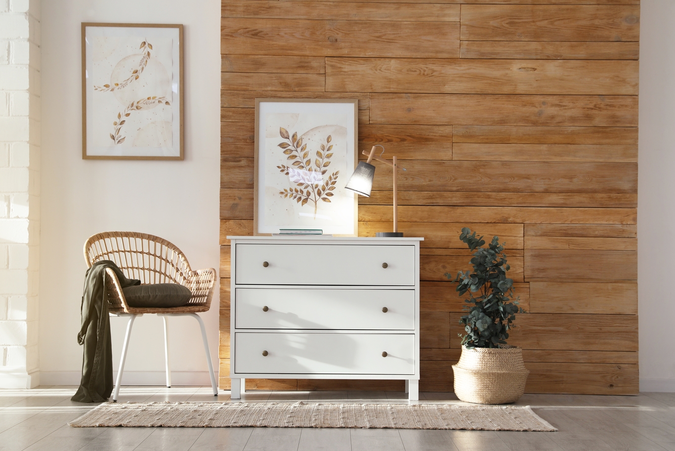
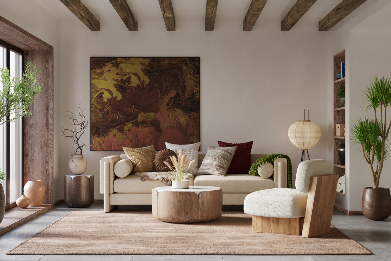
Velvet chairs in soft coral or couches upholstered in faded plum can act as the centerpiece in a room without competing with other elements. These shades work particularly well with wood grains and neutral flooring.
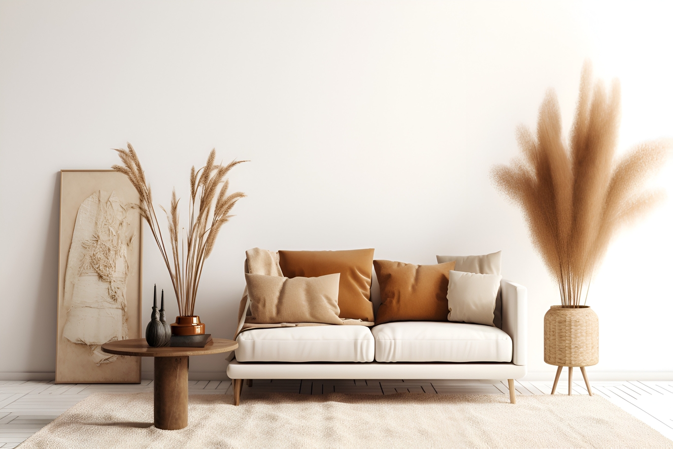
Layered Tones
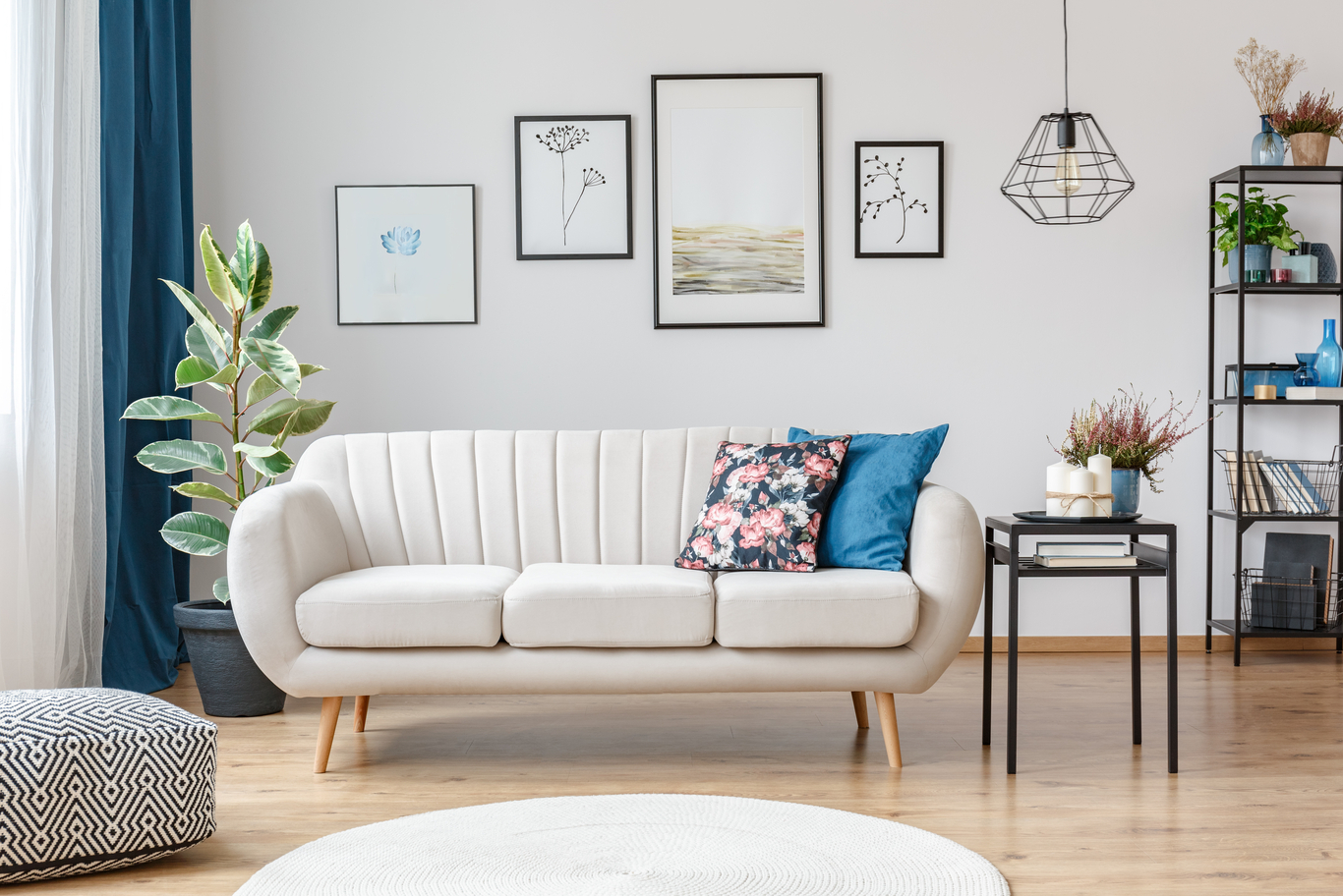
Incorporating cushions, throws, and ottomans in coordinating but not matching floral hues creates a dynamic yet cohesive arrangement. Layering variations like lilac, sunflower yellow, and rose beige keeps the composition fresh.

4- Lighting and Fixtures
Soft Diffused Hues
Lampshades in pastel textiles—linen in powder blue or cotton in cherry blossom pink—create an inviting glow. Paired with antique brass or white ceramic bases, these lights add a romantic ambiance.
Decorative Accents
Pendant lights with colored glass in subtle tones of blush or coral provide sculptural interest and a gentle color echo in dining or living spaces.
5- Accessories and Decor
Art and Wall Pieces
Abstract floral prints in watercolor palettes support the theme without being literal. Prints that blend greens with light peach, dusty rose, or faded reds fit the seasonal story without distracting from the room’s purpose.
Vases and Ceramics
Summer-colored ceramics—whether matte or glossy—bring seasonal notes to mantels or shelves. Grouping different heights in complementary tones gives a curated, casual vibe.
6- Material Pairings for Balance
Textiles and Fabrics
Natural materials such as linen, cotton voile, and bamboo rayon work especially well with this palette. These light, breathable textures absorb the color without oversaturation. Curtain fabrics in sheer floral patterns soften light and add movement to the room, while handwoven throws in pale lemon or soft lavender add weight and character.
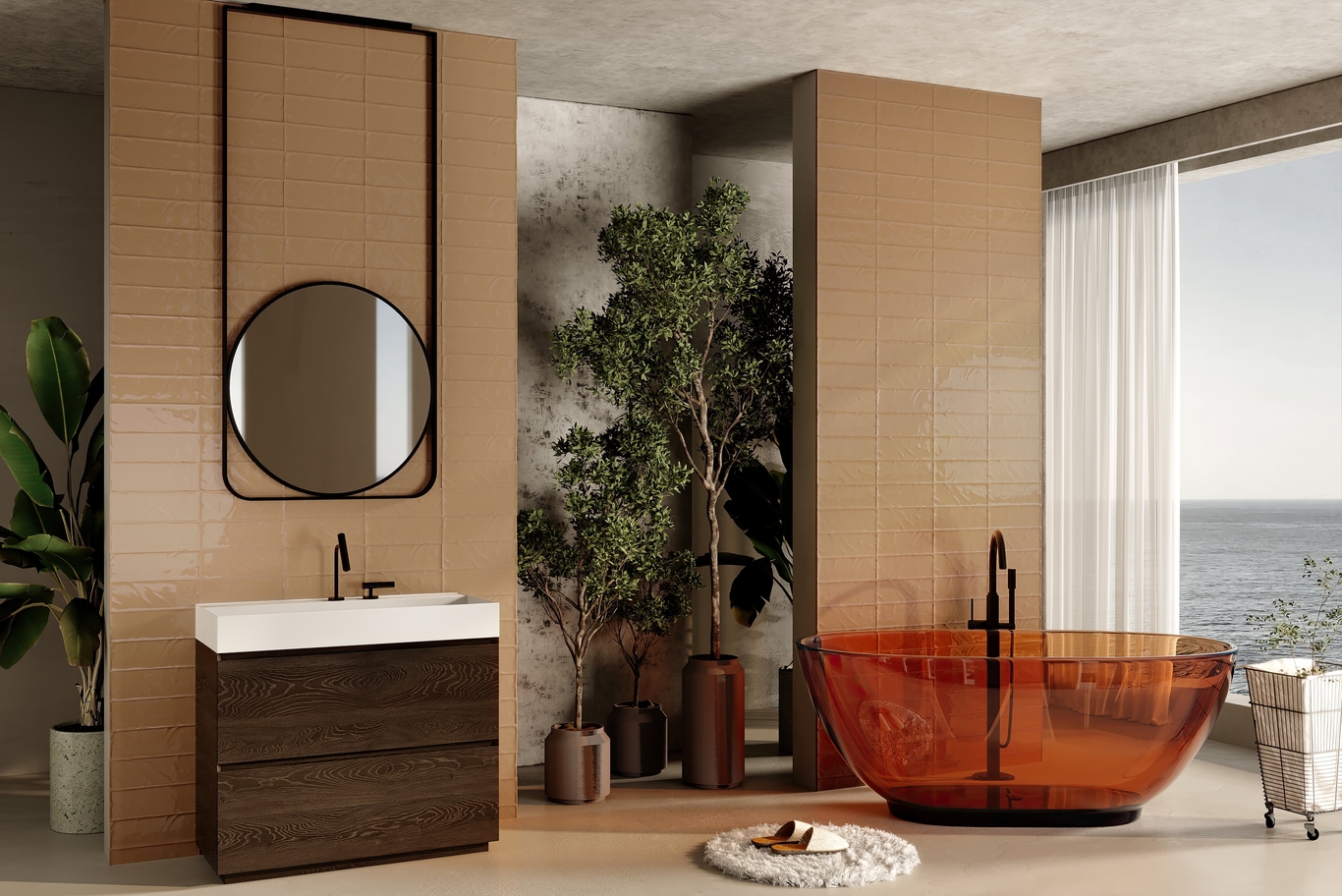
7- Hard Surfaces and Woods
Wood tones play a vital role in grounding the Floral Summer color story. Blonde oak, light walnut, and whitewashed pine blend gently with these soft hues. Glossy surfaces such as terrazzo in muted pinks or mosaics with floral tinting add visual intrigue to bathrooms and kitchens.
8- Complementary Color Palettes
Green as a Natural Anchor
Adding green tones—like sage, olive, or mint—provides grounding in otherwise warm rooms. These hues prevent the space from becoming too warm or overly feminine. Green also draws from the stems and leaves of flowers, subtly reinforcing the theme.
Neutrals as Buffers
Cream, sand, and cool beige provide a balancing backdrop. These shades help prevent the palette from becoming too playful and offer a stable frame for more expressive elements.
Touches of Blue for Contrast
Sky blue or muted navy serves as a counterbalance to the floral warmth. When used in moderation, it offers contrast and helps highlight lighter hues while giving visual depth to the room.
For more on how to introduce blues in harmony with warm palettes, visit our blog on serene blue interiors.
9- Styling for Different Spaces
Living Rooms
Using Floral Summer here invites comfort and calm. Upholstered seating, abstract botanical prints, and curated accessories like ceramic side tables or floral-motif rugs contribute to an inviting atmosphere.
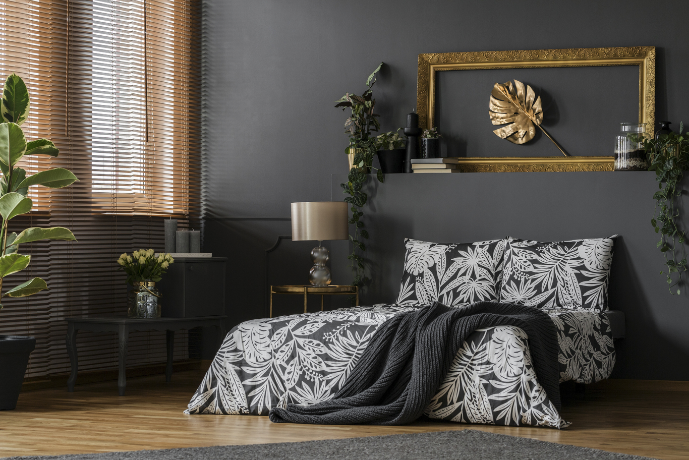
Bedrooms
In this private zone, soft bedding in floral shades paired with natural linens sets a soothing tone. Light pink or lavender painted walls paired with woven lampshades offer serenity while keeping the space lively.
Kitchens and Dining Rooms
In these areas, this palette can be incorporated through cabinetry detailing, backsplash tiling, and upholstered dining chairs. Fresh-cut flowers in matching tones can serve as living decor for daily use.
Bathrooms
Small spaces benefit from the fresh feeling Floral Summer delivers. Rose-colored towels, blush-toned cabinetry, and tinted glass accessories elevate the space without requiring structural changes.
10- Seasonal Styling and Longevity
Although inspired by summer, these colors can be adapted for year-round use. As the season changes, simply rotate accessories—introducing more earthy or deeper tones in fall or winter. The foundation remains gentle and fresh, acting as a base for future updates.
11- Trends and Future Direction
Floral Summer fits into a larger design movement that embraces softness, humanity, and calm. The trend reflects a departure from industrial minimalism toward a warmer, slower aesthetic. As interest in wellness and nature-focused living continues to grow, palettes like this one become more relevant.
While saturated tones have their place, these light florals offer a quieter form of expression—one that suggests calm confidence rather than performance.
Conclusion
Floral Summer offers more than fleeting appeal. It captures the lighthearted spirit of summer while lending a timeless elegance that endures through the seasons. For interiors that seek warmth, softness, and depth without loud statements, this palette offers clarity and sophistication.
Ready to Refresh Your Interiors?
Bring the feeling of a summer garden into your living space. Whether you’re planning a seasonal update or a complete home transformation, our design team is here to help.
Explore our recent interior projects in Turkey for inspiration or contact us today to schedule a consultation.
Let’s design a space that feels like a breath of fresh air.