
The methodical process of applying a certain color scheme to an interior in order to produce a striking and harmonious environment is known as "color pack interior design." The underlying idea of this concept is the knowledge that colors affect perception, emotion, and the general ambiance of a space. By using a particular 'pack' or palette, designers can elicit particular feelings and create the right atmosphere.
This blog aims to explore the essence of this trend, providing an insightful guide. Our article will enhance your knowledge and inspire your next design project.
1- Choosing Your Color Pack
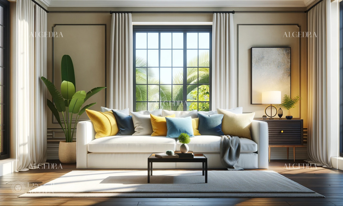
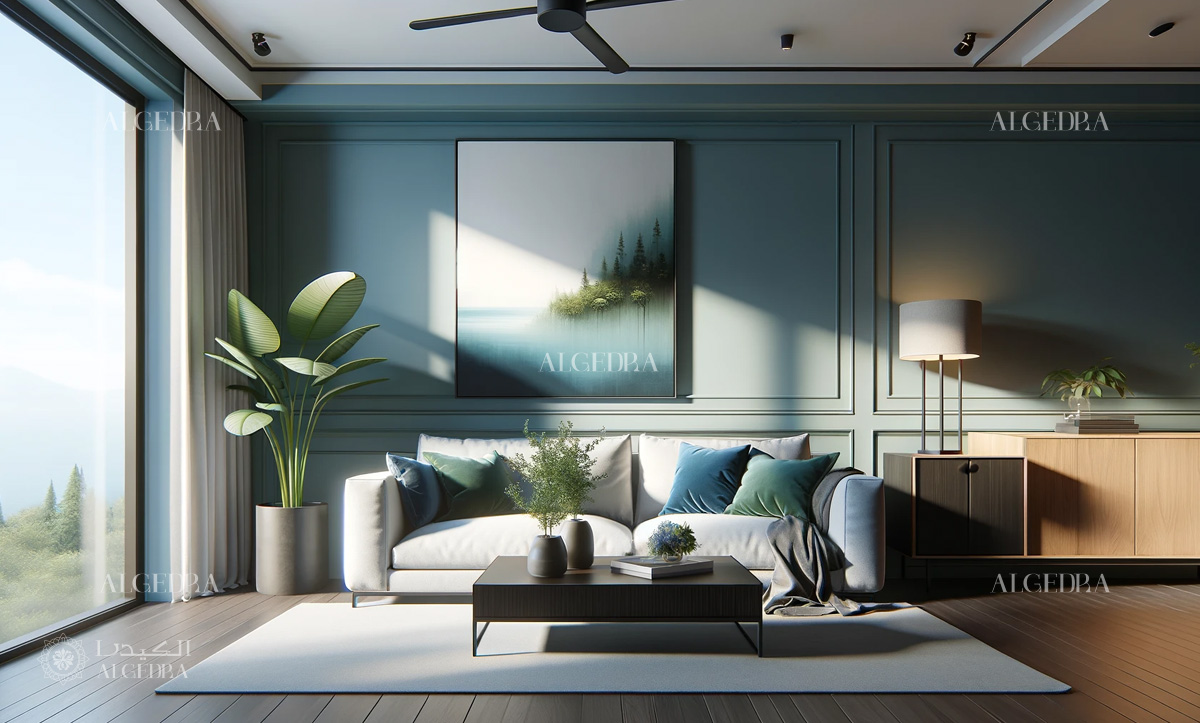
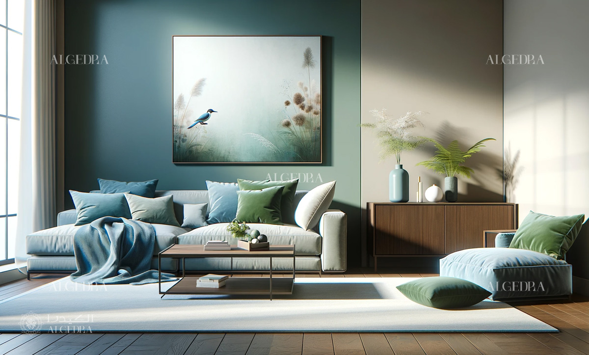
Selecting the right color pack is crucial. Start by considering the purpose of your space. For a calming retreat, consider blues and greens, which evoke tranquility and relaxation. If you're aiming for a more energetic vibe, vibrant colors like reds and oranges can invigorate a space. Neutral tones, such as whites, beiges, and grays, offer a timeless elegance and are incredibly versatile.
1.1. Foundations of Color in Interior Design
This encompasses the color wheel, primary, secondary, and tertiary colors, alongside concepts of color harmony and contrast.
- Primary Colors: Red, blue, yellow – the cornerstones of all color schemes.
- Secondary Colors: Green, orange, purple – created from primary color blends.
- Tertiary Colors: Formed by mixing primary and secondary colors.
1.2. Strategic Application of Color Pack Design
Initiate by assessing the space's purpose and the emotional ambiance you aim to create. Choose a primary color scheme and enrich it with secondary and tertiary hues to add depth and interest.
- Functionality of the Room: Adapt color schemes to the intended use of each space. Bedrooms often benefit from muted, calming tones, whereas living areas can accommodate more vibrant colors.
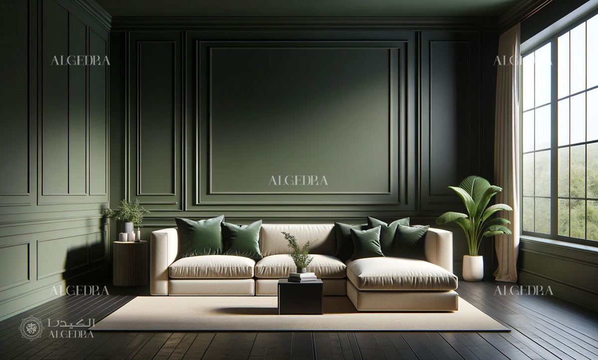
- Proportional Color Distribution: Strive for equilibrium. Generally, a dominant color should occupy about 60% of the space, with a secondary color at 30% and accent colors around 10%.
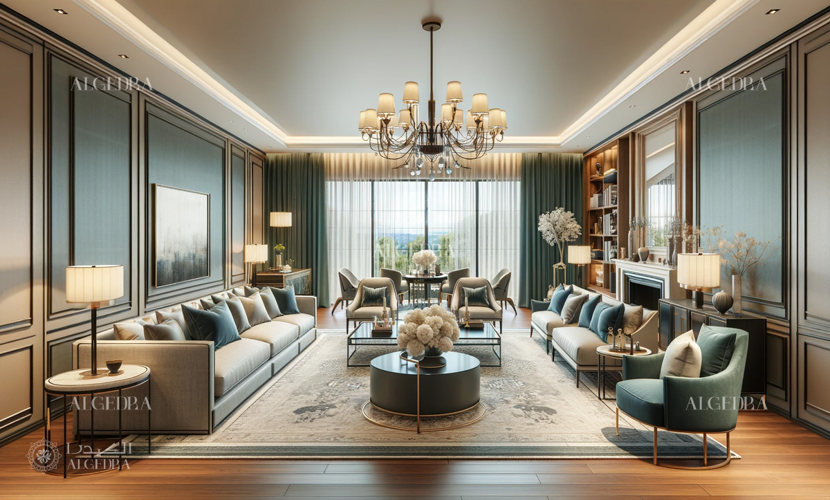
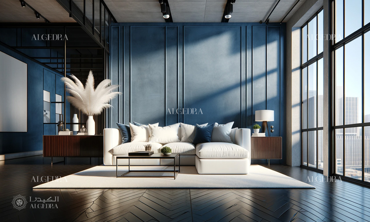
2. Balance and Harmony
Achieving balance is key in color pack interior design. This involves the colors themselves, and their application in terms of proportion and placement. A dominant color should anchor the space, complemented by secondary and accent colors. This creates a beautiful and cohesive look. Remember, balance doesn’t necessarily mean symmetry. It's about distributing visual weight effectively.
3. Texture and Materials
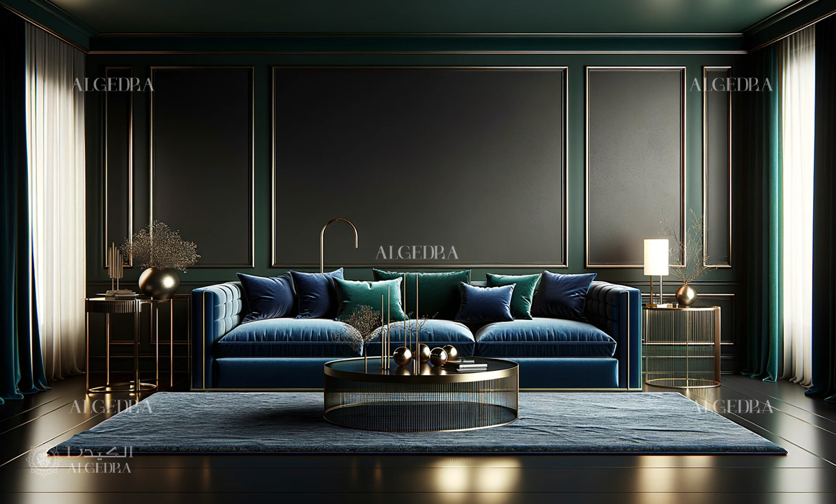
Incorporating various textures and materials can add depth and interest to your space. For instance, a velvet sofa in a deep blue can provide a luxurious feel, while a sleek, metal table in a minimalist space can enhance a modern aesthetic. Textures also play a significant role in how colors are perceived; a glossy finish can make a color appear brighter, whereas a matte finish gives a more muted effect.
4. Lighting and Color Perception
Lighting dramatically affects how colors are perceived in a space. Natural light brings out the truest form of the color, while artificial lighting can alter its appearance. Consider the direction of natural light and the type of artificial light when choosing your color pack. For instance, north-facing rooms might benefit from warmer tones to counteract the cooler natural light.
5. Pattern Play
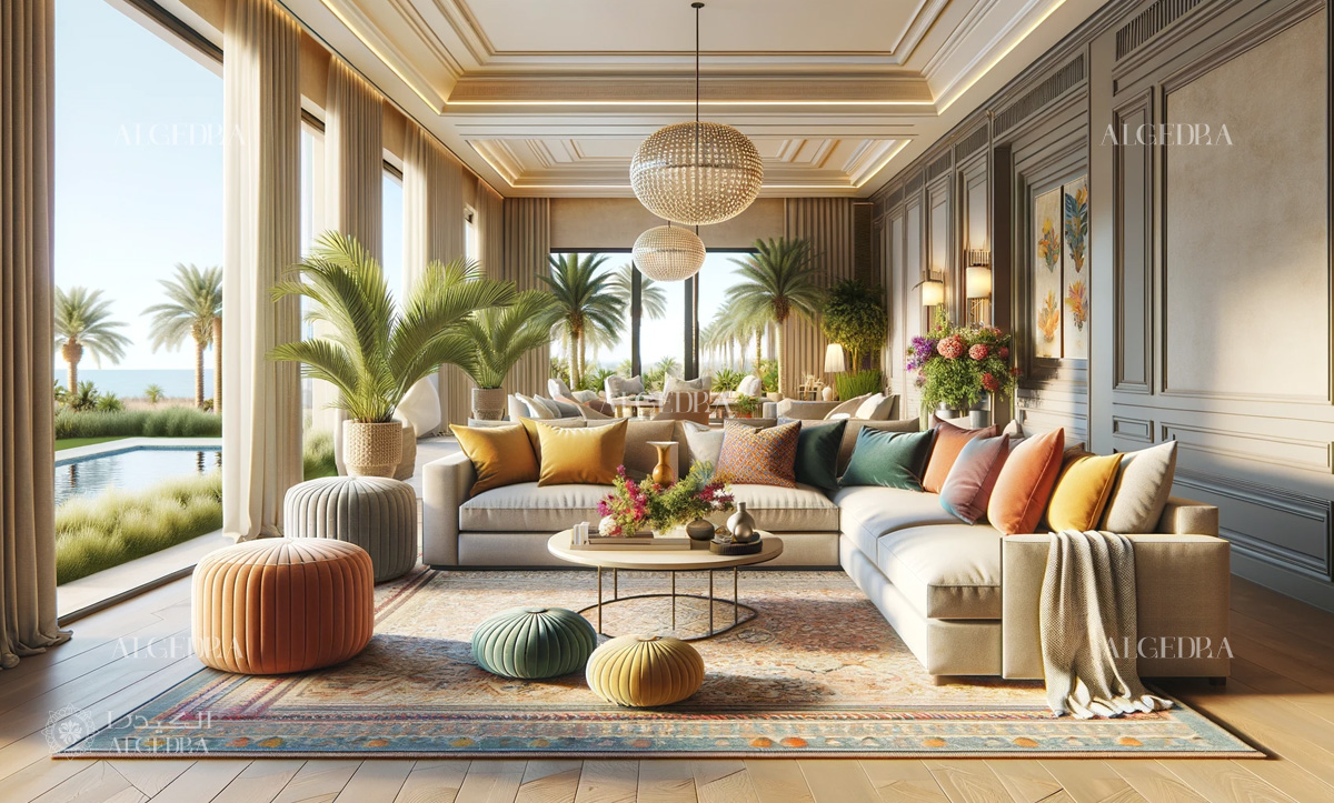
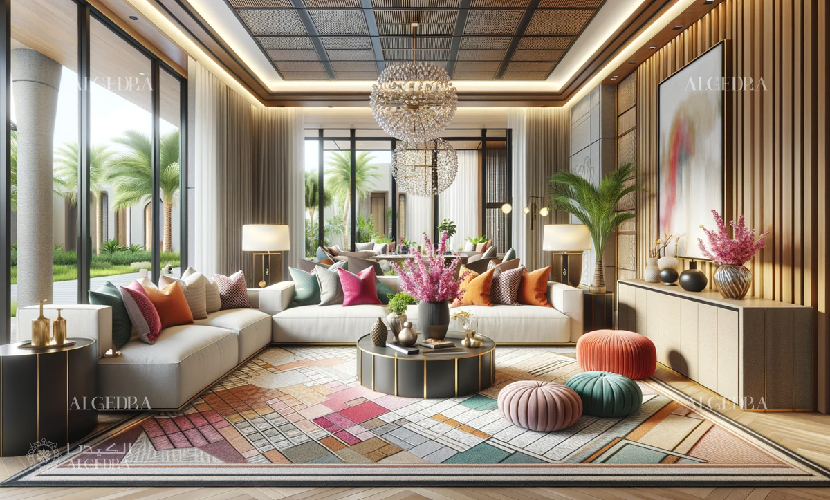
Patterns can add dynamism to your color pack. Whether it's through wallpapers, fabrics, or decorative items, patterns bring an additional layer of complexity and interest. Be cautious not to overwhelm the space; choose patterns that complement rather than compete with your color scheme.
6. Psychology of Colors
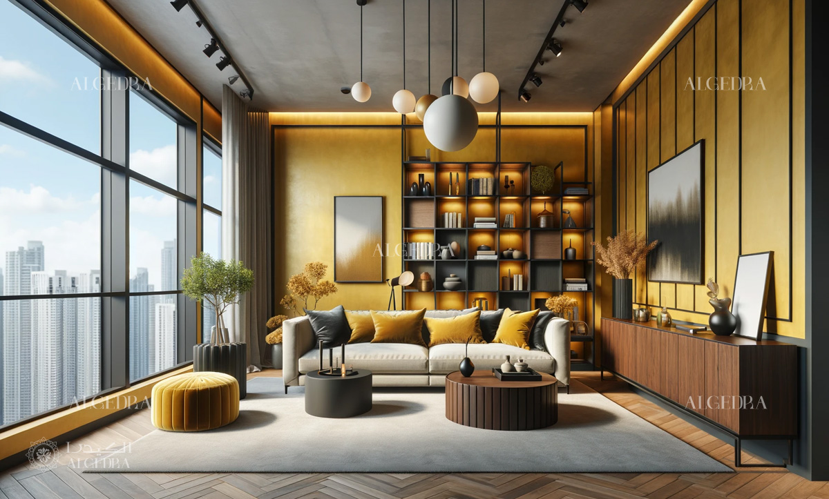
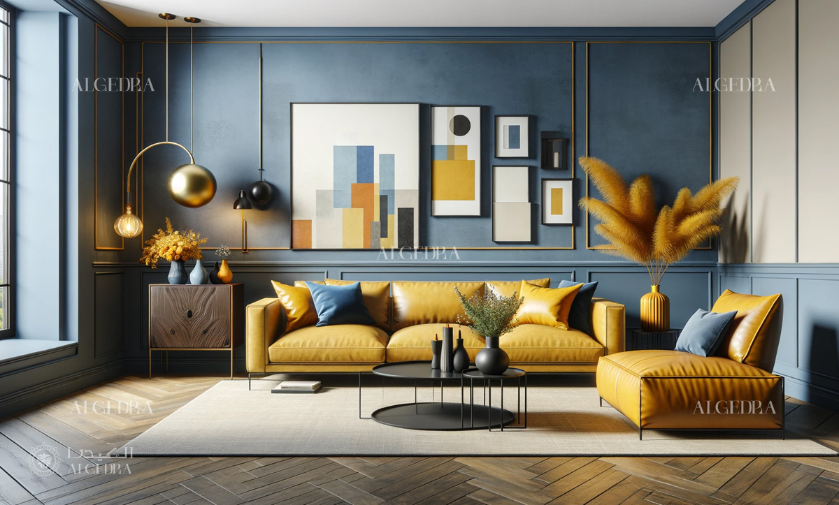
Understanding the psychology behind colors can enhance the effectiveness of your design. Colors have the power to influence mood and behavior. For example, blue is often associated with calmness and stability, making it a popular choice for bedrooms and bathrooms. Yellow, synonymous with happiness and energy, can be great for kitchens or dining areas.
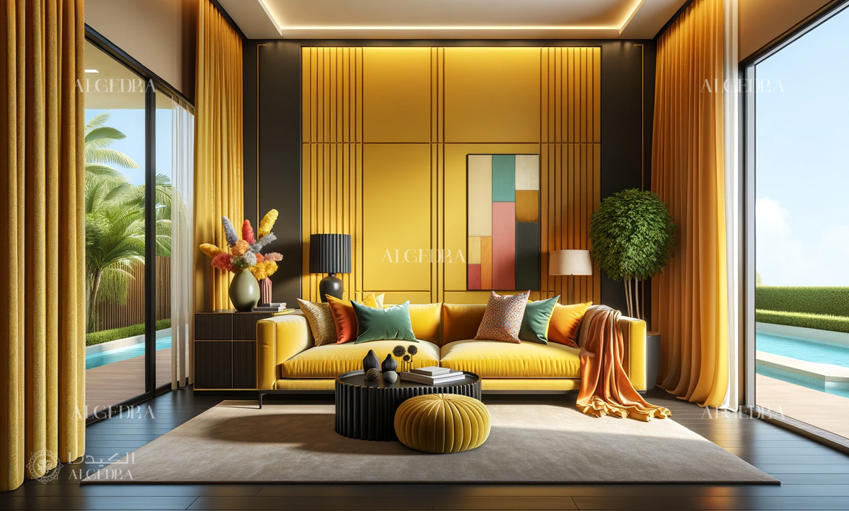
7. Trending Approaches in Color Pack Design
Current trends indicate a preference for bold, striking color combinations, often integrating contrasting warm and cool tones.
- Biophilic Elements: Incorporating nature-inspired hues for tranquility.
- Dramatic Contrasts: Utilizing high contrast color schemes for a modern, impactful aesthetic.
8. Challenges in Color Pack Design
Implementing color pack design can be complex, especially in achieving a harmonious balance without overwhelming the space.
- Utilize Color Sampling: Test your chosen colors in the actual environment, observing their interaction under varying lighting conditions.
- Seek Expert Guidance: Consultation with a professional interior designer can offer a fresh perspective and ensure a well-balanced result.
9. Practical Guidelines for Incorporating Color Pack Design at Home
Incorporating color pack design in your home can be an exciting venture. Here are actionable tips to help you apply this approach effectively:
- Commence with a Small Space: Test color packs in a limited area to evaluate their impact before applying them to larger spaces.
- Accentuate Key Elements: Apply your dominant color to central features like walls or major furniture, and introduce complementary colors through smaller decor items.
- Factor in Lighting: Consider how natural and artificial light alters color perception. Observe your color choices across different times to gauge their true effect.
- Blend Textures and Patterns: Elevate your color pack by integrating diverse textures and patterns that harmonize with your chosen colors.
10. Applying Color Packs Across Various Interiors
Discover how color pack design can be personalized to different rooms:
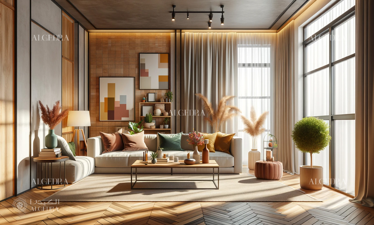
- Living Room: Foster a warm, inviting atmosphere using a neutral base with vibrant color accents in accessories for a balanced yet dynamic space.
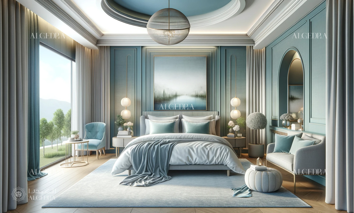
- Bedroom: Opt for cooler, soothing shades like blues or greens, accented with gentle, neutral tones in soft furnishings for a restful environment.
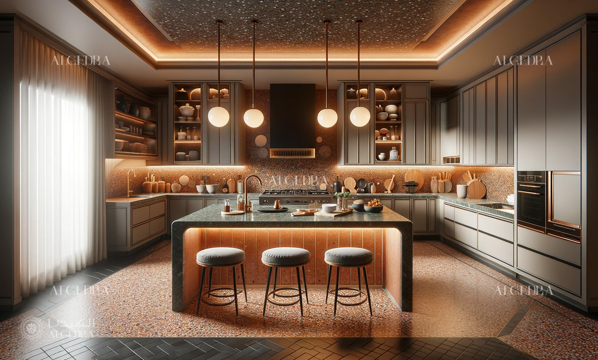
- Kitchen: Introduce energy with brighter colors. Blend warm hues with cooler tones for a lively yet cohesive look, focusing on colored cabinets or backsplashes as focal points.
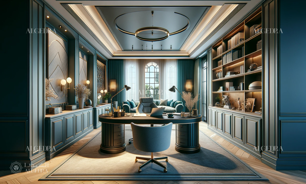
- Home Office: Enhance productivity with a balanced color pack. Subdued blues or greens can aid concentration, while warmer accents stimulate creativity and energy.
Color pack interior design provides a sophisticated and dynamic way to improve the aesthetic and emotional appeal of any room. You may effectively use this strategy in your home if you learn color theory, understand room functionality, and stay up to date on trends.
Regardless of the limitations, with a systematic approach and professional insights, color pack design may greatly boost any interior setting.