
Each December, the Pantone Color Institute looks at design trends, social movements and global attitudes to select a shade that captures the cultural mood for the coming year. For 2026 the institute made an unexpected choice: PANTONE 11‑4201 Cloud Dancer, a soft white that some might not even classify as a color. The announcement on 4 December 2025 emphasised that Cloud Dancer is “billowy and balanced” and described it as an “ethereal”neutral. The shade acknowledges that the world is exhausted by constant stimulation; its understated presence invites calm, introspection and creative renewal. As Laurie Pressman, vice president of the Pantone Color Institute, explained, people are “looking for respite, looking for relief” after years of bright, saturated tones. Cloud Dancer answers that call by offering a visual pause and a blank canvas on which to imagine the future.
This blog explores why Pantone chose Cloud Dancer, what makes the hue distinctive and how to use it in interior design and home décor. We’ll examine the cultural context behind the selection, delve into its psychological impact and provide practical tips and color palettes for incorporating Cloud Dancer into different rooms. While the color itself is neutral, the possibilities it opens up are anything but bland.
1- Why Pantone Chose Cloud Dancer
1.1. Responding to overstimulation and the need for calm
Pantone’s color selections are not arbitrary; they reflect broader cultural shifts. Leatrice Eiseman, the Pantone Color Institute’s executive director, described Cloud Dancer as “a lofty color that reads like a breath of fresh air” and “a symbol of a calming influence in a frenetic society”. She and Pressman noted that people are grappling with overstimulation from technology and constant digital noise, and many are re‑evaluating where they want to be in their lives. Cloud Dancer offers a respite from that chaos; it is a deliberate simplification designed to encourage quiet reflection and focus.
Pressman described the color as an “airy white hue that exemplifies our search for balance between our digital future and our primal need for human connection”. She emphasised that Cloud Dancer invites us to pause, look inward and reset.
The color responds to a transitional time when people seek “truth, possibility and a new way of living”. Calling the hue a “conscious statement of simplification” that enhances focus and releases us from external distractions.
1.2. A blank canvas for new beginnings
Pantone’s 2025 color, Mocha Mousse, was a warm brown that evoked cozy indulgence. By choosing white for 2026, the institute shifted dramatically. The color acts as a blank slate for creativity and renewal, and the selection process is ongoing and anthropological, considering what people are feeling and what is bubbling up culturally. The constant conversation with designers, consumers and trend forecasters revealed a growing desire for simplicity and serenity, which Cloud Dancer embodies.
1.3. Cultural anthropology and the name itself
Pantone’s selection process is akin to reading culture. The institute’s team of international experts, sometimes called color anthropologists, analyzes influences from fashion, interiors, art, film and global events. They also consider emerging technologies and social media. Pressman explained that the name is crucial, as it conveys the emotion behind the hue and helps people immediately understand its message. Cloud Dancer conjures images of billowy clouds and lightness, suggesting elevation above the chaos and a perspective of clarity and calm.
2- The Character of Cloud Dancer
Cloud Dancer is more than just “white”. Pressman clarified that it is not a pristine or technical white but rather a soft hue with subtle warmth that feels organic. She noted that the color moves beyond crispness toward something more natural and inviting.
Eiseman explained that Cloud Dancer contains both cool and warm undertones, making it truly neutral. This balance allows it to work with a wide range of colors and materials. In the Real Simple interview, she noted that in terms of light, white contains all colors, while in pigment it can be the absence of dye; what matters is the emotional response it evokes. Pressman added that Cloud Dancer has an inviting, calm nature that provides comfort to both consumers and designers. It encourages true relaxation and quiet focus.
3- Psychological Impact of Cloud Dancer in Interiors
Using a white palette can profoundly influence mood. Interior Design magazine described Cloud Dancer as a “whisper of calm and peace” and noted that it invites inward reflection and rest while offering space for creation and innovation. Eiseman said the hue offers a promise of clarity at a time of transformation and enhances focus by providing release from external distractions. Pressman added that the color opens space for creativity, allowing imagination to wander so new insights can emerge.
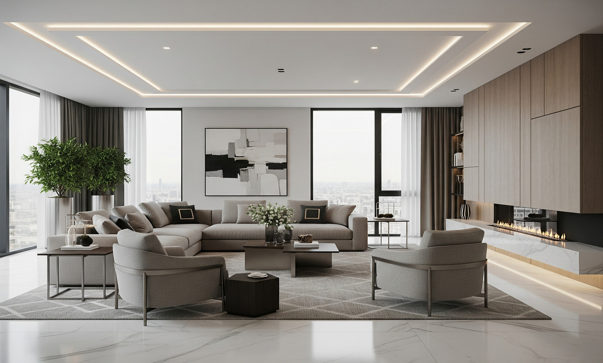
In psychological terms, white spaces are often associated with cleanliness, light and spaciousness. However, stark whites can feel cold or sterile. Cloud Dancer’s subtle warmth mitigates this issue; as Pressman explained, it moves toward an organic feel.
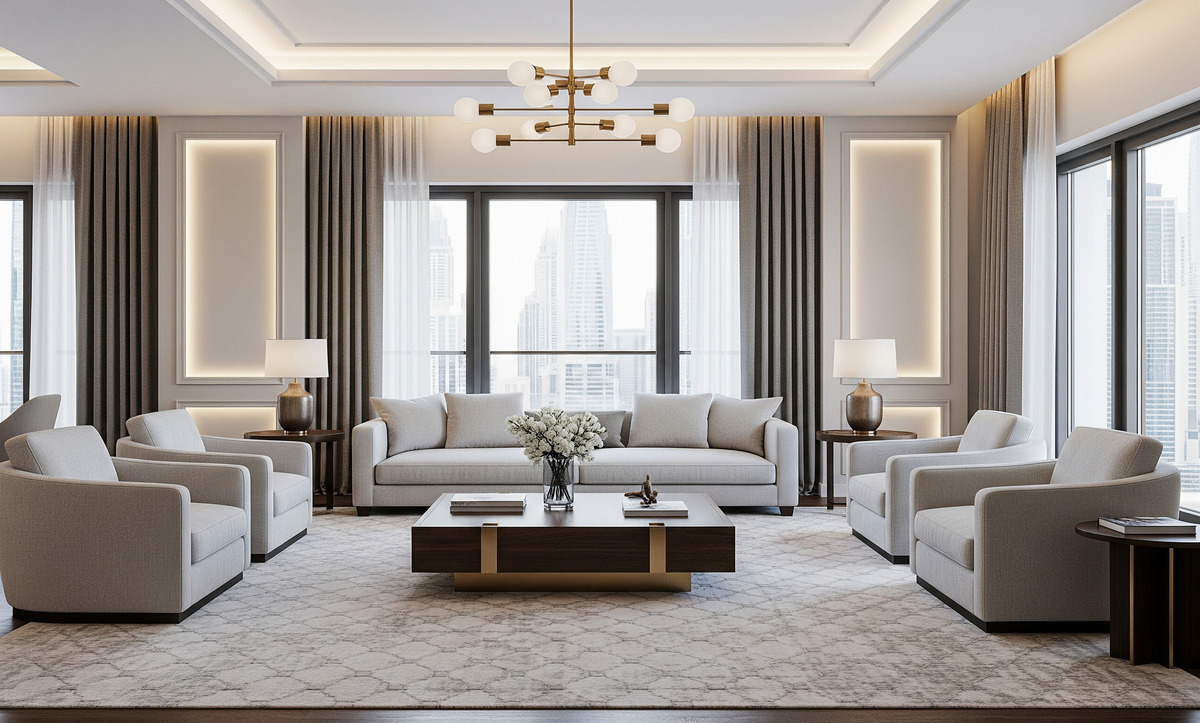
Cloud Dancer infuses rooms with spa-like serenity and a calming atmosphere. The hue’s warmth differentiates it from technical whites and makes it suitable for comfortable, lived-in spaces.
4- Using Cloud Dancer in Interior Design
4.1. Emphasise texture and materiality
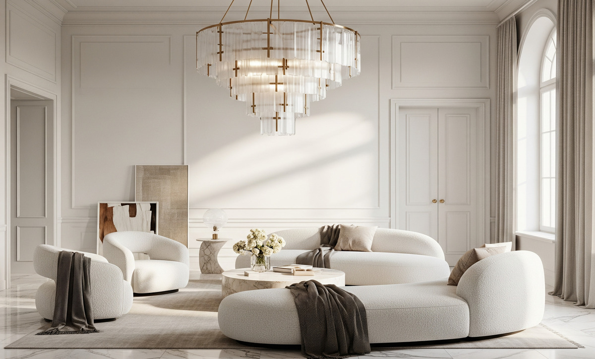
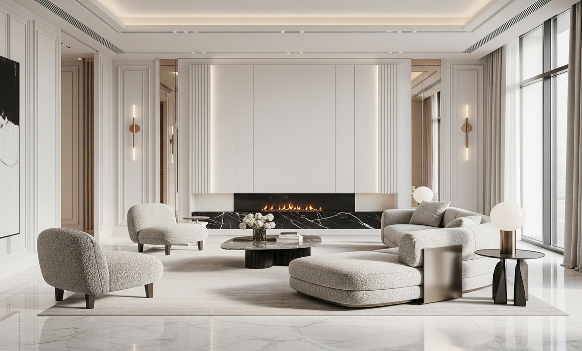
A neutral palette requires attention to texture to avoid flatness. Leatrice Eiseman told Elle Decor that Cloud Dancer creates spaces where function and feeling intertwine; she recommended pairing the hue with rounded furniture, plush fabrics and spa-like bathrooms to build atmospheres of serenity and spaciousness. She stressed that the effect is “minimalist, yet not stark”.
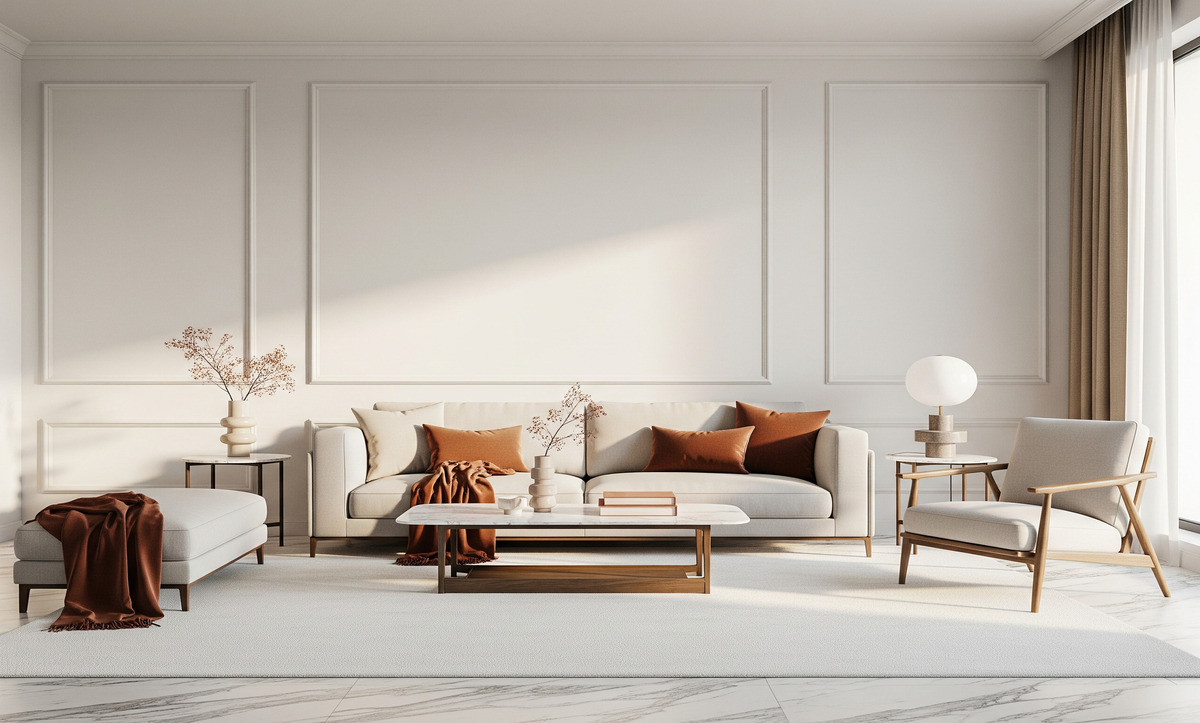
In practice, use textiles such as linen, bouclé and wool to add dimension. Layering rugs, throws and cushions in different textures can create cosy warmth within a neutral scheme. Surfaces like plaster, terrazzo and stone gain depth when contrasted against Cloud Dancer walls. Wood tones—from warm oak to cooler ash—pair beautifully with the color’s balanced undertones.
4.2. Play with light and shadow
Because Cloud Dancer is a light tone, it amplifies natural light and highlights the architecture of a room. The color behaves like atmosphere; it is not an accent but a presence that slows time and creates a contemplative pause. The hue heightens the relationship between light, material and space, refining edges and framing contrasts. In interiors, Cloud Dancer can make small spaces feel larger and airier. Use it on walls and ceilings to bounce light around the room, and consider matte finishes to avoid glare.
4.3. Use Cloud Dancer as a backdrop or a feature
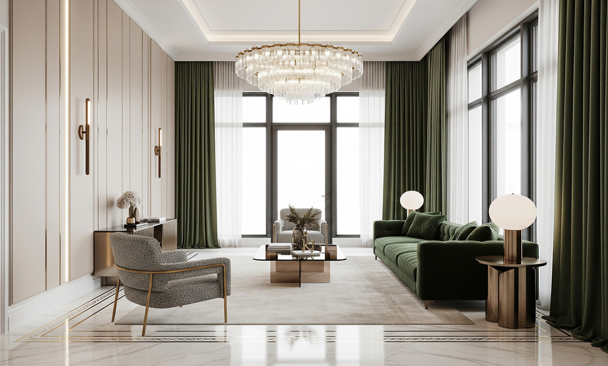
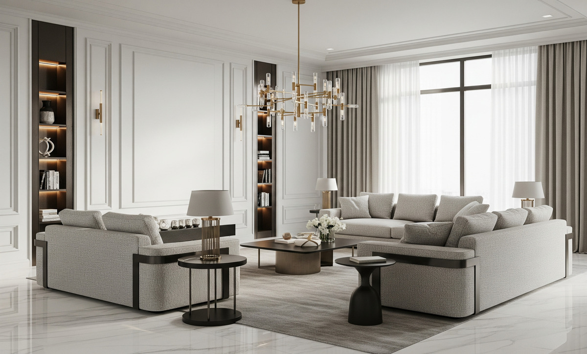
Some may worry that a white palette will make a space monotonous. Pressman assured that Cloud Dancer does not have to dominate; it can act as a versatile backdrop in a room drenched in color. She noted that the hue works beautifully as a sofa or can be integrated through accessories, and that there are numerous ways to incorporate it without creating a monochromatic statement. The versatility means you can paint entire walls in Cloud Dancer for a serene envelope, or use it in furniture, curtains or lighting to create moments of calm amid bolder hues.
4.4. Choose warm or cool accents depending on mood
Cloud Dancer’s balanced undertones allow it to pair with a wide spectrum of colours. It was important for the shade to be neutral enough to work with both cool and warm tones. Seven Pantone-curated palettes to accompany the color:
- Powdered Pastels – delicate shades like Lemon Icing and Peace Dust that create a soft, understated look.
- Take a Break – playful hues such as Pink Lemonade, Papaya and Cocoa Crème that show Cloud Dancer can anchor more vibrant tones.
- Atmospheric – colors inspired by sky and weather, like Cosmic Sky and Dusky Citron.
- Comfort Zone – earthy neutrals like Rose Brown and Mountain Trail that highlight the hue’s organic warmth.
- Tropic Tonalities – bright colors reminiscent of tropical vacations, with Cloud Dancer as the billowy cloud.
- Light & Shadow – softened hues and shadowy shades for a tonal, moody palette.
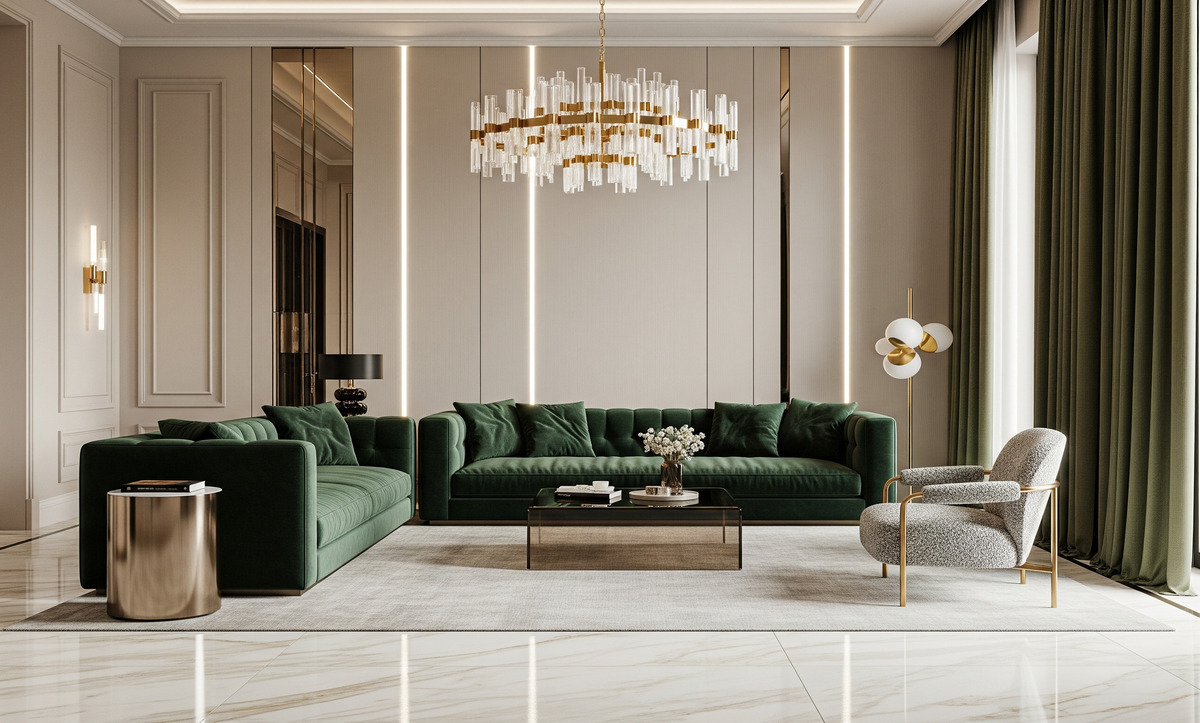
- Glamour & Gleam – deep black, vintage wine and metallics for a sophisticated contrast.
These palettes demonstrate how Cloud Dancer can shift from serene and understated to bold and glamorous depending on accompanying colors. In a living room, pair Cloud Dancer walls with leather furniture and brass accents for a luxe, Glamour & Gleam look. In a bedroom, combine the hue with powdery pastels for a restful retreat. For a playful kitchen or kids’ room, incorporate the Take a Break palette with pops of Papaya and Pink Lemonade.
4.5. Bring Cloud Dancer into every room
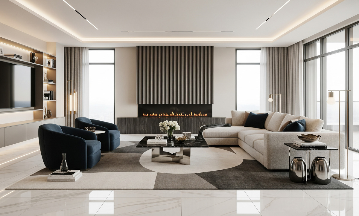
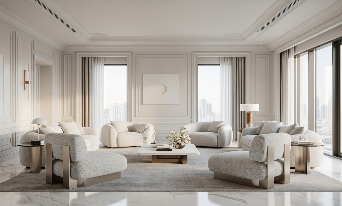
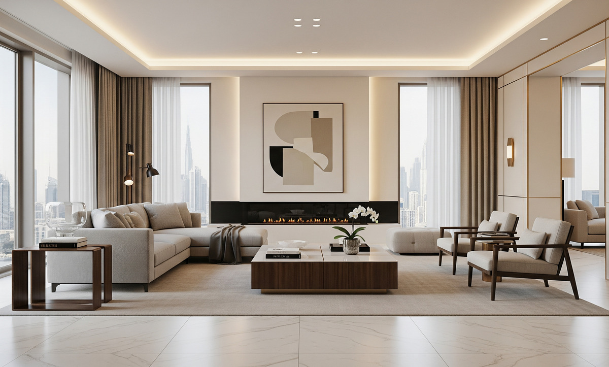
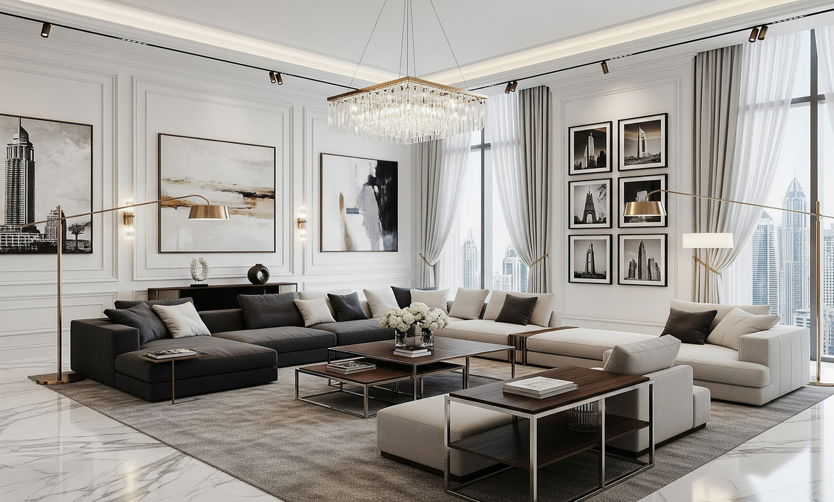
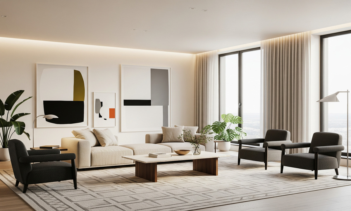
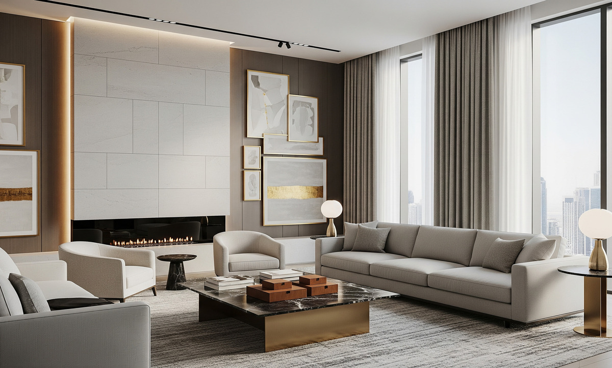
- Living rooms: A Cloud Dancer backdrop enhances artwork, furniture and textiles. Use the color on walls, then add warmth with wood coffee tables and textiles in earthy tones. Consider built-in bookshelves painted in the hue to make the room appear taller. If you prefer a statement piece, choose a Cloud Dancer sofa or armchair and contrast it with colored throw pillows.
- Bedrooms: White bedrooms often feel peaceful. To prevent them from feeling sterile, use Cloud Dancer with tactile bedding, upholstered headboards and draperies. Elle Decor suggested rounded furniture shapes and plush fabrics to promote relaxation. Add warmth with wood nightstands or a woven rug.
- Kitchens and bathrooms: Cloud Dancer cabinets or tiles make smaller kitchens appear larger. Pair them with marble or quartz countertops and metallic hardware for a fresh look. In bathrooms, use the hue on tiles or paint to create a spa-like ambiance. Wood vanities, woven baskets and greenery break up the white and add texture.
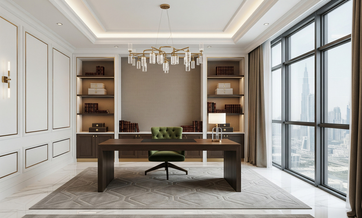
- Home offices: A Cloud Dancer backdrop can reduce visual noise and increase focus. Combine it with natural wood desks and shelving. Accessorise with plants and artwork in muted tones to maintain a calm atmosphere.
- Outdoor spaces: While primarily an interior color, Cloud Dancer can extend to outdoor living. Cushions, umbrellas or even exterior trim in the hue reflect sunlight and create a resort-like atmosphere, especially when paired with natural textures like wood and stone.
4.6. Consider finishes and maintenance
White surfaces show wear more readily than darker ones, so consider finish levels and materials. Matte and eggshell finishes hide imperfections but may be harder to clean. Semi-gloss or satin paints are easier to wipe down but reflect more light. For upholstery, choose performance fabrics treated to resist stains. Slipcovers in Cloud Dancer can be removed and laundered, making maintenance easier. In high-traffic areas, incorporate the color through accessories rather than large surfaces.
5- Cloud Dancer Beyond Interiors
The Color of the Year influences more than home design. Cloud Dancer also appears in fashion, where it lends itself to “puffy silhouettes and oversized padding” that wrap the body in warmth. The shade also appears in “diaphanous, floaty and fluid” organza and chiffon garments. In beauty, it translates into chic white nails and hair tones shifting from light to deeper shades.
Interior Design reported that Pantone is partnering with artists and brands across disciplines for a creative initiative exploring Cloud Dancer. The first collaboration features a limited-edition tote bag by illustrator Emiliano Ponzi. Pantone is also working with Spotify on a meditative soundscape paired with powdery pastels and shadowy shades. These projects emphasise the experiential nature of the color and its potential to influence music, graphic design and product development.
6- Addressing Skepticism and Misconceptions
Some observers questioned whether white counts as a color at all. This debate by explaining that, in light, white contains all colors, whereas in pigment it can be the absence of dye. Eiseman argued that the emotional component matters more than technical definitions; if a hue evokes feelings, it functions as a color. Pressman acknowledged that Cloud Dancer is a dramatic departure from previous vibrant selections and that some might see it as a cop‑out. However, she insisted that the color is relevant and meaningful precisely because it offers simplification in a loud and chaotic world.
Designers may worry that Cloud Dancer will look sterile or lack personality. Pressman emphasised that it is not a stark white; its organic warmth differentiates it from clinical whites. The hue works with any style, from minimalist to maximalist, because it adapts to its surroundings.
White is one of the most popular paint colors and is timeless. Instead of competing with trending hues, Cloud Dancer complements them and offers a long‑lasting foundation.
7- A Fresh Start for Design
Cloud Dancer is a color for those yearning for a reset. It speaks to our collective desire to slow down, simplify and find clarity amid constant noise. Its balanced undertones make it adaptable; its softness and warmth prevent it from feeling sterile; and its neutrality provides endless opportunities for pairing with other hues. As you consider refreshing your home in 2026, think of Cloud Dancer as both a calming presence and a canvas for your creativity.
Ready to Embrace Cloud Dancer?
Whether you’re repainting a room, replacing bedding or searching for the perfect accent chair, Cloud Dancer offers a serene foundation for your design projects. Experiment with textures, layer complementary colors and let this ethereal white guide you toward spaces that feel restful and inspired.
Share your Cloud Dancer transformations on social media or contact your favourite designer to help you bring this fresh, balanced hue into your home.
If you find this hue intriguing, contact Algedra - your award-winning interior design company - to make one of the best home styling transformations for you!
FAQs
1. What is Cloud Dancer?
Cloud Dancer (PANTONE 11‑4201) is Pantone’s Color of the Year 2026. It is a balanced, billowy white with subtle warm and cool undertones. Pantone describes it as ethereal, calm and inviting. The hue functions as a blank canvas that encourages reflection and creative renewal.
2. Why did Pantone choose a white hue for 2026?
Pantone selected Cloud Dancer to respond to widespread exhaustion with overstimulation and constant digital noise. The institute’s experts saw a cultural shift toward simplification and quiet focus; the color symbolises calm and the desire for a fresh start. It balances our digital future with our need for human connection.
3. How can I use Cloud Dancer in my home without it looking sterile?
Focus on textures, materials and finishes. Round furniture, plush fabrics and tactile surfaces such as wood, stone and woven textiles prevent the color from feeling stark. Layering rugs, pillows and throws adds depth. Use Cloud Dancer as a backdrop for artwork and décor, or incorporate it through furniture and accessories.
4. What colors pair well with Cloud Dancer?
Because the hue has both warm and cool undertones, it harmonises with many palettes. Pantone proposed seven color families: Powdered Pastels (delicate hues), Take a Break (playful brights), Atmospheric (sky and weather tones), Comfort Zone (earthy neutrals), Tropic Tonalities (vibrant tropical hues), Light & Shadow (muted tones) and Glamour & Gleam (black, wine and metallics). Choose accents based on the mood you want to create.
5. Is Cloud Dancer only for minimalist interiors?
No. Pressman pointed out that Cloud Dancer is versatile and does not have to create a monochromatic scheme. It can anchor maximalist rooms drenched in color, serve as a foundation for eclectic patterns or act as a calming element in bohemian spaces. The hue’s neutrality means it adapts to diverse styles and evolves with changing décor trends.