

The wall the sofa faces does more work than any other surface in a living room, and in most homes it gets the least thought. A screen goes up, a cable runs down the plaster, and a room that was carefully considered everywhere else ends up organised around a black rectangle nobody planned for. The alternative takes a little joinery and a lot of measuring, which is where our family sitting room design work usually begins — with the media wall drawn before the furniture is chosen, rather than after.
Sixteen rooms follow. Some solve the screen with stone, some with fluted oak, some by refusing to give it the best wall at all. Each one carries a measurement or a construction note you can take to your own project.
1. Getting the mounting height right before anything else
Screens go up too high in most homes, usually because they are hung like pictures rather than furniture. From a sofa, the eye sits roughly 105 centimetres above the floor, so the centre of the screen wants to land between 100 and 110 centimetres, which puts the bottom edge of a 65-inch panel around 65 centimetres up. Viewing distance runs comfortably at one and a half to two and a half times the screen diagonal. Every design in this piece obeys those numbers first, then gets interesting.
2. Stone as the backdrop, fire beneath the screen
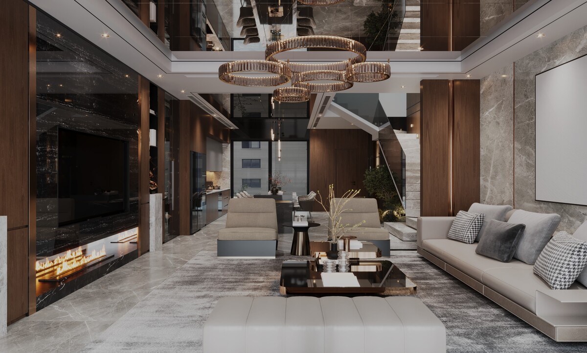
In the double-height room with the ringed chandeliers, the screen is set into a slab of dark veined marble that runs floor to ceiling, with a linear gas fire slotted into the same plane below it and walnut panelling closing both sides. Book-matched stone rewards this treatment, since the veining mirrors across the joint and reads as one piece rather than two. When fire and screen share a wall, keep at least 40 centimetres of dead surface between the flame outlet and the panel, and specify a fire with a front-throwing flue so heat is not travelling straight up the stone. Slab or engineered surface is a real decision here, and our comparison of stone chosen from the quarry against manufactured slabs is worth reading before you commit.
3. Recessing the panel into fluted oak joinery
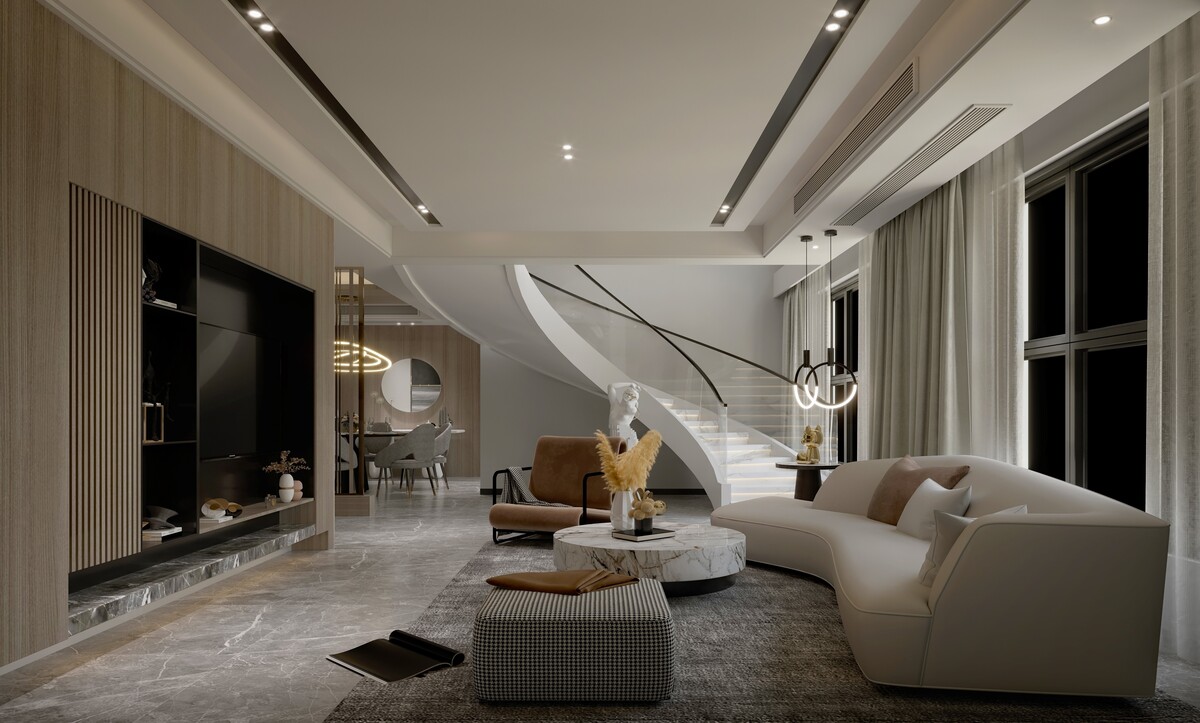
The pale room with the curved staircase takes a quieter route: a run of fine fluted oak covers the whole wall, and a black-lined niche is cut into it to hold the screen, with a marble ledge below acting as a display shelf. A recess needs 12 to 15 centimetres of depth for a slim panel on a fixed bracket, and closer to 20 if the bracket articulates. Line the back of the niche in dark lacquer or dark veneer so the screen disappears into shadow when it is switched off. The flute profile itself matters — 20 millimetre reeds at 25 millimetre centres read as texture from across a room, while anything finer disappears under lamplight.
4. Lacquered joinery walls with open display niches
The white living room with the low modular sofa handles the screen as one module in a much larger cabinet wall: full-height lacquer doors, a black-lined open section framing the panel, oak slats running above as a cornice. Full-wall joinery of that scale needs a 40 millimetre service void behind it for cabling, and a ventilated back panel if any AV equipment lives inside a closed door. Handleless push-catch fronts keep the composition calm, and a shadow gap at floor and ceiling stops the run from looking like a fitted wardrobe.
5. Keeping the console freestanding in a smaller room
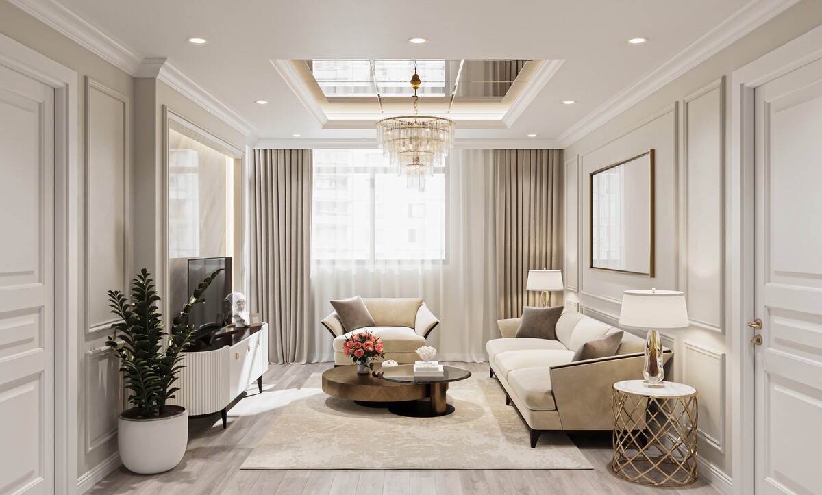
Not every wall wants building into. In the classic ivory room with the crystal chandelier and the panelled doors, the screen sits on a fluted white sideboard, and the wall behind it stays plain. For rooms under about 20 square metres, or for rented apartments, that is the more graceful answer — the joinery earns its place as furniture and can move on. Our guide to the low pieces that anchor a seating group covers the proportions that keep a console from crowding the room.
6. A shallow recess in a painted wall, with a light console beneath
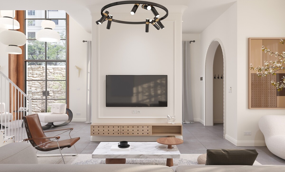
The bright room with the arched opening and the black spotlight ring builds its media wall out of plaster rather than joinery: a shallow rebate framed by a raised margin, the screen mounted flat inside it, and a low oak console with lattice-fronted doors sitting beneath. Cheaper than a full cabinet run and often better in a room with mouldings, since the margin picks up the existing profile language. Keep the rebate 25 to 30 millimetres deep, run the conduit inside the studwork, and hold the console at least 15 centimetres clear of the rebate edges either side so the two elements read as separate pieces.
7. A moulded panel grid that keeps the wall clear
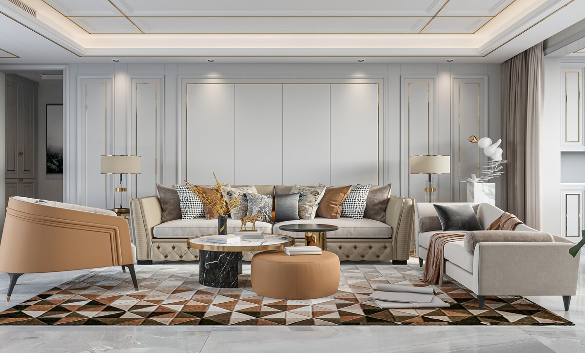
The ivory room with the gold-lined panelling and the pair of shell-backed sofas holds its wall entirely open, and the discipline behind that is worth copying. The panel grid is set out from the room's centre line rather than from a corner, so the field widths stay equal across the whole elevation and the gilt beading lands symmetrically either side of the sofa. Once a grid like that exists, a screen can be dropped into any single field later and it will look intentional instead of applied. Allow a 60 millimetre stile between fields and keep the mouldings shallow, around 12 millimetres proud, so a wall-mounted panel does not sit deeper than the joinery around it.
8. Giving the central panel to a mirror instead
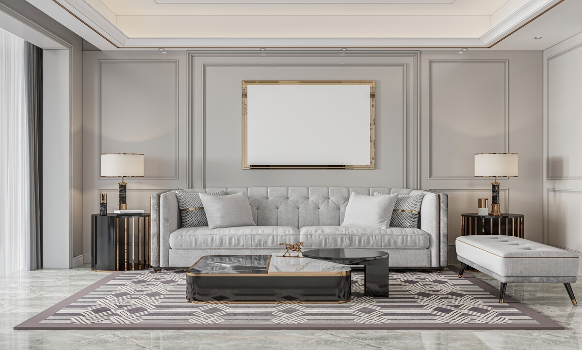
The grey room with the buttoned sofa and the twin marble lamps runs the same moulded language and puts a gilt-framed mirror where most homes would put a screen. Worth doing when the room is a formal reception rather than a family sitting room, and it also solves a rear wall in an open-plan layout by reflecting the light from the opposite glazing. If a screen has to arrive later, size the mirror to the panel field first and match the future panel to the same width, so the two swap without a replastering job.
9. The double-height wall and the problem of scale
A screen mounted at seated eye level on a seven-metre wall looks abandoned unless something happens above it. The atrium with the floating treads and the suspended glass pendants shows the principle without a television anywhere in sight: the lower wall stays in flat grey render, and the drama is carried in the upper half by the cascade of fixtures. Apply the same logic to a media wall in a double-height room by cladding a defined lower band — three metres or so, in stone or veneer — and treating the surface above it as a separate, calmer field.
10. Wood slats as a full-height textured surface
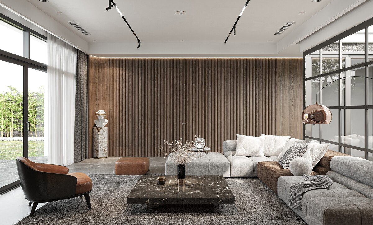
The room with the grey sectional and the copper dome pendant gives its entire feature wall to vertical timber battens, lit from a concealed strip at the top so the ribs cast their own shadow. Battens run at 20 to 30 millimetre widths with equal gaps, mounted on an acoustic felt backing that takes some liveliness out of a hard-floored room. Species changes the whole reading, and walnut against oak and bamboo is a decision worth making before the sample boards arrive.
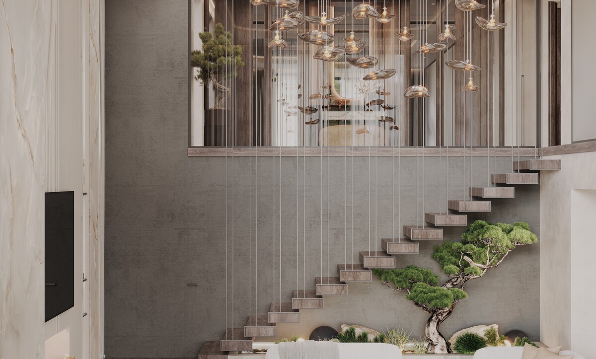
11. Dark timber and the loft-scale media wall
The industrial loft with the double-height kitchen mounts its screen on a wall of dark ribbed timber with a low grey cabinet run beneath, which is the right move in a room with a lot of visual competition. Dark wall, dark screen, and the panel stops announcing itself from the dining table. Keep the cabinet run under 45 centimetres deep so it reads as a plinth, and set it 5 centimetres clear of the wall on a recessed base to lighten it.
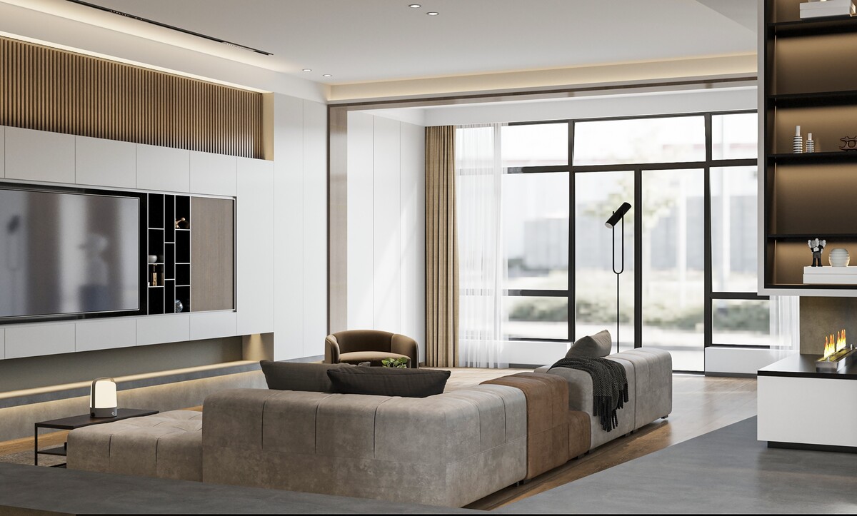
12. Metal inserts breaking up a dark panelled backdrop
The dark contemporary room with the crystal branch chandelier sets its screen on a white panelled ground broken by polished copper strips, with a low black console running beneath and timber slats wrapping the ceiling above. Vertical metal inserts do two useful things at once — they divide a wide elevation into readable bays, and they catch the evening light so the wall keeps some life when the screen is off. Keep the strips narrow, 80 to 120 millimetres, and repeat the same metal somewhere else in the room so the wall belongs to the scheme.
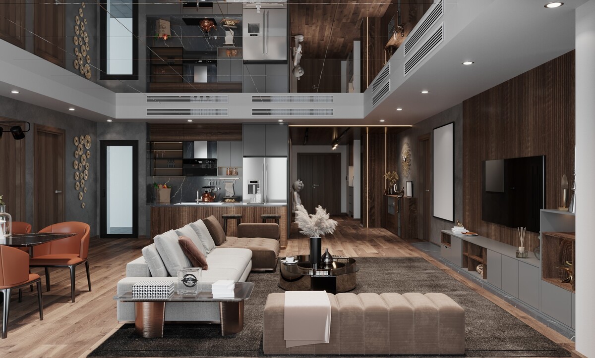
13. Framing the screen in bronze on a fluted ground
In the pale room with the twin marble tables, the panel sits inside a bronze frame on a fluted white surface, with a black marble ledge running beneath it and a lit glass display column alongside. Metal returns of 15 to 20 millimetres around a screen hide the panel edge and the bracket line at once, which is what makes the framed treatment convincing up close. Warm metals also give a room its evening character, and layered wall-mounted fixtures will do more for that wall than any ceiling light.
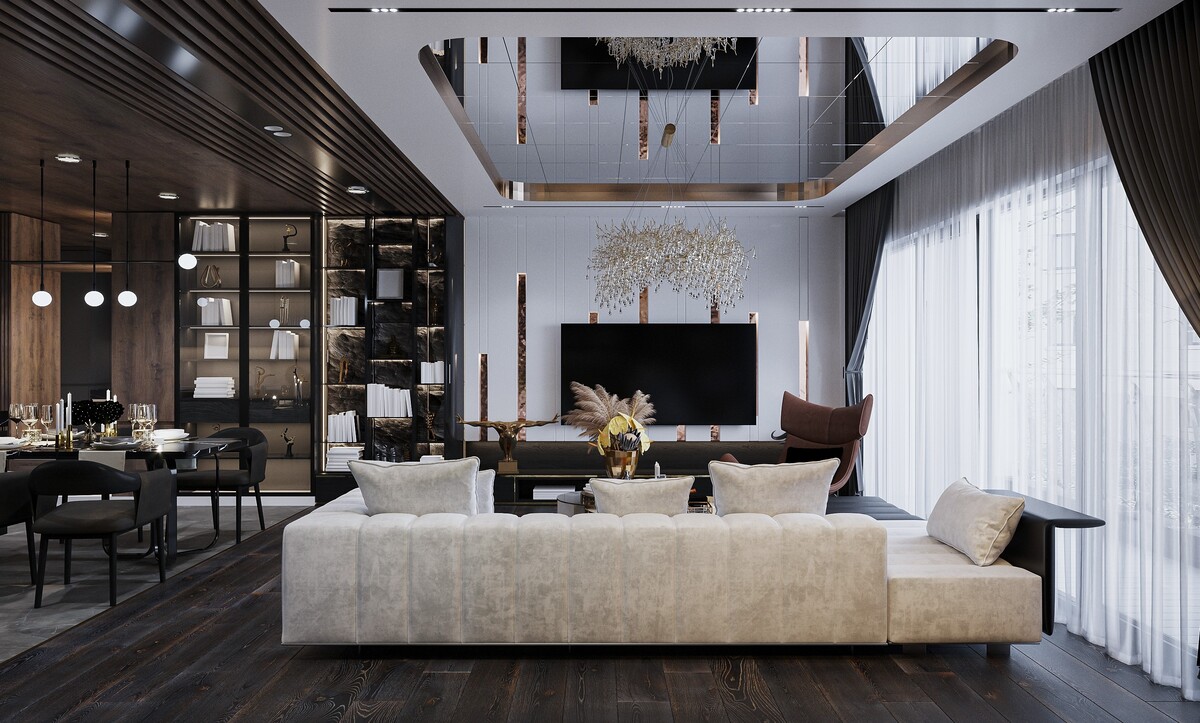
14. Fluted metal consoles under a wide dark panel
The white classic room with the moulded ceiling rose sets a very wide dark panel across the wall and runs a fluted, brass-handled console beneath it at full width. Matching the panel width to the console width, rather than to the screen, is the trick that keeps the composition from looking top-heavy. Allow 30 centimetres of dark panel either side of the screen so the black rectangle sits within a field instead of ending it.
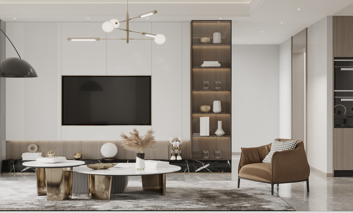
15. Shelving as the media wall
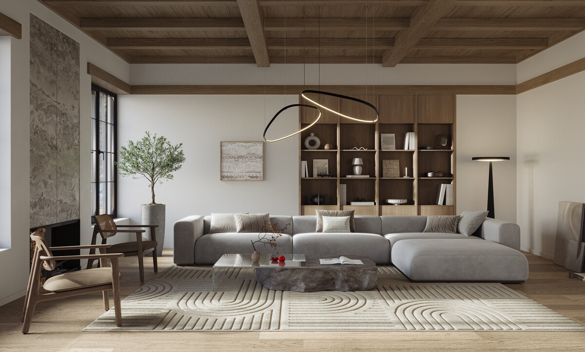
The beamed room with the pale sectional and the raw stone coffee table hands its whole back wall to an oak grid of open shelving, and no screen appears at all. Adapt it by leaving one bay, ideally at seated eye height and off the room's centre, backed in dark timber for the panel. Uprights at 350 to 400 millimetre spans keep 25 millimetre shelves from deflecting under books, and mixing closed base cabinets into the lower two rows hides the equipment.
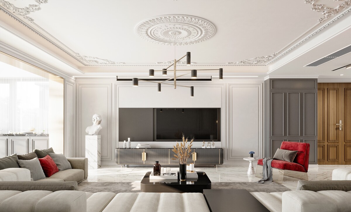
16. Turning the seating toward the glazing
The vaulted apartment with the herringbone floor and the tall steel-framed windows organises its whole plan around daylight, with the long sofa facing the glass and the low console holding the opposite wall. In an apartment with a real outlook, a screen deserves the secondary wall or a lift mechanism inside the joinery. Set the seating 60 to 80 centimetres off the glass so the frames stay visible, and put the media run on the return wall where it falls outside the sightline from the main seat.
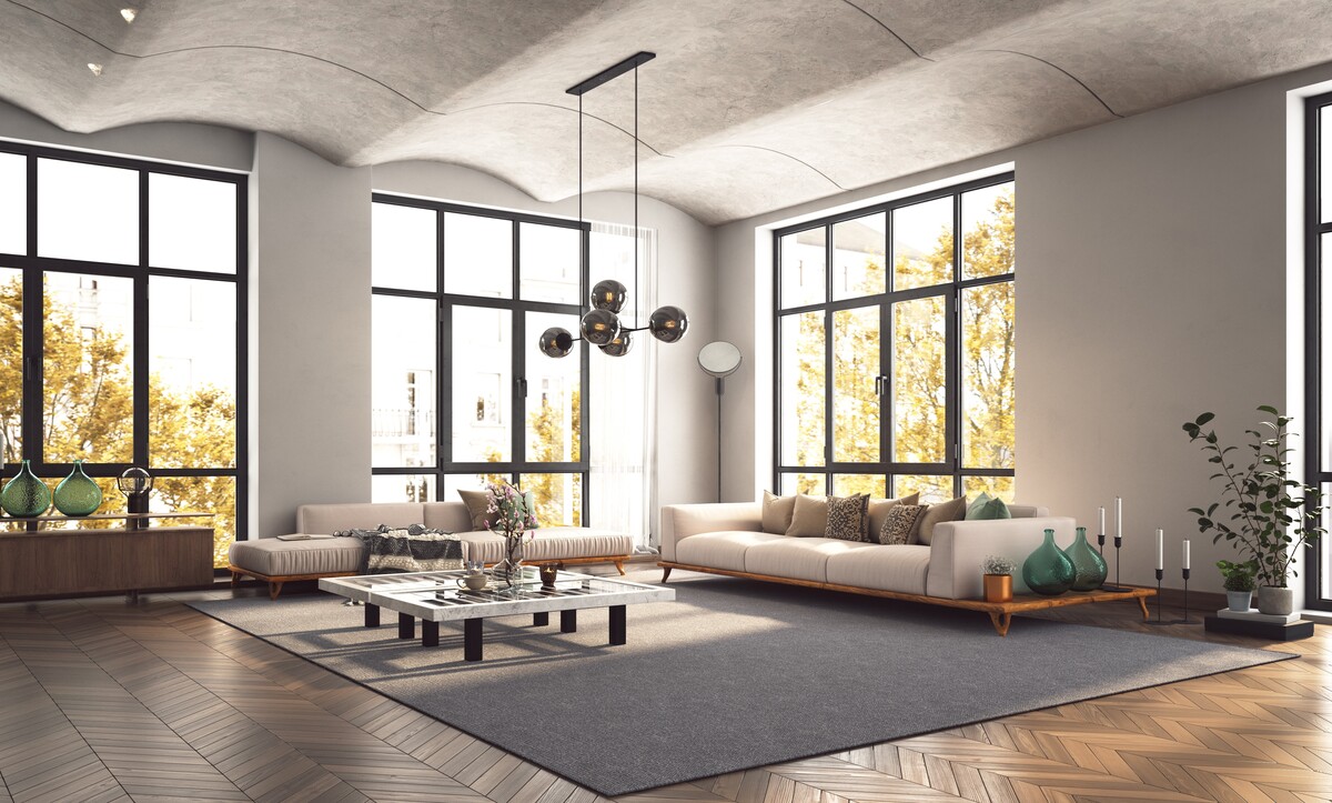
17. Building the room around a fire opening
The plaster-hearth room with the olive velvet sofa and the walnut study nook makes its case simply: a square opening cut into a rendered chimney breast, a pendant hung low above it, and a desk tucked into the corner. Choosing a hearth over a panel is a legitimate design decision, and what is happening in contemporary fireplace design makes the case better than any argument about furniture. Keep the opening square and unframed, and give it 90 centimetres of clear render either side so the wall stays quiet.
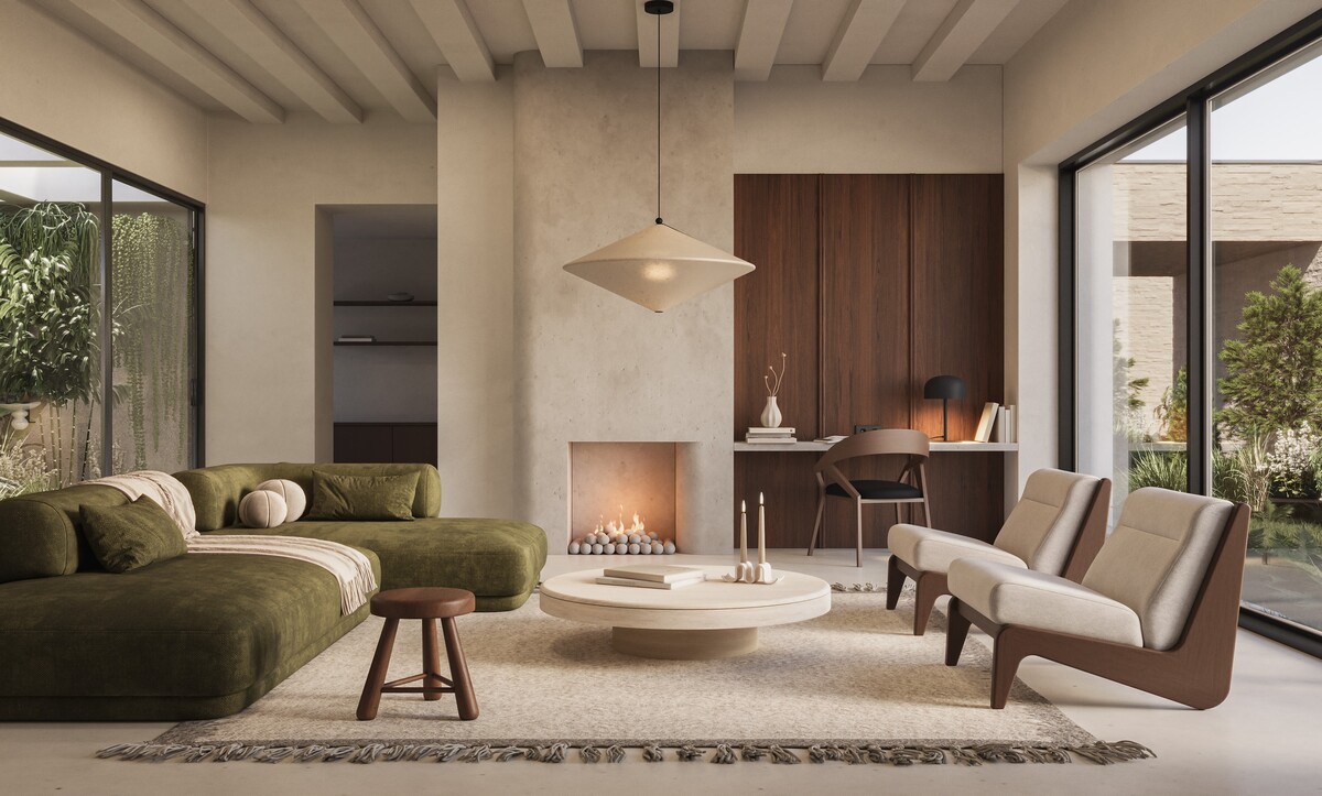
18. Cabling, ventilation and the details that decide the result
Run a 50 millimetre conduit from the screen position down to the cabinet before plastering, and put the socket inside the recess rather than beside it. Any equipment behind a closed door needs 5 centimetres of clear air above it and a ventilated back panel. Soundbars want a shelf 10 centimetres deeper than the bar itself so the front face is not swallowed by the joinery return. Small things, all of them, and they are the difference between joinery that looks fitted and joinery that looks added.
19. Bringing the wall and the room together
A media wall only reads well when the seating agrees with it — the sofa square to the panel, the rug carrying the group, the surface materials picked up somewhere else in the room. Our piece on choosing a frame and depth for the main seat covers the half of the equation that faces the wall, and the surface layering that keeps a monochrome room from flattening covers everything in between.
Planning a living room or a full villa interior? Algedra works across interior design, architecture and landscape from a single studio, with projects in Istanbul, Dubai, Doha, Riyadh and the wider Gulf. Talk to our team about your space, or look through our approach to the main sitting room to see how the joinery, lighting and seating get drawn together.