

Cold minimalism asked people to live in a gallery. Warm minimalist interior design keeps the discipline and gives back the comfort: oak with the grain showing, stone chosen for the colour it already is, and light warm enough to read by at midnight. Our designers set out the palette room by room, with the measurements behind each decision.
Stand in the doorway of a room you find restful and count the materials in it. There will be three, perhaps four. A timber, a stone, a textile, and a metal holding it all together. The rooms that exhaust people are rarely the busy ones: they are the ones carrying seven materials that never agreed to sit together.
That counting exercise is where our designers begin every warm minimalist scheme, and it explains why the look has outlasted the cold minimalism that came before it. The white box with the concrete floor asked people to live in a gallery and put nothing down. What replaced it keeps the discipline and returns the comfort: oak with the grain still showing, stone chosen for the colour it already is, wool underfoot, and lighting warm enough to read by at midnight. What follows is the palette as we specify it, room by room, with the measurements and material calls that decide whether a scheme like this reads as serene or merely beige.
The Entrance Built as One Piece of Joinery
Most halls are a corridor with a shoe pile at one end. We treat the entrance as a single commission instead: a full-height oak wardrobe, a recessed bench beside it, one long bronze pull running the height of the doors, and a drawer underneath deep enough for everyday shoes. The whole run sits flush with the adjoining wall so the hall keeps its line and the eye reads one clean plane.
The measurements matter more here than almost anywhere. We hold the bench at 450 mm seat height and 400 mm deep, comfortable for putting shoes on and shallow enough to leave 900 mm of clear passage in front of it. Veneer runs vertically across the doors from a single flitch so the grain continues through the composition, and a warm downlight over the recess with one framed piece inside it finishes the arrival.
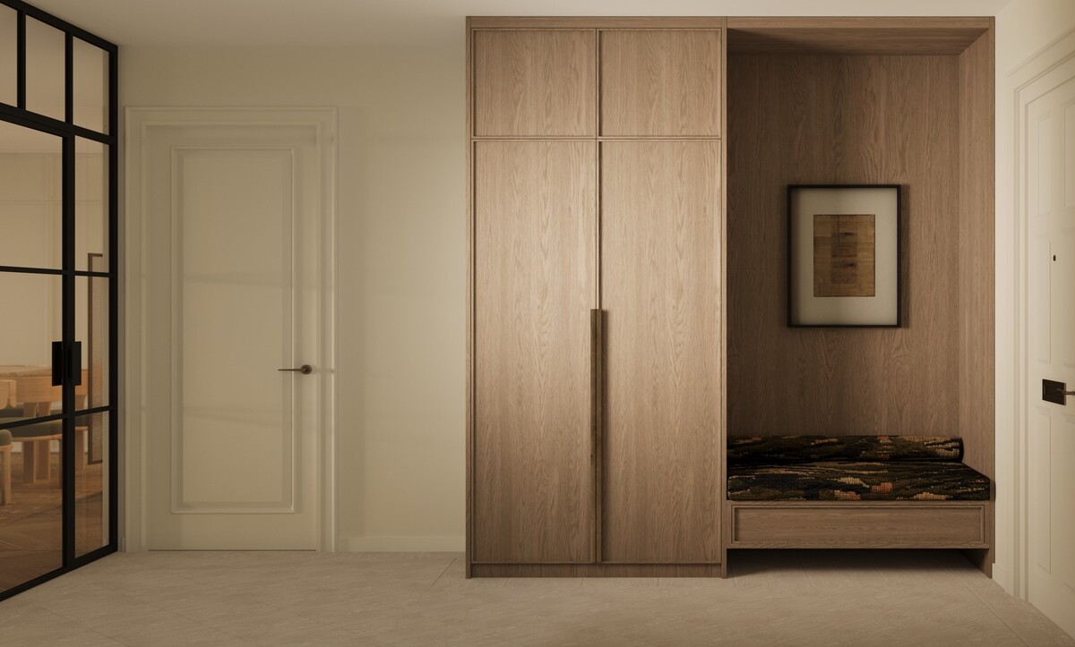
A full-height oak wardrobe with an integrated bench, deep drawer, long bronze pull and a framed artwork lit inside the recess.
One Dramatic Stone and Quiet Cabinetry in the Kitchen
A kitchen in this palette takes its colour from a single material and leaves everything else alone. Green quartzite running from the worktop up the full wall behind the hob gives a room of plain oak doors all the drama it needs, and no painted surface is required anywhere in it.
Quartzite rewards the choice technically as well as visually. It resists acid and heat far better than marble, which matters immediately beside a hob, and the green varieties hold their depth under warm light where a cool grey would flatten by evening. We reserve sequential slabs so the veining continues across every join, mitre the external corners at 45 degrees so no substrate edge shows, and seal on installation and annually after.
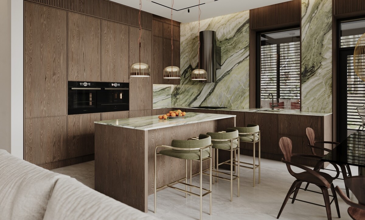
Green quartzite runs from the worktop to a full-height splashback behind the hob, set against quiet oak cabinetry and a dark ceiling.
Pendant Lighting Scaled to the Furniture
Undersized fittings are the most common error we correct in kitchens. Against cabinetry 650 mm deep and two metres tall, a small pendant simply disappears and the island loses its centre. We size them as furniture: 450 to 550 mm in diameter above an island, hung 750 to 800 mm above the worktop so the light falls on hands and clears the eye line.
Hand-blown glass and woven rattan both belong in this palette, and a slight stagger in height across a run of three keeps the line alive. Whatever the shade, the cable or rod finish should appear elsewhere in the room, on a tap, a handle or a shelf bracket, so the fitting reads as part of the scheme.
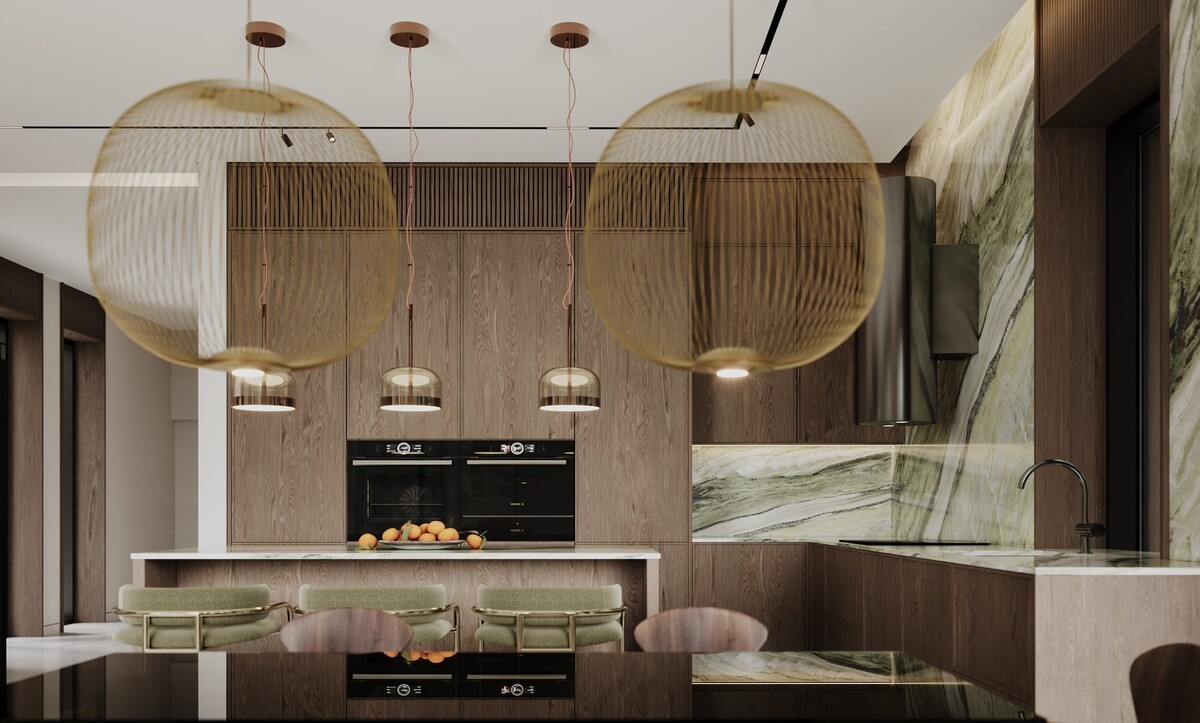
Large woven and glass pendants hang low over a stone island in a kitchen of dark timber and brushed metal.
Zoning an Open Plan With Light and Material
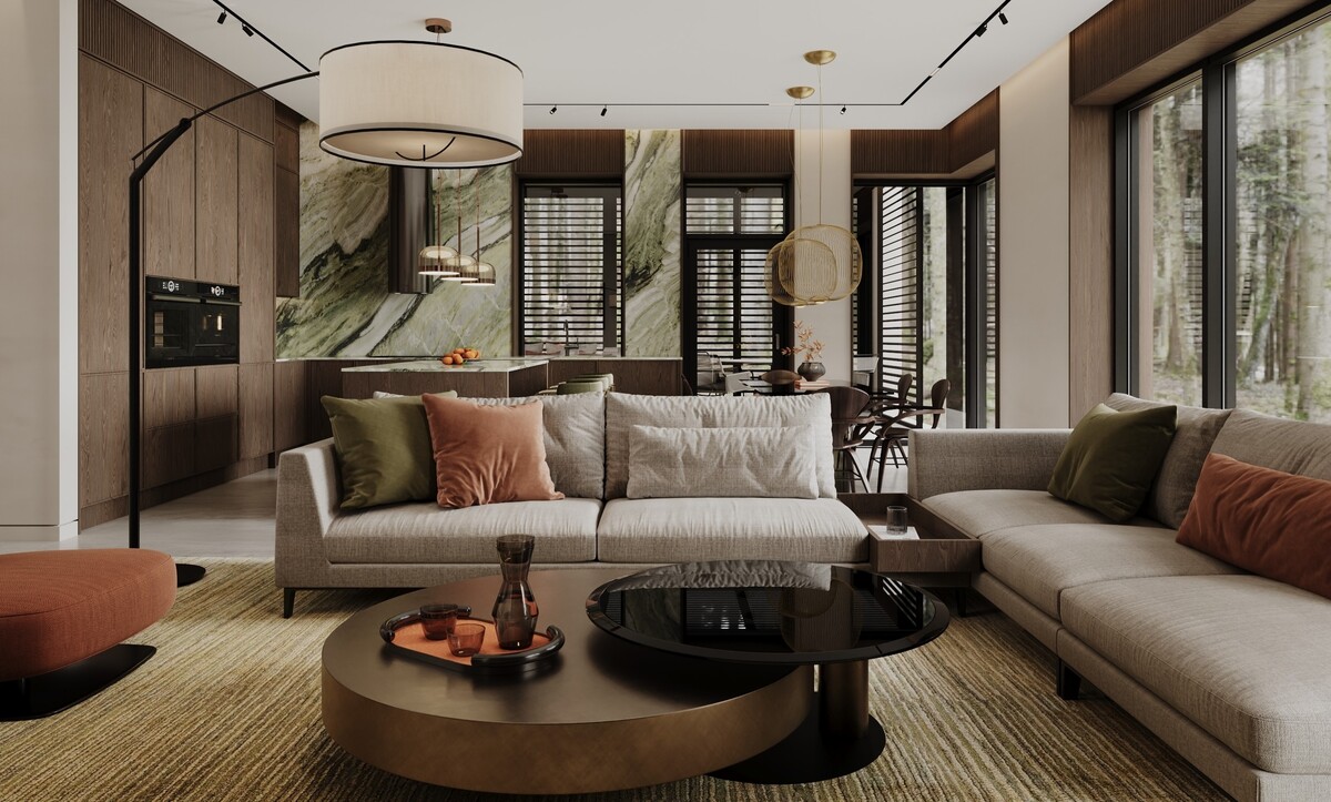
Kitchen, dining and seating sharing one volume take their separation from light and material, which costs no floor area at all. We draw it overhead and underfoot: a track line running the length of the ceiling, a different pendant character above each zone, and a rug sized to carry every leg of the seating group.
Flooring runs continuously through all three, which is what keeps a modest footprint reading as one generous room. The circulation figure worth holding is 1100 mm between an island edge and dining chairs when pulled out, below which the two zones compete every time someone stands up. Each zone takes its own circuit and its own dimmer.
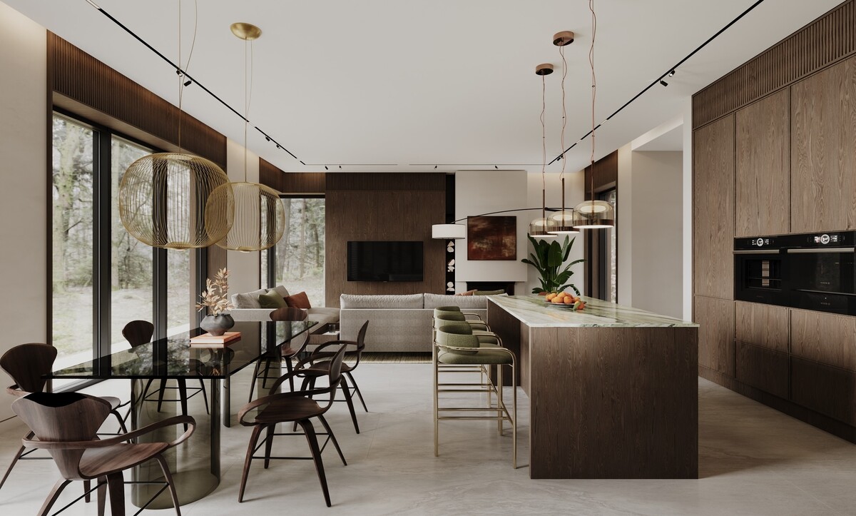
An open-plan kitchen, dining table and seating group share one volume, separated by a ceiling track, three pendant types and a single rug.
Muted Colour Carried in Textiles, Where It Can Change
Our designers put colour into the things that can be replaced in an afternoon and keep it out of the things that cannot. A neutral shell of plaster, oak and stone takes olive, rust and clay through cushions, throws and a rug, and the room can shift register in a season with no contractor on site.
Three tones is the working limit, each repeated at least twice at different heights so the palette reads as a decision. Natural fibres hold their colour considerably longer than synthetics under strong daylight, which matters in a scheme this dependent on tone. More living rooms built on this principle run through our feature on interiors held to a quiet, material-led palette.
A sand-coloured sofa is layered with olive, rust and clay cushions against pale plaster and oak flooring.
Children's Rooms Held to the Same Rules
Parents often assume a child's room has to break the palette. It gains from the same restraint, provided the discipline leaves room for the child's own colour to land somewhere. Soft sage joinery, a round upholstered nook cut into the wardrobe wall, a single line drawing on plaster and furniture scaled to a small person give a room that grows with its occupant.
We specify washable matt emulsion throughout, round every exposed joinery edge to a 3 mm radius, and size the reading nook opening between 600 and 700 mm with upholstered sides. Low open storage does more for tidiness than any amount of instruction, because a four-year-old will put a book on a shelf they can reach and nowhere else.
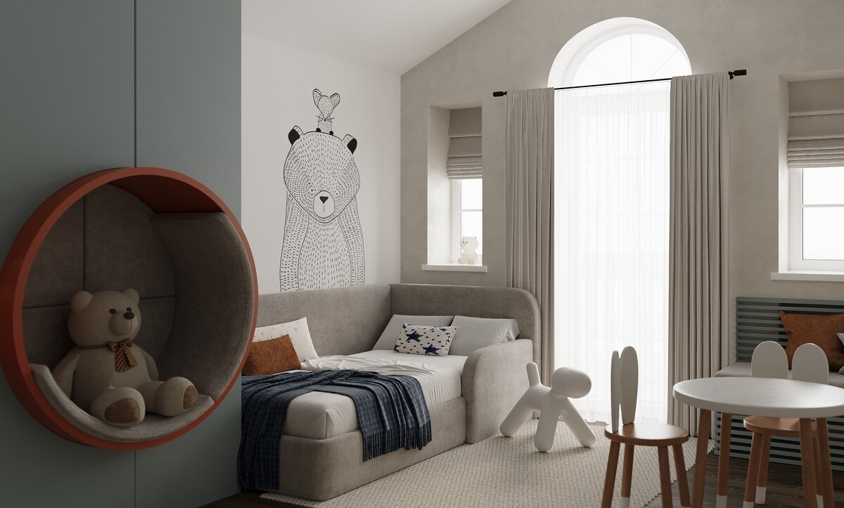
A child's room in soft sage joinery with a round upholstered reading nook, a line drawing on plaster and small-scale furniture.
Terracotta Against Cream in a Minimalist Bedroom
A rust velvet headboard, two framed photographs and a pair of slim pendants are the entire scheme in this bedroom, and the room is better for the restraint. Velvet in a terracotta tone warms a north-facing room measurably, and a stain-treated pile survives the nightly contact a headboard takes.
Pendants hang 600 mm above the nightstand surface, centred on the table itself, which keeps the bedside clear for a book and a glass of water. Artwork stays within the width of the bed so the wall reads as one composition. Where a client wants a softer version, we move the colour into the bed linen and leave the headboard in natural linen.
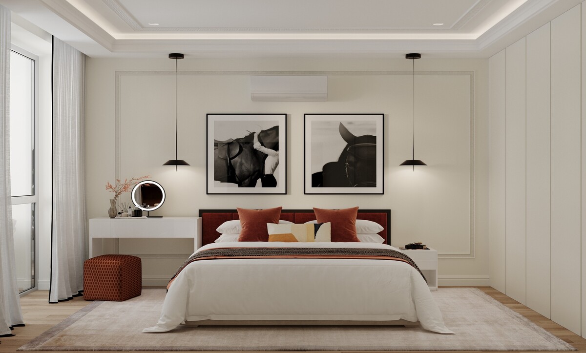
A cream bedroom with a rust velvet headboard, two framed photographs and slim black pendants hung over the nightstands.
Furnishing Around a Sculptural Staircase
A curved plaster flight is the most generous thing a room can be given, and the correct response is to furnish quietly beneath it. Low seating in boucle, layered rugs, a carved timber table and two wall lights are enough; anything more argues with the shape.
We light the curve from below with a recessed floor wash so the plaster keeps its shadow after dark, and leave the opposite wall entirely clear. The instinct to hang something there is strong and worth resisting, because the staircase needs the empty wall to be read against.
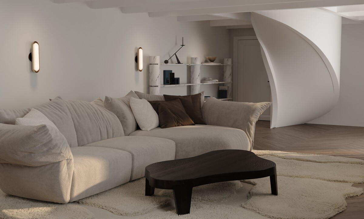
A curved plaster staircase rises behind a boucle sofa, layered rugs and a carved timber table lit by two slim wall lights.
Deep Tones in Small Dining Rooms
Clients hesitate before taking a small dining corner dark, and the result almost always proves the hesitation wrong. Taupe cabinetry with a black pedestal table and four rust armchairs makes a modest corner feel deliberate, where pale paint would leave it looking unfinished.
The finish decides it: matt absorbs light evenly and lets the colour stay soft, while anything with sheen shows every undulation in the wall. A round table at 1100 mm seats four comfortably in this footprint, and a pedestal base removes the leg clash that makes small dining rooms awkward. Brass chair legs lift the arrangement and stop the scheme going heavy.
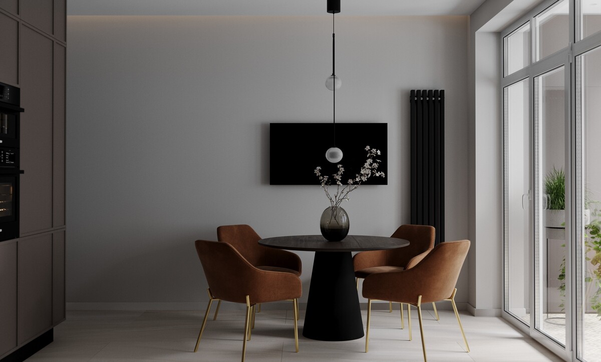
A compact dining corner with taupe cabinetry, a black pedestal table, rust velvet armchairs and a single globe pendant.
Fluted Joinery and a Burnished Splashback
Vertical fluting across upper cabinetry gives a small kitchen depth with no pattern at all, and a warm strip lighting it from below turns a working surface into the most atmospheric part of the room after dark.
Ribs machined at 25 mm centres read as texture from across a room and stay fine enough to clean easily. The practical bonus is that fluting disguises the joint lines between doors, which is why it suits a long uninterrupted run better than flat fronts do. For the splashback, lacquered bronze or oxidised steel sealed against heat gives a warmth no tile delivers.
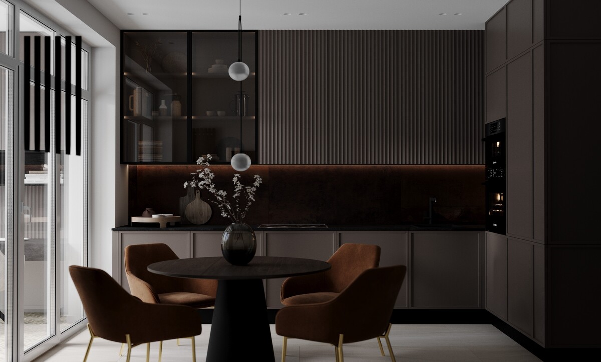
Ribbed upper cabinetry lit from below sits above a burnished metal splashback and a dark stone worktop.
A Slim Metal Screen in Place of a Partition Wall
Apartments where a solid wall would darken half the plan are the natural home for a fin screen. Painted metal verticals between kitchen and seating divide the two functions, carry the eye upward and let every bit of borrowed light through.
We space the fins at 120 to 150 mm, fix them top and bottom into structure, never plasterboard, and match the colour to the adjoining cabinetry so the screen belongs to the kitchen. Powder-coated steel at 20 mm stays rigid across a two-metre span while reading slim enough to stay graphic. Our designers return to this move often, and more of the thinking behind it appears in our round-up of the apartment interiors our design team keeps coming back to.
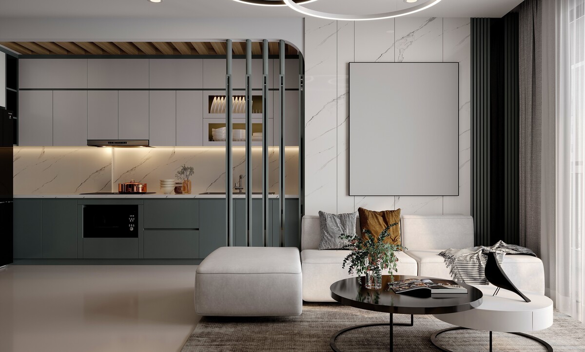
Painted metal fins divide a kitchen from a seating area, screening the two functions while letting daylight through.
Marble and Oak Together in the Bathroom
All-stone bathrooms photograph beautifully and feel cold to stand in. Bringing oak alongside the marble, as a tall storage run, a vanity base or a bench, solves that without losing any of the material quality.
We set mirror lighting at 2700K because skin reads badly under anything cooler, hold the vanity 850 mm off the floor, and carry the floor stone up the shower wall so the room reads as one continuous surface. A shadow gap beneath the vanity with a low-level strip makes the unit float and doubles as night lighting, which is the detail clients mention most often after moving in.
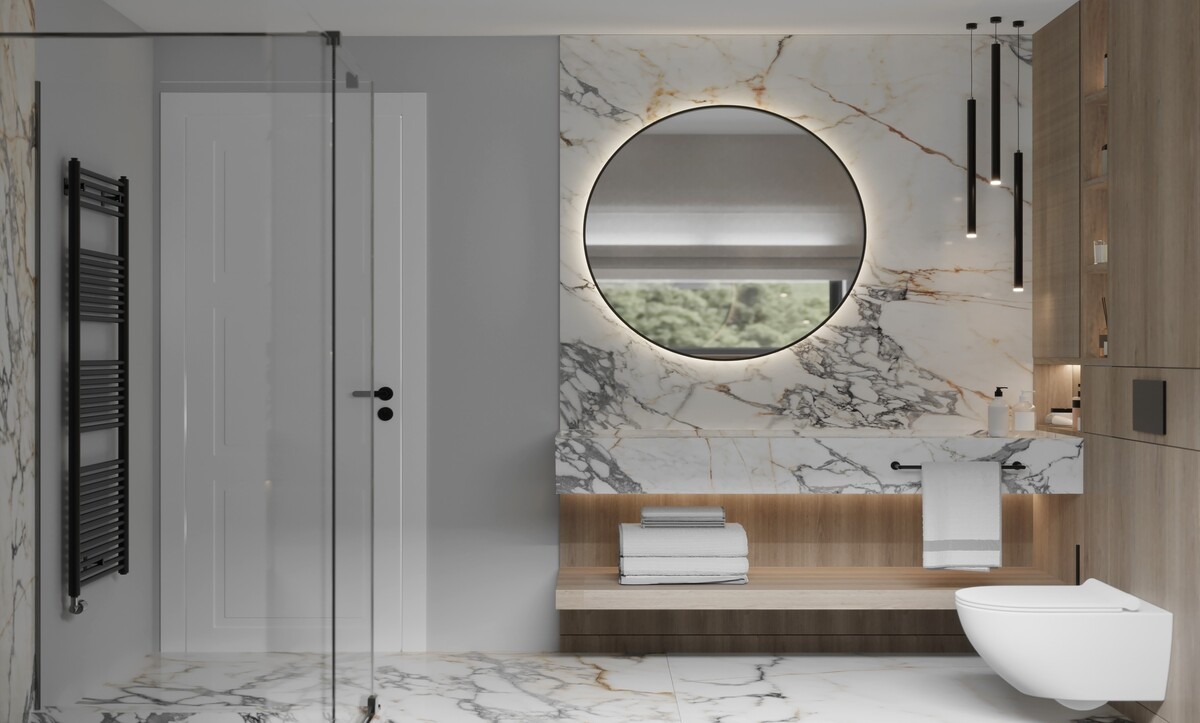
A veined marble wall sits behind a floating vanity, a backlit round mirror and a tall run of oak joinery.
Fluted Timber in a Wet Room, Specified Properly
Floor-to-ceiling fluted oak behind a stone basin and a freestanding tub produces the softest bathroom in this palette, and it is also the one most often specified badly. Standard veneer in a wet room will delaminate inside two years.
The specification is marine-grade veneer or thermally modified timber with a UV-stable lacquer, ventilation at six air changes per hour, and the timber held 100 mm clear of any direct splash zone. Get those three right and the finish lasts. Brushed brass tapware and a basin carved from a single block complete a room built from three materials and nothing else.
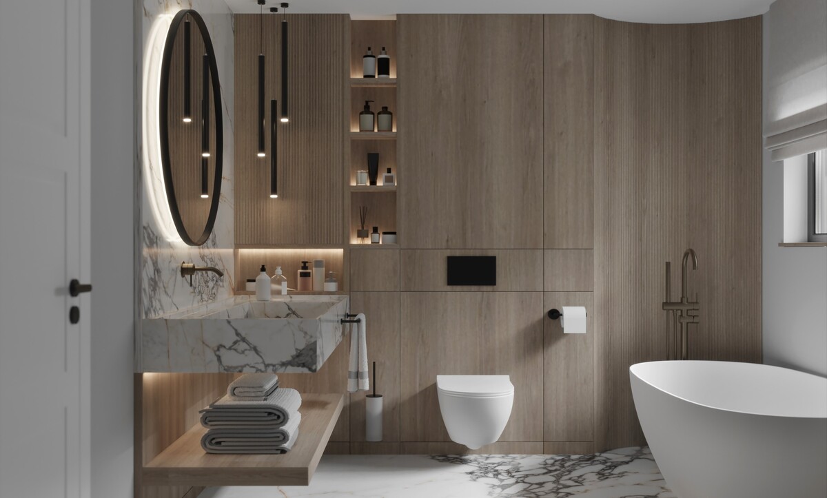
A wet room clad floor to ceiling in fluted oak, with a carved stone basin, freestanding tub and brushed brass tapware.
One Stone, One Timber, One Light
This kitchen is the whole argument in a single elevation. Grey marble above, dark walnut below, one linear pendant between them, and the palette is closed. Nothing else is needed and nothing else would help.
We run a linear fitting at roughly two thirds of the island length and dim it to around forty per cent for evenings. A honed finish on the stone keeps reflections soft in a room with strong side light, where a polish would throw glare across the worktop by mid-afternoon. Open timber shelving above gives the eye somewhere to rest between two heavy materials.
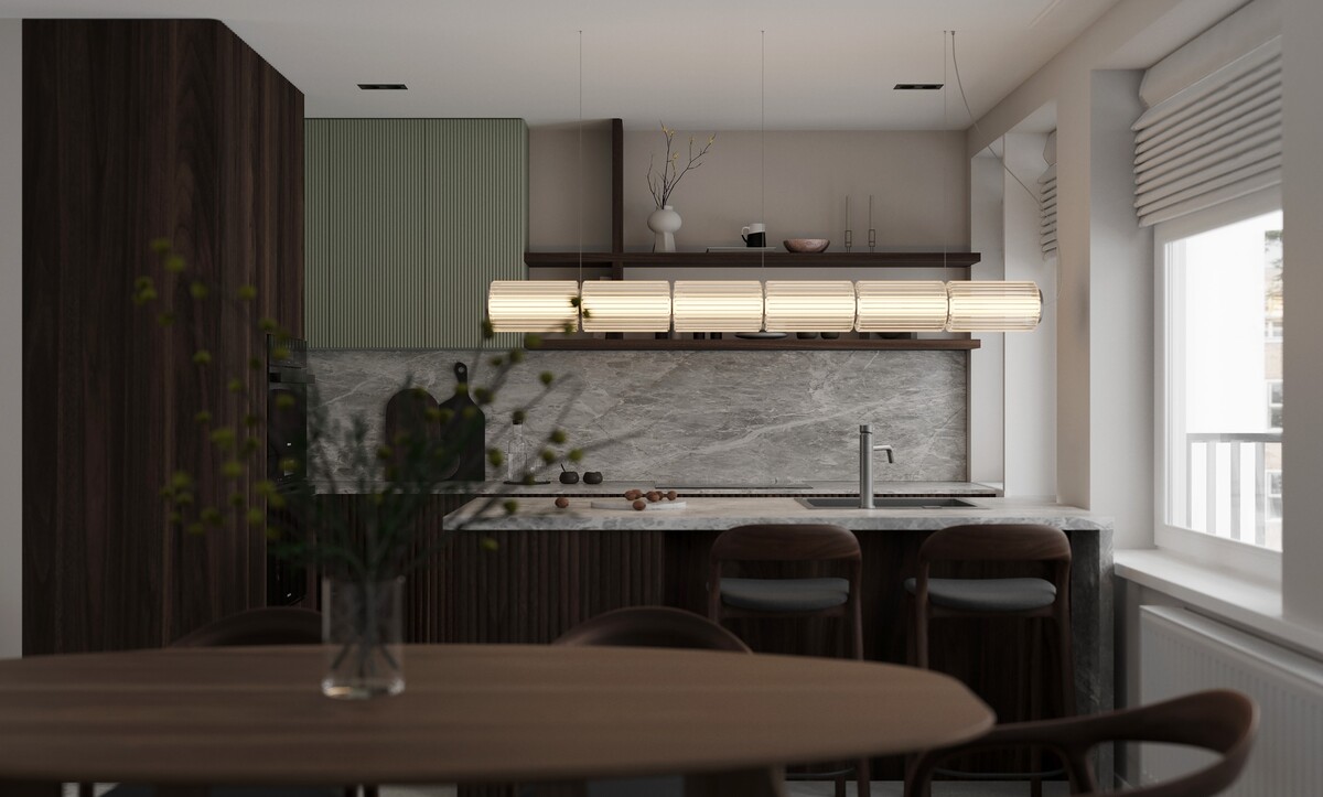
A grey marble splashback runs behind a dark walnut kitchen, lit by a single long linear pendant above the island.
Concealed Storage Behind a Single Plane
The reason warm minimalist rooms stay calm comes down to storage more than taste. A full-height run of handleless cabinetry in warm white, broken by one marble inlay panel and a row of small lit niches, absorbs everything a living room accumulates and presents one surface to the room.
Push-to-open gear keeps the face uninterrupted, and a 20 mm shadow gap at floor and ceiling stops the run reading as a wardrobe. Lit niches at 300 by 300 mm, spaced evenly along the lower band, give the plane its rhythm and somewhere for objects to live in the open. Planning storage at this scale belongs in the first week of a project, and our villa interior design service begins with exactly that inventory.
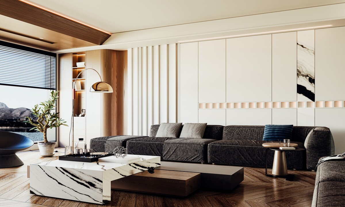
A full-height run of handleless warm white cabinetry is broken by a marble inlay panel and a row of small lit niches.
The Case for One Sculptural Chair
In a room this quiet, one piece with genuine shape does the work a gallery wall would do elsewhere. A black curved lounge chair against pale plaster earns its place precisely because nothing around it competes for attention.
Float it 300 mm clear of the wall so the silhouette reads from every side, light it with a single directional spot, and keep every other seat in the room plain. Buying two sculptural chairs is the mistake here, because they cancel each other out.
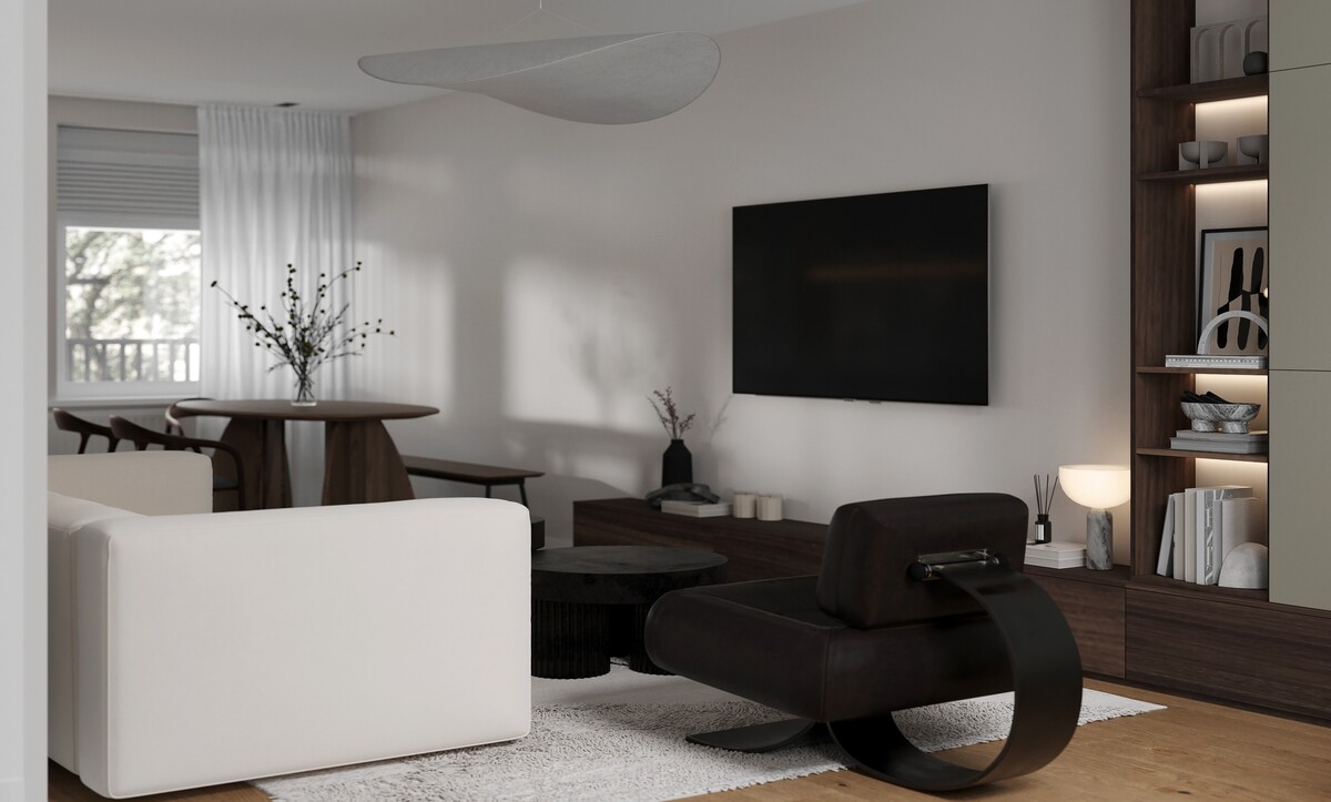
A single black curved lounge chair stands clear of a pale plaster wall above light oak flooring.
Light Scheme, Dark Scheme, One Apartment
A bright, airy kitchen and a deep, moody dining corner sit happily in the same home provided the materials underneath agree. We hold the joinery profile, the handle detail and the flooring constant, and let colour be the only variable between rooms.
Doing it the other way around, with the same colour and different detailing, produces a home that feels assembled from showrooms. The discipline behind that consistency is the subject of our guide to achieving quiet luxury in an apartment, and it applies as much to a two-bedroom flat as to a villa.
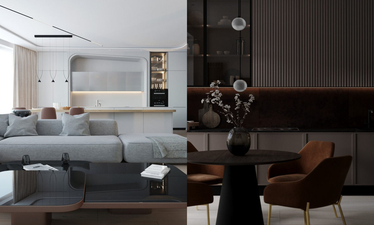
A pale, airy kitchen and a deep, moody dining corner belong to the same apartment through shared joinery and flooring details.
Travertine and Oak Through a Bedroom and Its Bathroom
Carrying one stone across two connected rooms turns two separate projects into a single suite. A carved travertine double basin on an oak base, and a bedroom beyond with open shelving, a fluted desk in rust and a single ring pendant, read as one idea continued through a doorway.
Travertine needs filling and a penetrating sealer in wet areas, and it suits unlacquered brass tapware, which develops a patina at roughly the same warmth as the stone. How far to carry a single palette before it begins to tire is a judgement we make on every project, and our guide to choosing a design direction for a whole house sets out where we draw the line.
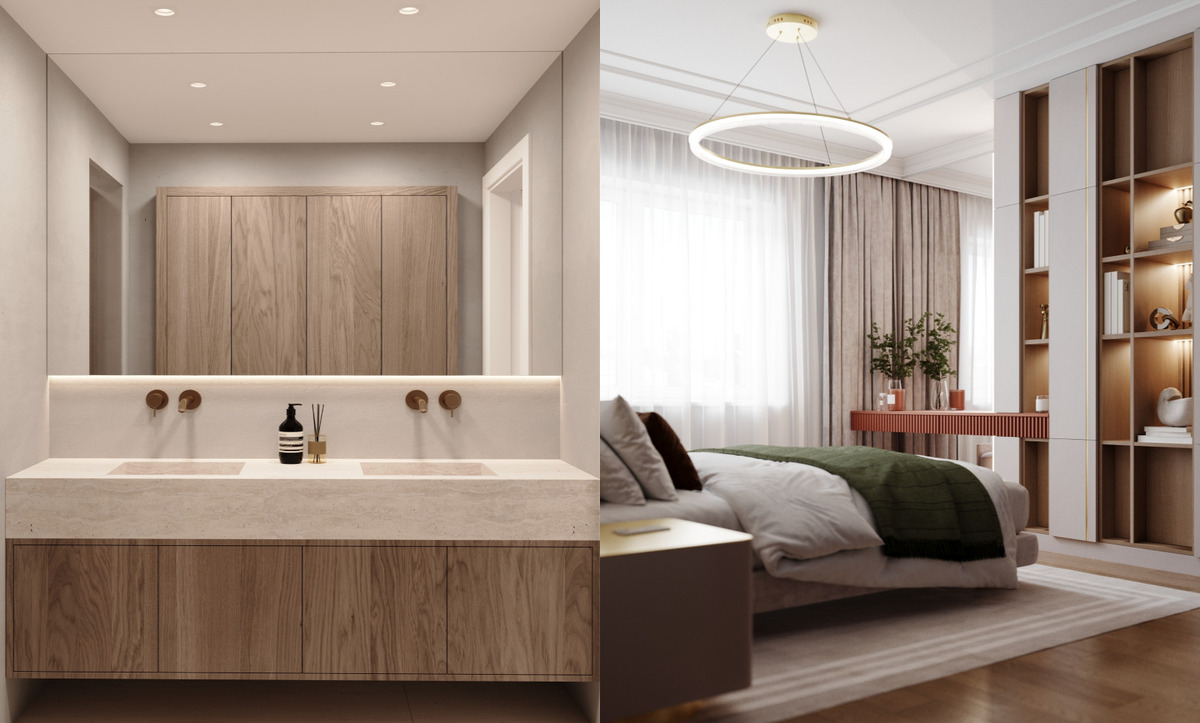
A carved travertine double basin sits on an oak base, with a bedroom beyond holding a fluted rust desk and a ring pendant.
Where Classical Detailing Meets a Warm Minimalist Palette
Panelled walls and warm minimalism are often treated as opposites, and they sit together comfortably when the mouldings stay restrained. A marble vanity beneath framed photography, or a dark-stained timber bedroom with an oxblood leather chair and a lit display bay, shows the palette absorbing traditional detail without strain.
Keep mouldings shallow at 12 to 15 mm and paint them in the wall colour so the relief appears only as shadow. That single rule is what lets a calm house make room for one richer, darker room. For context on how this sits against the wider market, our survey of the material directions shaping interiors now is worth reading alongside.
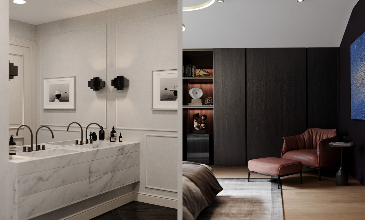
A marble vanity sits beneath framed photography on panelled walls, beside a dark timber bedroom with a leather armchair.
Build Your Home on Three Materials and One Light Temperature
Three materials per room, no more: one timber, one stone, one textile family, with a single metal running through all of them. Lighting warm and layered, with nothing above 3000K in a living space. Storage concealed behind one plane so surfaces stay clear. Colour carried in fabric, which changes in an afternoon, while the finishes stay as built.
Send us your floor plan, the rooms you want to start with and a few photographs of schemes you respond to. Fill out the contact form and one of our designers will come back with first thoughts on materials, lighting and storage, along with an honest budget range.
Warm Minimalism: Frequently Asked Questions
What is warm minimalism in interior design?
A minimalist discipline worked in warm natural materials. Surfaces stay clear and storage stays concealed, but the palette runs on oak, travertine, wool and brass at 2700 to 3000K, where cold minimalism relied on white paint, concrete and cool light.
How many materials should one room contain?
Three as a working rule: one timber, one stone, one textile family, with a single metal running through all of them. A fourth material needs a reason.
Does warm minimalism suit a family home?
Particularly well. Concealed storage, washable matt finishes and natural fibres handle daily use better than high-gloss or pale painted surfaces, and the colour lives in textiles that can be replaced cheaply.
What lighting temperature should I specify?
2700K in bedrooms and bathrooms, 2700 to 3000K in living and dining spaces, and nothing cooler anywhere people relax. Every circuit should dim.
Can warm minimalism work in a small apartment?
It suits small apartments better than large houses, because concealed storage and a tight palette are what make a compact plan feel generous.
Which stone works best for a kitchen worktop in this palette?
Quartzite for durability beside a hob, travertine and limestone for warmth where the surface takes less punishment, and large-format sintered panels where the budget needs the look at lower cost.
How do I stop a neutral scheme from looking bland?
Vary the texture and hold the colour steady. A fine fluted panel beside a broad flat one, a rough wool rug against honed stone, and a matt wall against a lacquered door give a single-tone room all the contrast it needs.