

Every room has a centre line, whether or not anyone drew it. Our designers explain how symmetry is set out on site, why paired furniture and axial lighting do so much of the work in a luxury interior, and the three moments when breaking the balance is the better decision.
Walk into a room and stop at the door. Before any single object registers, the eye has already found the centre line and checked whether the room agrees with it. A bed sitting 200 mm off the middle of its wall will nag at a visitor who could never explain why, and a chandelier hung to the centre of a ceiling above a table pushed toward a window will make an expensive dining room feel subtly wrong for as long as it stays that way.
Symmetry is the quietest tool our designers have, and the one clients notice least when it works. It costs nothing at the drawing stage and a great deal to correct once the joinery is fixed and the ceiling is closed. What follows is how we set it out in practice, room by room, together with the three situations where a balanced plan is the wrong answer and something looser serves the room better.
Setting Out the Room From Its Centre Line
Every elevation is drawn from the middle outward. We mark the centre of the main wall first, then set the media joinery, the fireplace opening and the stone ledge against that line, so each element lands equally on both sides. The herringbone flooring runs to the same axis, and the curtains stack symmetrically at either end of the glazing.
The figure to protect is the gap between the joinery and the side walls, which should match within 20 mm along the whole run. Where an existing room is out of square, and most are, we absorb the difference in a shadow gap at one end, which keeps the split off the visible elevation. One deliberately asymmetric object, in this case a green sculptural chair pulled forward of the fireplace, keeps the composition from reading as a showroom.
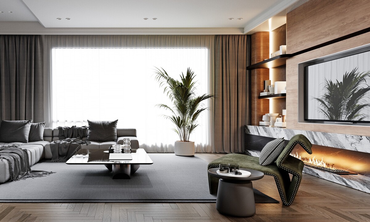
A grey sectional faces a timber media wall with a marble fire ledge, with one green sculptural chair breaking the symmetry.
Mirror Symmetry in a Narrow Dressing Corridor
Narrow rooms gain more from symmetry than generous ones, because a centred composition reads as width. Here a vanity sits on the centre line of the end wall with two identical upholstered stools beneath it, a run of pendants drops in a straight line above, and full-height mirror panels multiply the arrangement in both directions.
Mirror joints want planning as carefully as the furniture. We set the panel divisions to align with the vanity edges, hold the pendants 1500 mm above finished floor so they clear a seated head, and keep the fluted plinth to one side as the single asymmetric note. Specifying the stools as a matching pair is the decision that makes the corner look designed and not furnished.

A mirrored dressing corridor with a centred vanity, two matching stools, a line of black pendants and a white fluted plinth.
The Dining Room Axis: Table, Chandelier and Wall
A dining room is the easiest room to get right and the most obvious when it goes wrong. Table, chandelier and the feature behind the head of the table all belong on one axis, and the chairs pair off evenly along both sides.
We centre the linear chandelier on the table itself, which matters in any room where the table sits off the geometric middle. A large round clock hung on the same axis gives the far wall a centre of its own, and a micro-cement finish behind it keeps the backdrop quiet enough to carry something that bold. Hang the fixture 750 to 850 mm above the table surface and size it to roughly two thirds of the table length.
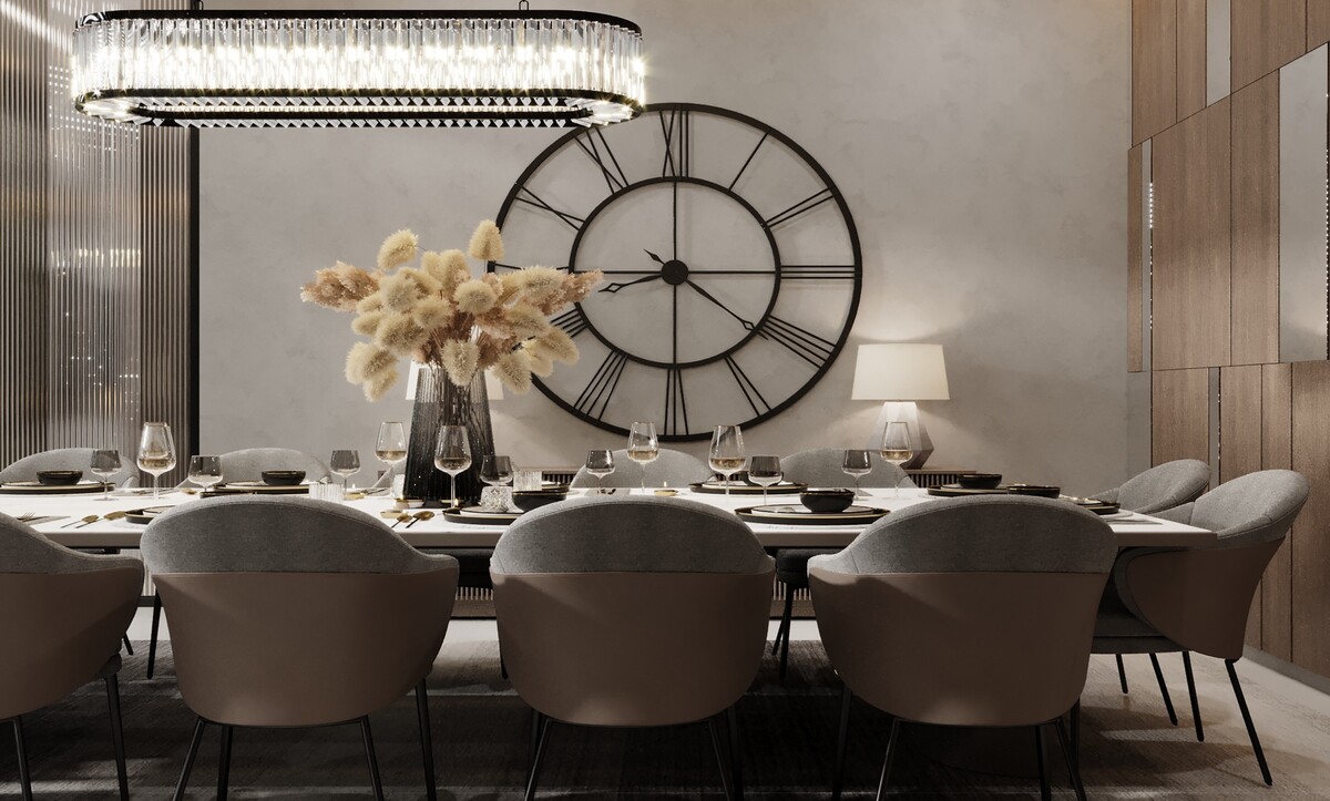
A long dining table under a linear crystal chandelier, with an oversized roman-numeral clock centred on a micro-cement wall.
Bilateral Balance Around a Media Wall
When the television is the thing a room points at, the surrounding joinery has to carry it symmetrically or the screen looks stuck on. A full-width white panel run with a concealed cove above and a low console below gives the screen an equal field on each side and absorbs it into the architecture.
The lighting does as much as the joinery. A continuous cove washing the ceiling keeps the brightness even across the elevation, which stops one end of the wall reading heavier than the other. Deciding what a room should be arranged around comes before any of this, and our guide to choosing a focal point covers that first decision.
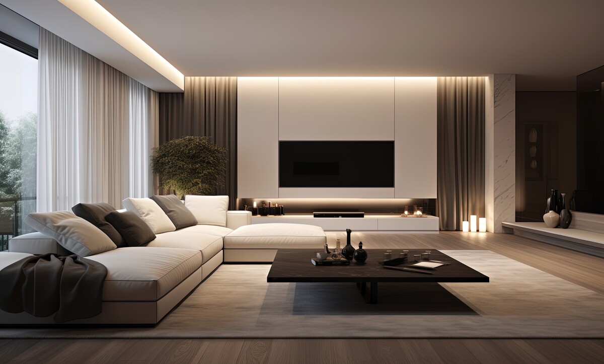
A cream sectional faces a full-width white media wall with concealed cove lighting and a low black coffee table.
Centring a Bed When the Wall Has Two Finishes
Bedrooms are where symmetry is broken most often by accident. Here the wall carries patterned wallpaper on one side and fluted panelling on the other, and the bed is centred on the junction between them, which makes a split wall read as one composition.
Matching nightstands and matching lamps are the cheapest symmetry available in any house, and we specify them as a pair in every scheme. A chandelier hung slightly wide of the centre is a deliberate exception that works because the bed itself holds the axis firmly.
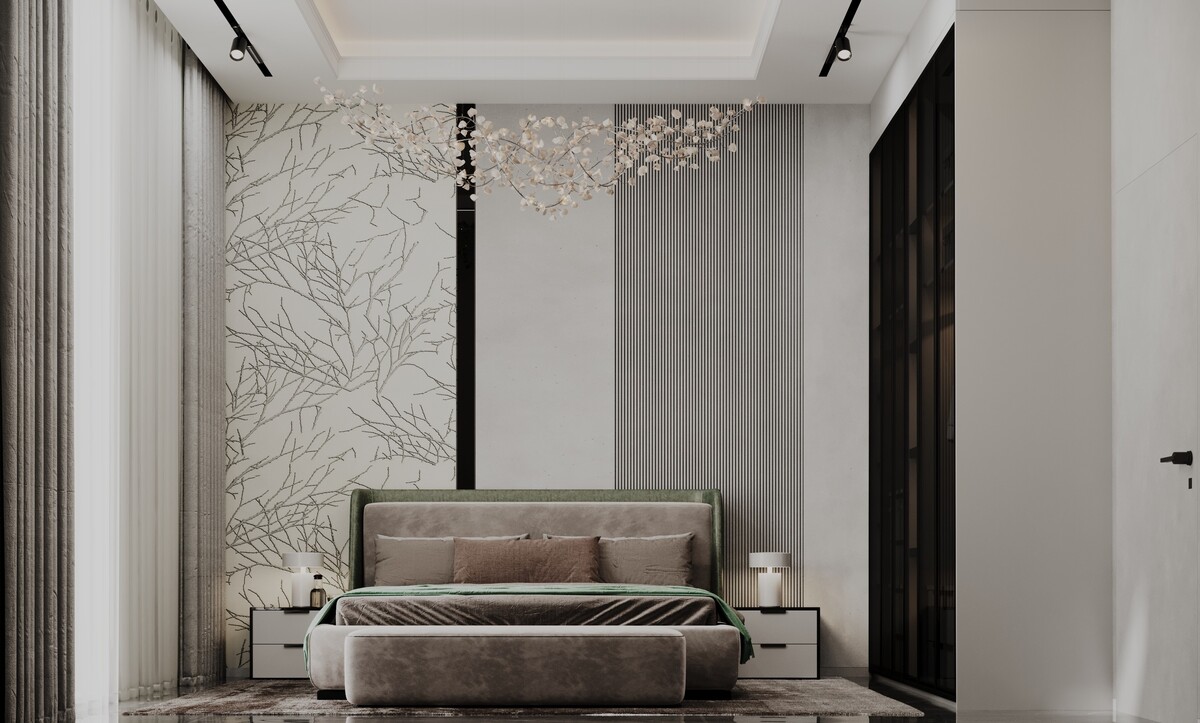
A green upholstered bed centred between branch-patterned wallpaper and fluted panelling, under a blossom chandelier.
Symmetry in Circulation: Halls, Stairs and a Home Lift
Transition spaces reward balance more than any other part of a house, because people pass through them quickly and read them as a single impression. Flanking a home lift with equal walnut panels, and setting a dark reveal to one side, turns a piece of equipment into a designed element.
Lift openings arrive with a structural tolerance that rarely matches the drawing, so we build the panelling as a frame around the finished opening, which avoids scribing it afterwards. The staircase opposite takes a run of small wall lights at equal spacing, which carries the rhythm through the hall and makes the two circulation routes feel like one idea.
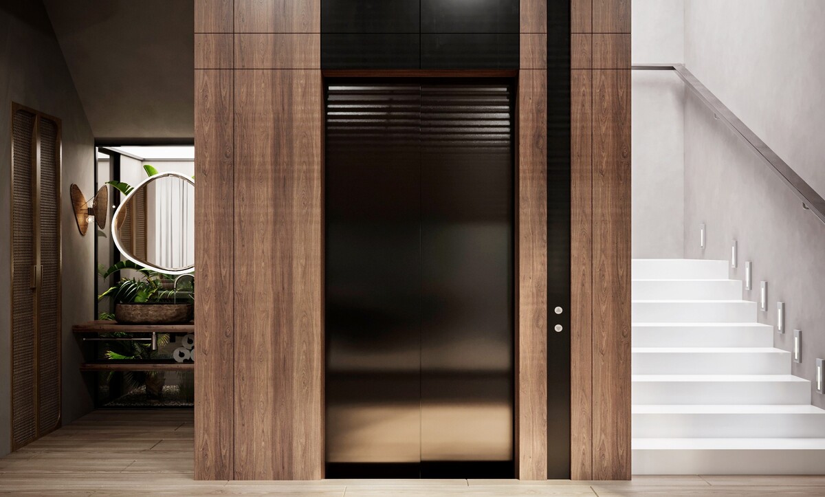
A home lift clad in walnut panels sits beside a white staircase lit by evenly spaced wall lights, with a planted corner opposite.
A Backlit Headboard Wall as the Axis of a Bedroom
Fluting lit from behind gives a bedroom wall a vertical rhythm that does the centring work on its own. The bed sits on the axis, the panelling runs the full width, and a single light strip behind the ribs grazes the surface so the texture reads after dark.
We set the strip 80 mm behind the panel face so no diode is visible from the bed, and run the fluting at 25 to 30 mm centres. One asymmetric object is enough to keep the room human, and a tall wavy floor mirror placed to one side does that here while bouncing daylight back across the room. More headboard wall treatments appear in our feature on bedroom design solutions.
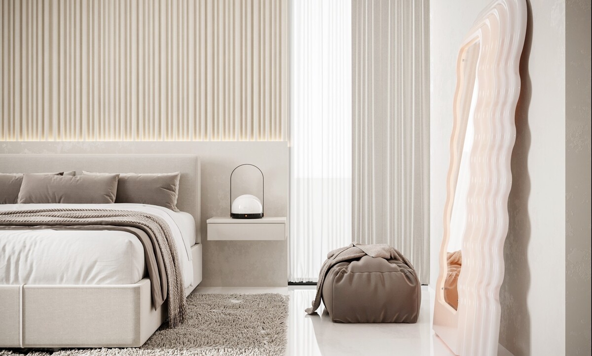
A beige bedroom with a backlit fluted headboard wall, a floating nightstand, a leather pouffe and a tall wavy floor mirror.
Asymmetric Balance in a Walk-In Closet
Small rooms with unequal functions call for balance by weight. A tall glazed wardrobe on one side carries most of the visual mass, and a slim lit vanity with a stool on the other balances it through brightness and fine detail at a smaller volume.
Reeded glass is the detail that makes this work, because it reads as a soft vertical texture and hides the contents without closing the room down. We light every hanging bay from the front edge at 2700 K and keep the vanity depth to 400 mm so the walkway stays clear.
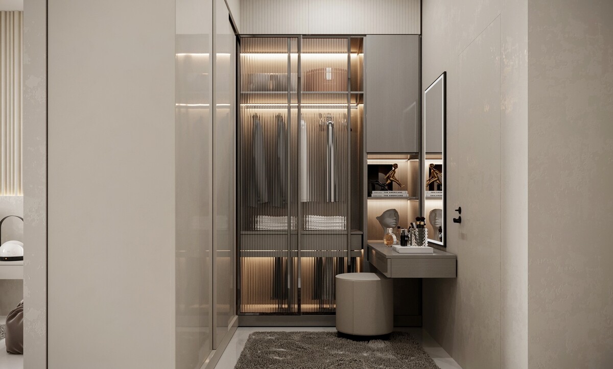
A walk-in closet with a tall reeded-glass wardrobe lit from within, a slim vanity, a round stool and a deep pile rug.
Small Utility Rooms, Centred Properly
Guest cloakrooms and kitchen bars are where symmetry pays off disproportionately, because the rooms are small enough for an error of 50 mm to be obvious. A basin centred in a lit marble niche, with the mirror and the niche sharing one axis, makes a tiny room feel considered.
In the kitchen alongside, two identical stools tuck under a stone counter at equal spacing, which is a better decision than three crowded along the same length. We allow 650 mm of counter per stool and centre the pair on the island, holding them clear of both ends.
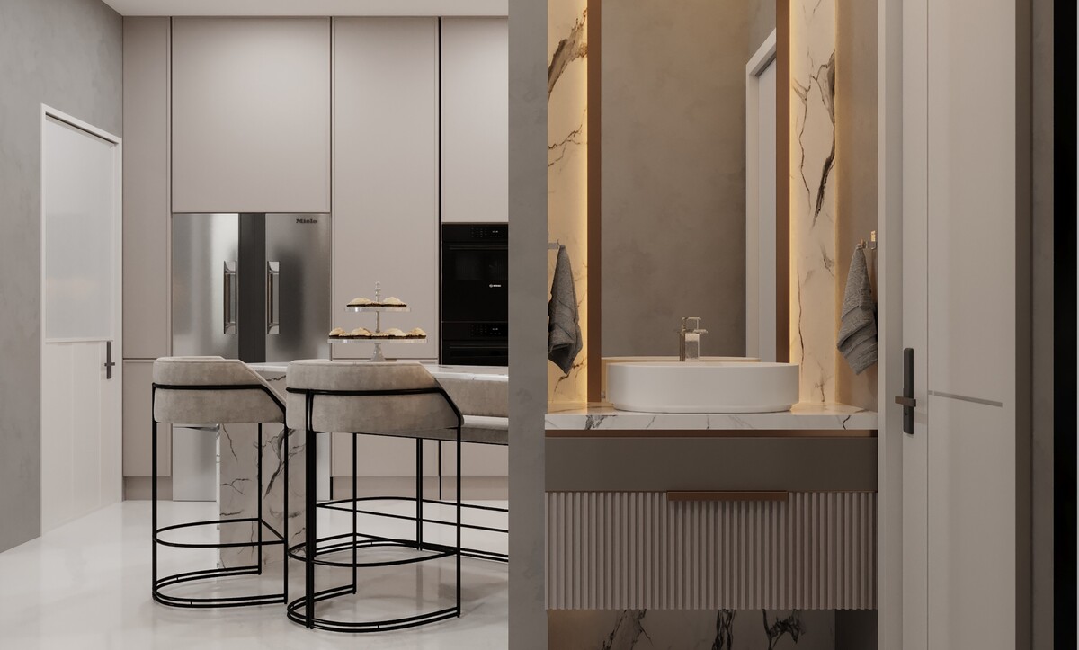
A pale kitchen with two matching bar stools at a stone counter, beside a guest cloakroom with a basin in a lit marble niche.
Balancing a Kitchen That Cannot Be Symmetrical
An L-shaped kitchen has no axis to work with, so the balance comes from the elevations. A continuous run of fluted cabinetry above, a book-matched stone splashback running the full length below it, and a marble waterfall bar placed to close the shorter leg give the room its order.
We align the top of the splashback with the underside of the upper cabinets along the whole run, which is the single detail that makes a fitted kitchen look resolved. Veining that continues from splashback to bar top ties the two legs together visually even though they differ in length.
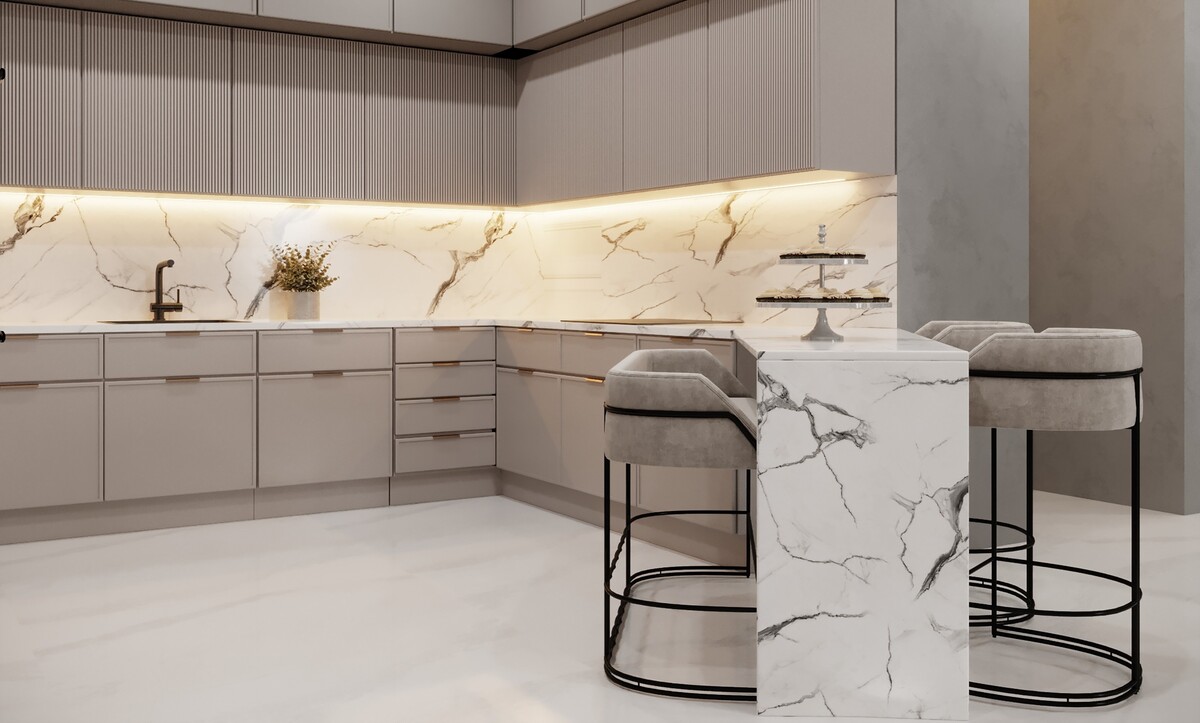
A kitchen with fluted taupe cabinetry, a book-matched Calacatta splashback and a marble waterfall breakfast bar.
Symmetry Within Clusters, Looseness Across the Room
Very large reception rooms fail when the whole plan is forced onto one axis. The better approach is several balanced groups arranged loosely against each other: a pair of armchairs facing a sofa here, a second seating group beyond, each internally symmetrical and none of them sharing a centre line.
Every group needs its own rug, its own low table and a clear route between it and the next. Distances are what hold a room of this size together, and our guide to living room layout ideas sets out the seating gaps and circulation widths worth protecting.
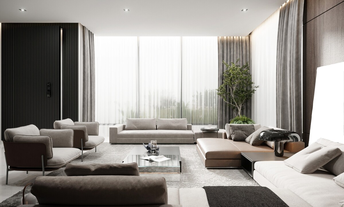
A large reception room with several seating groups arranged against a black slatted wall and full-height glazing.
The Mirrored Seating Plan
Two sofas facing each other across a low table, with a pair of armchairs closing one end, is the oldest symmetrical plan in the book and still the most sociable arrangement for conversation. A timber panelled wall behind, with a single centred artwork, gives the group its backdrop.
We hold 1800 to 2200 mm between facing sofa fronts, which is close enough for conversation at a normal voice and wide enough to pass through. Matching the armchair pair exactly, down to the leg finish, is what separates this arrangement from a collection of furniture that happens to face the same way.
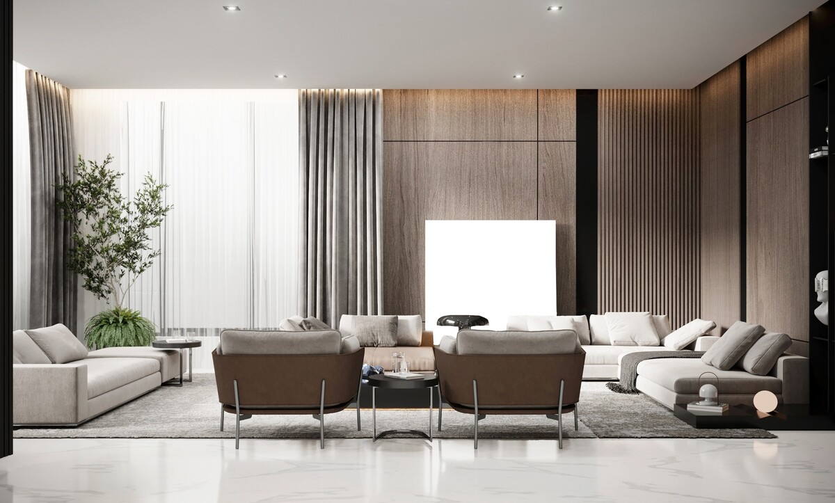
Two facing sofas and a matching pair of armchairs sit before a timber panelled wall with a single centred artwork.
Full Axial Symmetry in a Principal Bedroom
This is symmetry at its most complete: a marble headboard panel on the centre line, equal timber bays to either side, matching nightstands, matching pendant drops, a ring chandelier centred above the bed and track lighting running evenly along both sides of the ceiling.
A composition this strict depends on the stone being centred on its own veining as well as on the wall, so we mark the cutting line on the slab at selection. Ceilings carry a surprising amount of this balance, and our guide to ceiling design ideas covers the cove, track and fixture decisions that keep an elevation like this even.
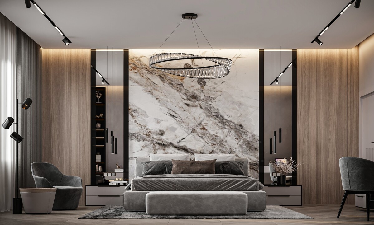
A bedroom with a marble headboard panel flanked by timber bays, matching nightstands and a ring chandelier centred above.
When Function Interrupts a Balanced Wall
Bedrooms with a sitting area rarely allow a perfect elevation, and forcing one produces an awkward room. Here slatted timber runs above a half-height plaster band across the full width, which gives the wall continuity, while the bed and the sofa sit beneath it at different positions.
The continuous material is what holds the room together where the furniture cannot. We keep the band height constant at around 1100 mm regardless of what sits in front of it, and let the burgundy cushions and throw repeat on both pieces so the two zones read as one scheme.
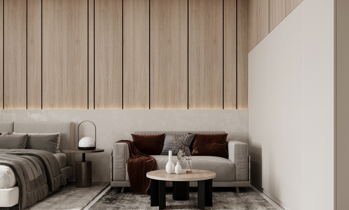
A bedroom with slatted timber above a half-height plaster band, a bed on one side and a sofa with burgundy cushions on the other.
The Rooms Where Symmetry Is the Wrong Answer
An open living space with a kitchenette along one wall has no business being symmetrical. A corner sofa pushed into the angle, a slatted timber wall running behind it and bar stools gathered at one end produce a room that works for the way it is used, and a forced central axis would waste half the floor.
Our rule is simple: symmetry for rooms people sit still in, looser balance for rooms people move through. Repeating one colour across the plan, as the blue cushions do here, is enough to hold an asymmetric arrangement together.
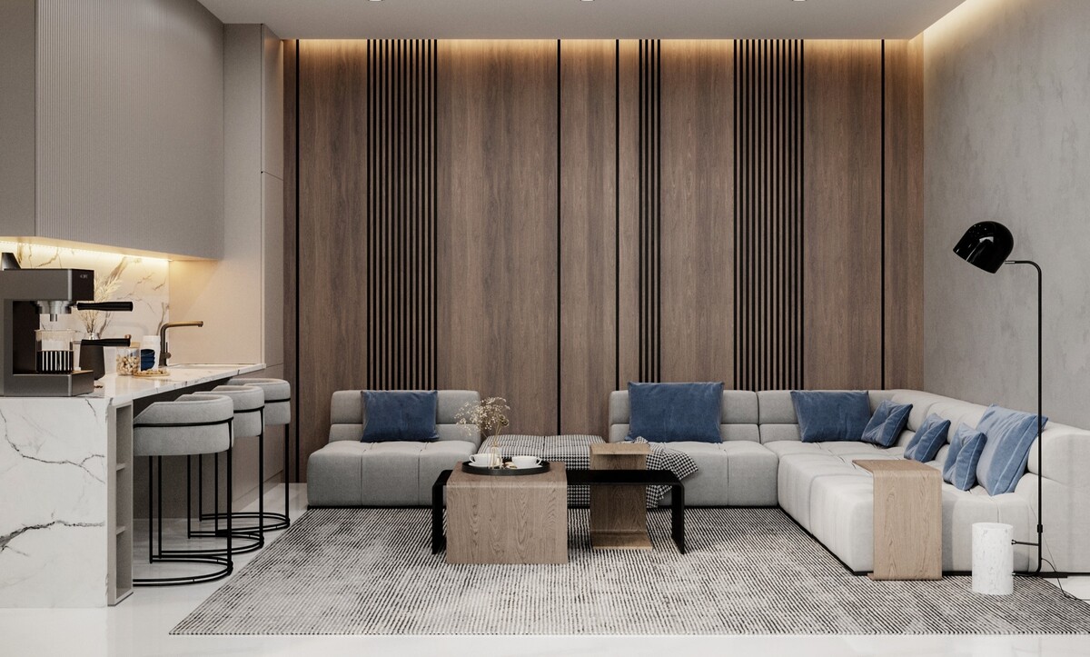
An open living area with a corner sofa against a dark slatted wall, blue cushions and bar stools at a marble counter.
Layering Symmetry at Three Heights
The most formal rooms set the balance up three times over: furniture at low level, a feature at eye level, and lighting above. A twelve-seat table pairs its chairs evenly, an oversized clock centres the plaster wall, and a crystal chandelier runs the length of the table overhead.
Mirror panels inset into the timber wall opposite repeat the rhythm without adding weight, and two matching table lamps on the console complete the pairing at a third height. Rooms built for hosting at this scale are the ones where the discipline is most worth the effort, and the way we plan them is set out on our bedroom and reception design service.
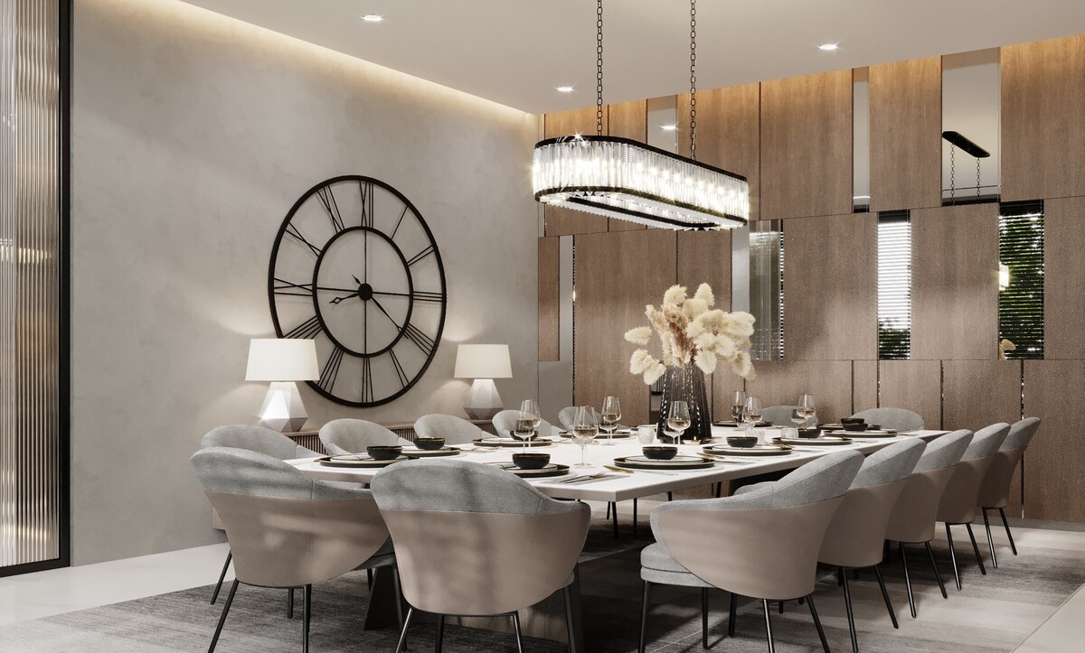
A twelve-seat dining room with a linear crystal chandelier, an oversized clock and a timber panelled wall inset with mirrors.
Draw the Centre Line Before You Buy Anything
Mark the centre of every principal wall on the floor plan, place the joinery and the lighting against those lines, and keep the paired elements genuinely paired. Rooms set out this way absorb new furniture for years without losing their composure, and the three exceptions above are worth making deliberately, with the reasoning written down.
Send us your floor plan and a few photographs of the rooms you want to start with. Fill out the contact form and one of our designers will come back with a layout, a lighting plan and an honest budget range.
Symmetry in Interior Design: Frequently Asked Questions
What does symmetry mean in interior design?
Arranging the elements of a room equally on either side of a centre line, so furniture, joinery and lighting share one axis. It is the oldest ordering device in interior design and the reason formal rooms feel calm.
Should every room be symmetrical?
No. Symmetry suits rooms people sit still in, such as bedrooms, dining rooms and formal reception rooms. Kitchens, open-plan living spaces and circulation areas usually work better with a looser balance.
What is asymmetrical balance?
Balance achieved by visual weight alone, for example a tall wardrobe on one side of a dressing room answered by a brightly lit vanity on the other. The two sides differ in form and match in presence.
How do I centre a bed when the wall is uneven?
Centre it on the dominant feature, such as a panel junction, a headboard wall or the window axis, and leave the raw wall width out of it. Absorb the difference in the joinery at one end.
Where should a chandelier hang over a dining table?
On the axis of the table itself, with the ceiling centre set aside, 750 to 850 mm above the surface, and sized to roughly two thirds of the table length.
How far apart should two facing sofas sit?
Between 1800 and 2200 mm front to front. Closer than that feels confined, and wider makes conversation across the gap uncomfortable.
Can symmetry make a room feel cold?
Only if it is left untouched. One deliberately asymmetric object, a sculptural chair, a floor mirror set to one side, or an off-centre pendant, keeps a balanced room from reading as a showroom.