Creating a productive and pleasant office environment requires choosing the right furniture and layout. However, one often overlooked aspect is the choice of colors. The colors used in your office can significantly influence the mood, productivity, and overall well-being of your employees.
Understanding color psychology and how different hues impact human behavior is crucial in designing a workspace that enhances creativity, efficiency, and positivity.
1- The Importance of Color Psychology in Office Design
Color psychology is the study of how colors affect human behavior and emotions. Different colors can evoke various psychological responses, which can either enhance or hinder productivity and well-being in the workplace. You can create an environment that supports the needs and goals of your business by strategically selecting colors.
2- The Psychological Impact of Colors
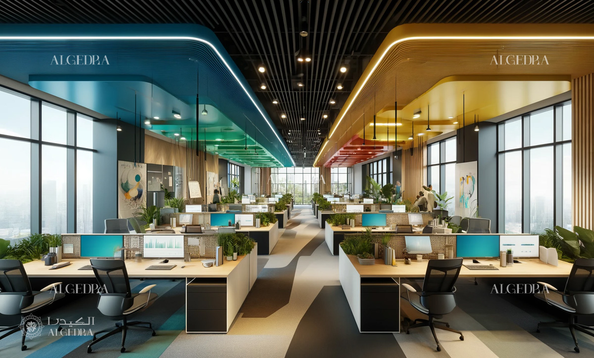
2.1. Blue - The Color of Calm and Focus
Blue is known for its calming and serene qualities. It can help reduce stress and anxiety, making it an excellent choice for high-pressure work environments. Blue also promotes focus and concentration, which can enhance productivity in tasks that require attention.
Light shades of blue can be used in meeting rooms and collaborative spaces, while darker blues are suitable for individual workstations.
2.2. Green - The Color of Balance and Harmony
Green is associated with nature and can create a refreshing and revitalizing atmosphere. It is easy on the eyes and can reduce fatigue, making it ideal for spaces where employees spend long hours. Green also promotes a sense of balance and calm, which can help in creating a harmonious work environment.
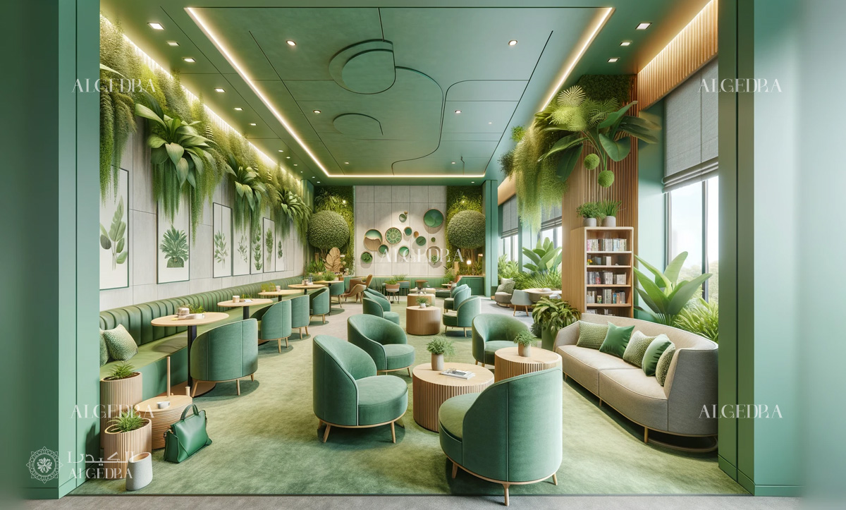
Consider using green in relaxation areas, break rooms, and spaces dedicated to brainstorming and creativity.
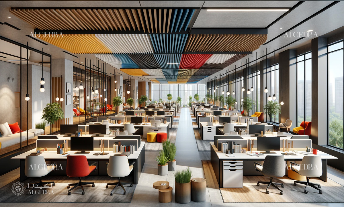
2.3. Yellow - The Color of Energy and Optimism
Yellow is a bright and energetic color that can stimulate mental activity and evoke feelings of happiness and optimism. It is perfect for areas where creativity and innovation are encouraged, such as design studios and brainstorming rooms.

However, yellow should be used sparingly as an accent color, as too much yellow can cause eye strain and agitation.
2.4. Red - The Color of Passion and Excitement
Red is a powerful and stimulating color that can increase energy levels and evoke strong emotions. It is ideal for areas where physical activity or high energy levels are required, such as gyms or sales floors. However, red should be used carefully, as it can also increase stress and aggression if overused.
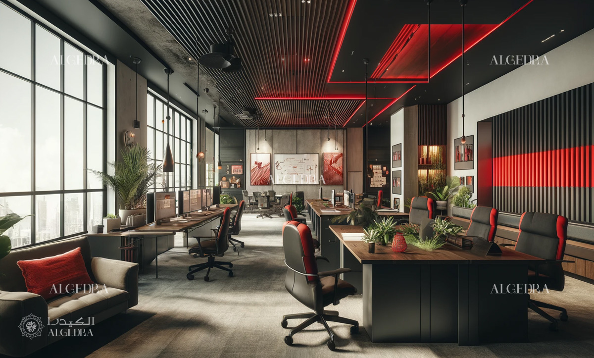
Consider using red as an accent color to add a touch of excitement and passion to your office.
2.5. White - The Color of Clarity and Simplicity
White is often associated with cleanliness, simplicity, and clarity. It can create a sense of openness and make spaces appear larger and brighter. White is a versatile color that can be used as a base color for walls and furniture, providing a clean and professional look.

However, too much white can feel sterile and impersonal, so it is important to balance it with other colors and textures.
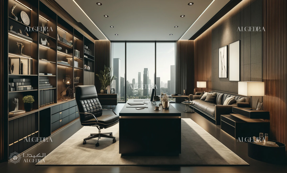
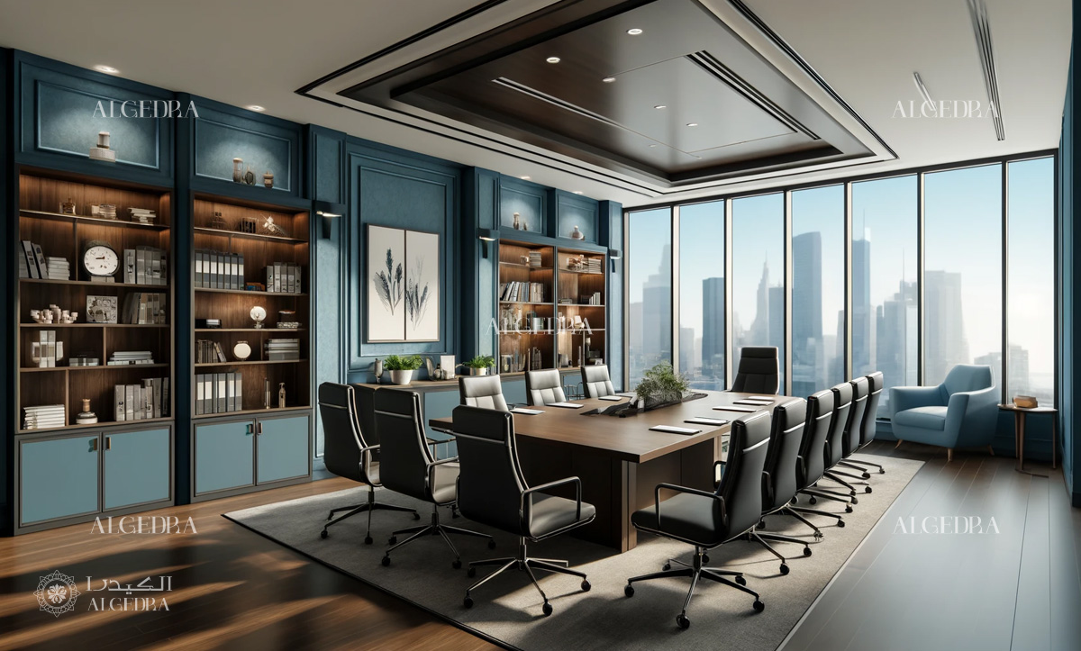
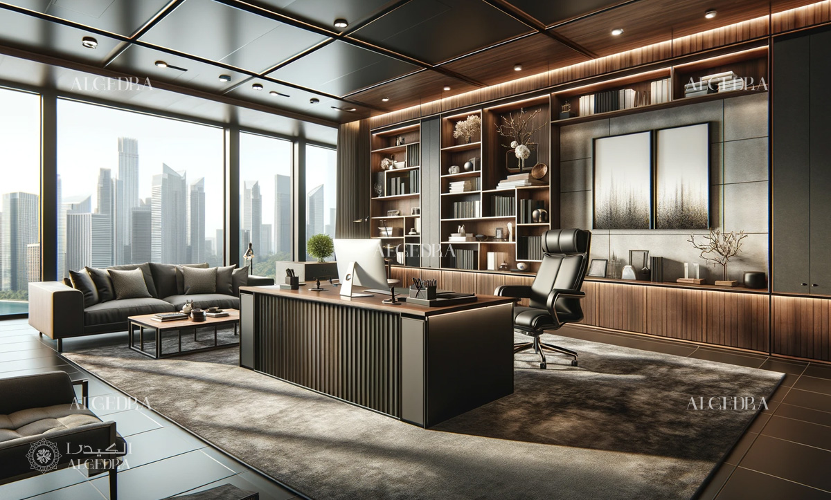
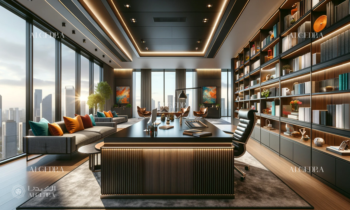
2.6. Gray - The Color of Sophistication and Neutrality
Gray is a sophisticated and neutral color that can create a modern and professional atmosphere. It is a great choice for corporate offices and boardrooms, as it conveys a sense of stability and reliability. Gray can also serve as a backdrop for other, more vibrant colors, allowing them to stand out without overwhelming the space.
3- Tips for Choosing and Combining Colors
When choosing colors for your office, it is important to consider the nature of your business, the type of work being performed, and the preferences of your employees. Here are some tips to help you make the best choices:
3.1. Understand the Purpose of Each Space
Different areas of your office serve different purposes, and the colors you choose should reflect that. For example, use calming colors like blue and green in areas where focus and concentration are needed, and more energetic colors like yellow and red in spaces where creativity and collaboration are encouraged.
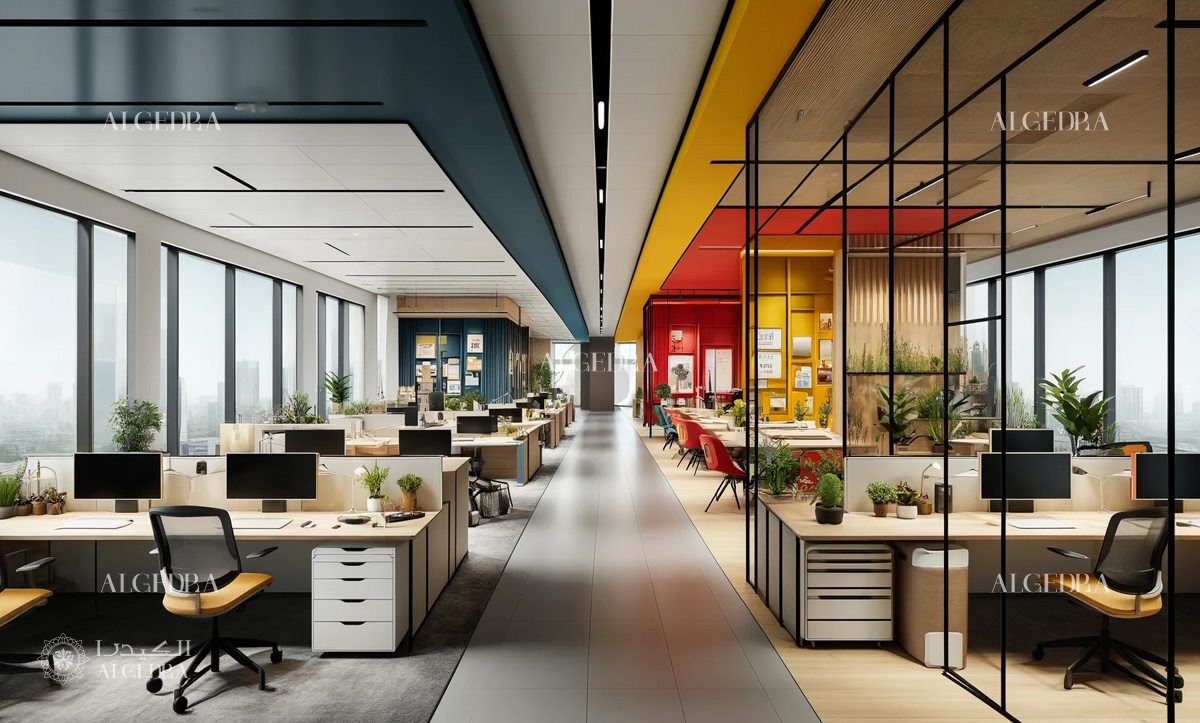
3.2. Balance Bold and Neutral Colors
Bold colors can add personality and energy to your office, but they should be balanced with neutral colors to avoid overwhelming the space. Use neutral colors like white, gray, and beige as base colors, and add pops of bold colors through accent walls, furniture, and decor.

3.3. Consider Lighting and Natural Light
The amount of natural light in your office can affect how colors appear. Bright, natural light can make colors look more vibrant, while artificial lighting can create different effects.
Consider the lighting in each area of your office when choosing colors to ensure they create the desired impact.
3.4. Incorporate Company Branding
Your office colors should reflect your company's branding and values. Incorporate your brand colors in a way that enhances the overall design and creates a cohesive look. This can help reinforce your brand identity and create a sense of unity among employees.
3.5. Seek Input from Employees
Your employees are the ones who will be spending the most time in the office, so it is important to consider their preferences and needs. Conduct surveys or hold discussions to gather input on color choices and create a space that everyone feels comfortable and motivated in.
Conclusion
Choosing the right colors for your office is a crucial aspect of creating a productive and pleasant work environment. You can design a workspace that looks great while supporting the well-being and productivity of your employees by understanding color psychology and the impact of different hues on human behavior.