

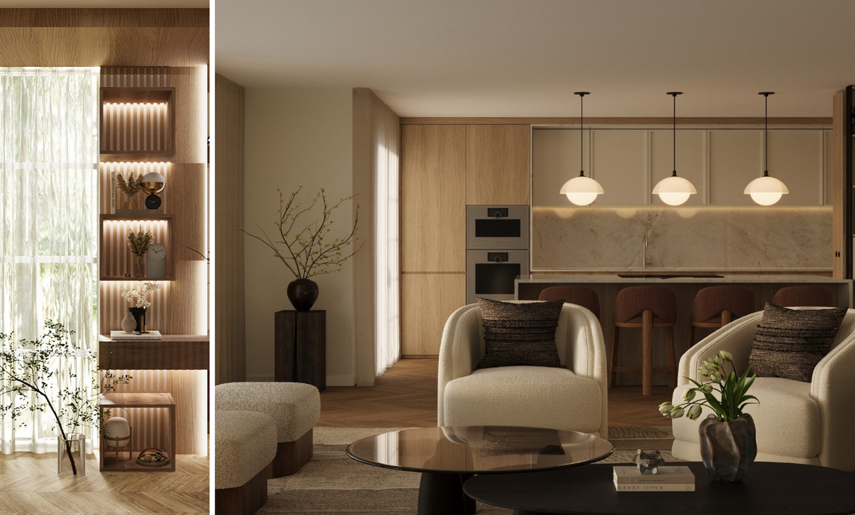
A moodboard arrives early in almost every project, usually as a single composed image or a short sequence of them, and clients tend to respond to it the way anyone responds to a photograph: quickly, emotionally, in the language of like and dislike. Our designers watch that moment closely, because a moodboard rewards a slower kind of looking. Assembled properly it carries an enormous amount of information — proportion, material weight, colour temperature, light quality, the eventual cost of a room, even the labour a finish will demand from whoever cleans it. Learning to read one changes the conversation between owner and studio, since precise reactions produce precise revisions while vague reactions produce another month of guessing. The pages below open our own boards and explain what each part of them is saying, and how to answer.
A moodboard is a document, not decoration
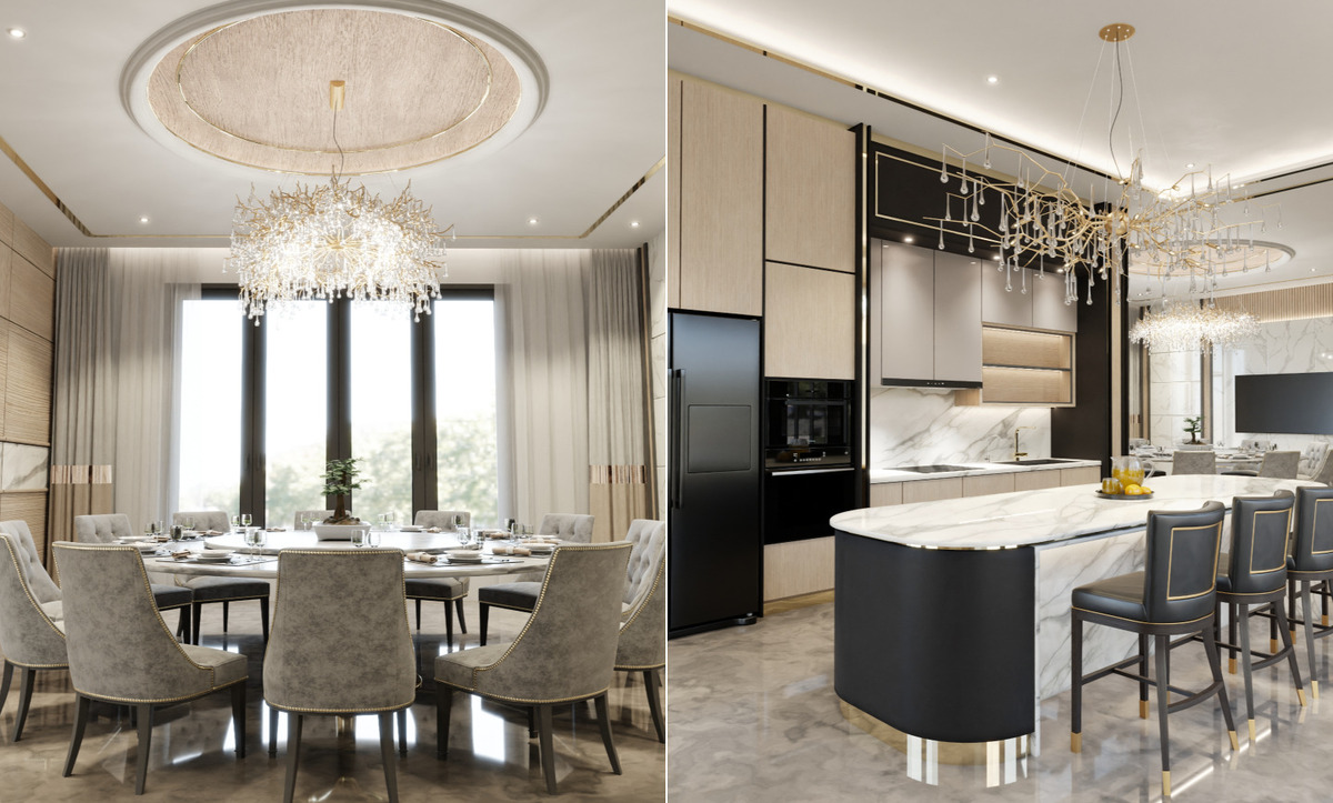
The composition arriving in your inbox looks like a magazine page and functions like an engineering brief in soft clothing. Every image on it was chosen to carry one decision forward: a stone with a particular vein scale, a lacquer with a particular reflectivity, a chair whose arm height sets the proportion of a whole seating group. Editorial photographs sit alongside product shots and material swatches for a reason — the photographs communicate atmosphere, the swatches communicate fact. Our board for an Istanbul apartment might hold nine images and four physical samples, and the samples are the binding part. Read the board as a set of proposals awaiting your approval or amendment, each one traceable to a room and a surface, and its purpose becomes clear immediately.
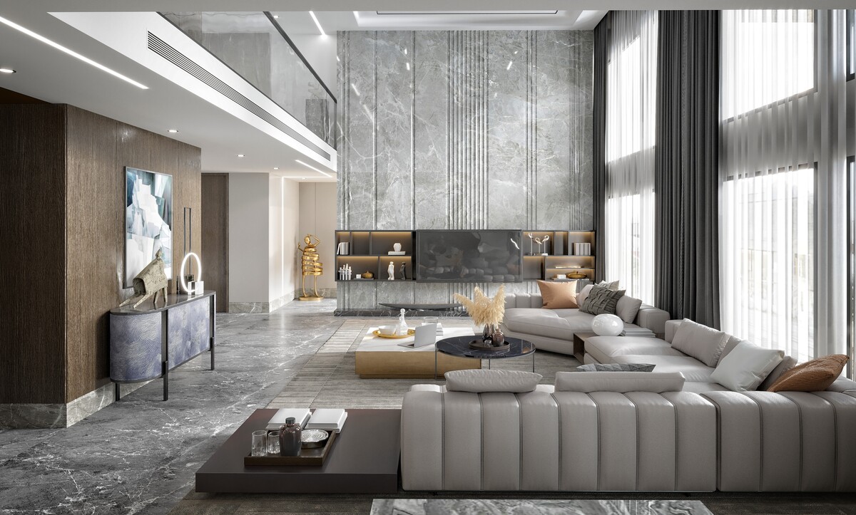
The rule of dominance: what occupies the most space wins
Look first at surface area rather than at your favourite object. The material covering the largest share of a board is the material that will cover the largest share of your home, and the board's proportions are usually deliberate. A composition where warm oak fills half the frame is announcing a timber-led interior, whatever the brass sconce in the corner might be whispering. Owners frequently fall for the smallest element on a board — a sculptural lamp, a marble side table — and approve the whole on that basis, then feel surprised by the finished room. Our designers usually annotate proportion for exactly this reason, marking which finish becomes floor, which becomes joinery, which becomes wall, which appears once as a single object. When the annotation is absent, ask for it.
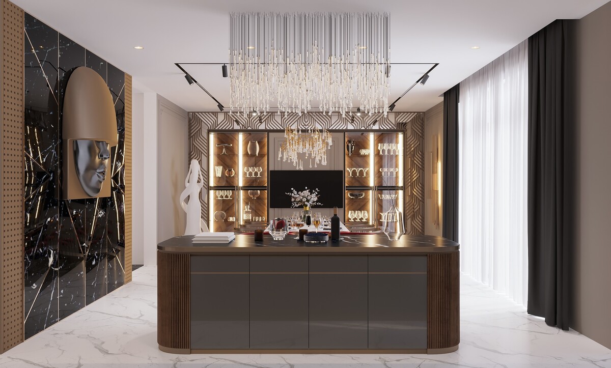
Colour temperature reads differently in your own light
Every image on a board was photographed somewhere else, under light that belongs to that place. Nordic interiors photograph in a cool, even, low-angle light that flatters pale grey-beiges and makes them look serene; the same paint under strong Mediterranean sun turns chalky, and under a north-facing Istanbul window turns faintly blue. Judging a palette from screens alone therefore builds in a margin of error. Our practice is to hand over physical samples and ask clients to view them in the actual room at three moments — morning, mid-afternoon and under the evening lighting scheme — before approving anything. The subtleties of a restrained palette repay the effort, as our study of the soft Nordic neutral now shaping quiet interiors explores in depth.
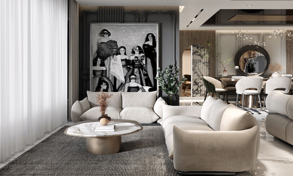
Texture is the layer photographs conceal
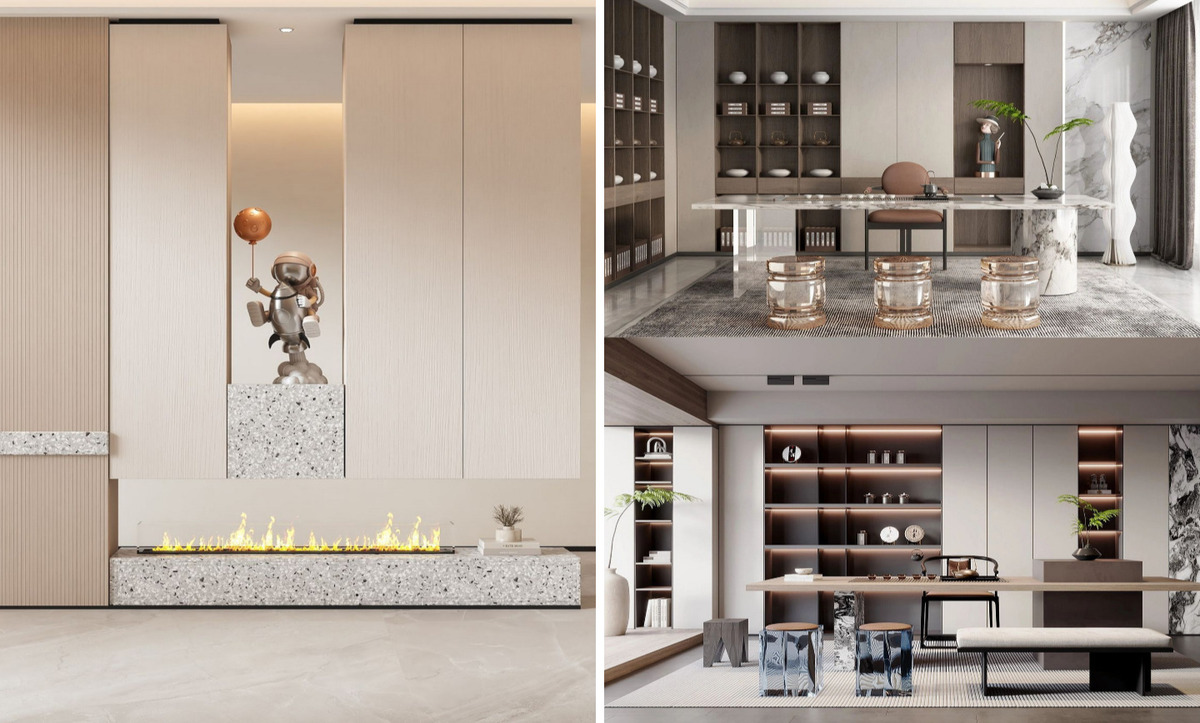
Flat images flatten touch. A boucle and a linen photograph almost identically at low resolution, though they behave like different species in a room: one absorbs sound and light and holds a rounded silhouette, the other drapes crisply and shows every crease. Plaster with a polished burnish reads on screen as plain paint until you stand beside it and watch the sheen shift as you move. When reading a board, identify which of the images exist to convey texture rather than colour, and ask what the tactile intent is behind each. Our boards pair the visual with the physical for that reason, and clients who run a hand across four samples in sequence make faster, firmer decisions than clients working from a screen alone.
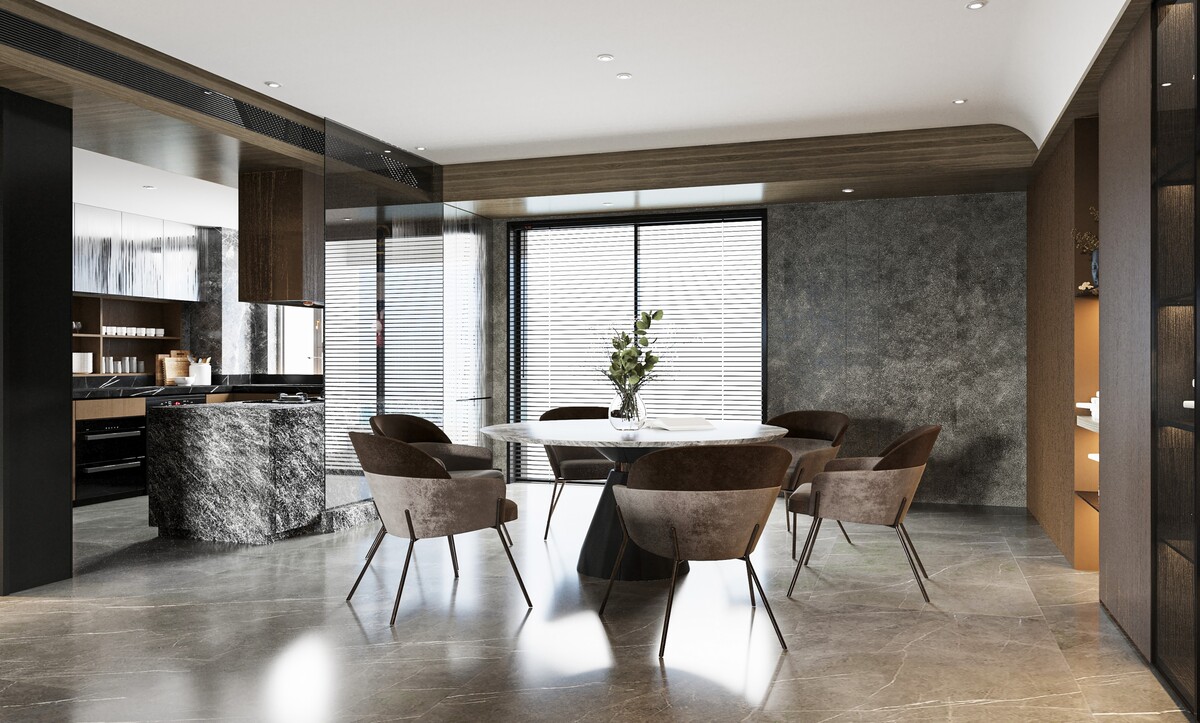
The scale question hidden in every photograph
Photography lies about size with total innocence. Wide lenses stretch small rooms, high ceilings appear in images taken in buildings with four metres of height, and a rug that reads as generous in a shot may be three metres across in reality. Reading a board well means asking what each image would become inside your own dimensions. A herringbone floor with wide staves suits a large salon and overwhelms a compact one, where a narrower stave keeps the same character at correct scale. Marble with a bold, widely spaced vein needs surface area to resolve; in a small bathroom it fragments into noise. Our design development stage tests every reference at true dimension against the measured plan, and the honest boards say so from the beginning.
Style references and the borrowing that follows
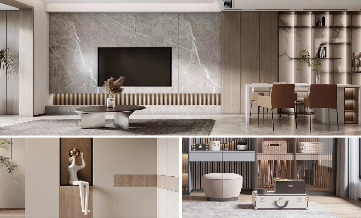
Boards often carry a stylistic thesis in shorthand: an arched opening, a fluted timber panel, a plaster cornice profile, a low-slung leather sofa. Each of those references brings a family of decisions along with it. An arch implies plasterwork, radius joinery and door leaves cut to curve — craft that costs real money and real programme weeks. A fluted panel implies a routing profile, a wrap detail at corners and a decision about vertical rhythm. Understanding which references are structural commitments and which are simply flavour saves considerable disappointment later, and the vocabulary of the moment is worth knowing before you choose. Owners weighing direction find useful ground in our survey of the interior styles Istanbul is favouring at present.
Reading the price of a board
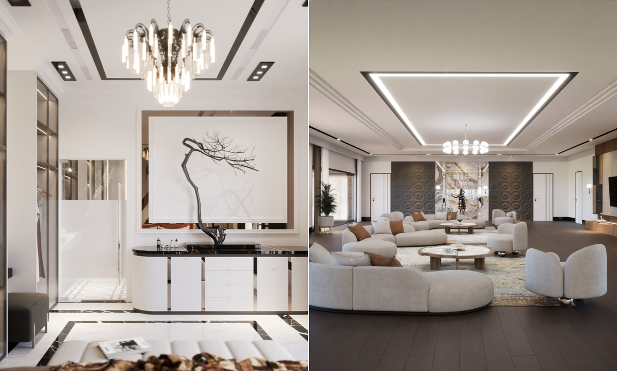
Cost hides in plain view. Six elements drive most of the difference between two boards that look superficially similar: the amount of bespoke joinery, the use of natural stone in place of engineered surfaces, book-matching requirements, decorative lighting from European houses, upholstery specified in performance or designer fabrics, and any curved or radius geometry. A board with straight cabinetry in a laminated finish and a stone-look porcelain floor might deliver eighty per cent of the visual effect at a fraction of the outlay. Our studio prices the board's implications during design development and offers alternates where an owner would rather concentrate the budget somewhere specific. The relationship between spend and quality deserves scrutiny of its own, which we set out in our piece on why cost and true luxury behave as separate qualities.
Lighting is the invisible half of every reference image
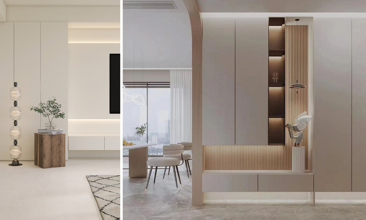
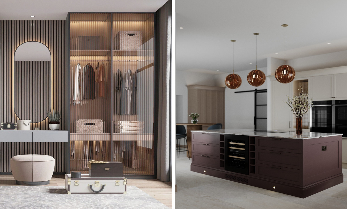
Almost every photograph on a moodboard was lit by a professional. The pooled glow on a stone counter, the grazing light down a plaster wall, the warm points reflected in a lacquered cabinet — those effects arrive through designed circuits, correct colour temperature and careful fixture placement. A room finished in the identical materials and lit by a single central fitting will disappoint everyone who approved the board. Reading a board attentively means asking how each atmosphere gets produced: cove lighting in a ceiling recess, wall washers at a fixed distance from the surface, table lamps on switched sockets, a dimming scene for evening. Our lighting layouts develop in parallel with the palette so the approved atmosphere has real hardware behind it.
Maintenance lives inside the material choices
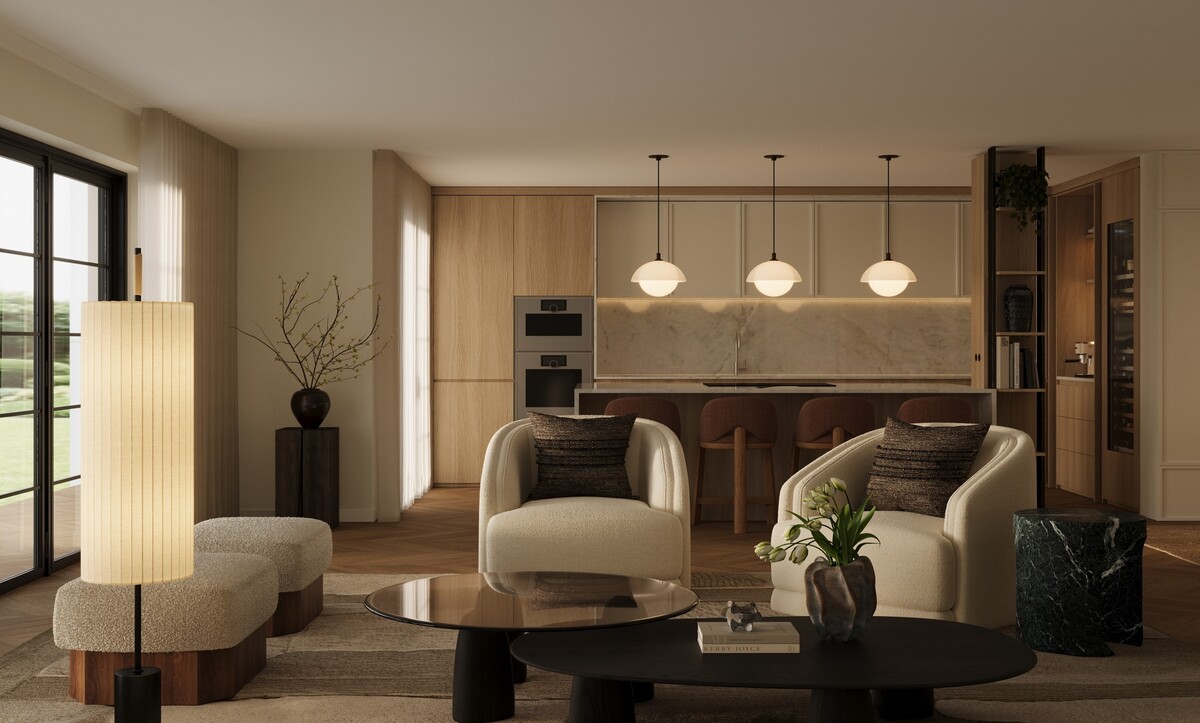
Some finishes ask something of you every week. Honed light marble in a kitchen accepts oil and lemon within weeks of installation, developing a patina that some owners love and others regret. Open-pore natural oak shows water rings. High-gloss lacquer holds fingerprints in bright light. Deep matt paint marks where furniture touches it. Pale wool absorbs everything a household with young children produces. None of these facts argues against the material — many of our most admired projects use every one of them — though owners deserve the information while approval remains reversible. Our boards carry a maintenance note against each significant finish, and clients frequently swap one or two once they understand the upkeep involved.
Reading a board for what it leaves out
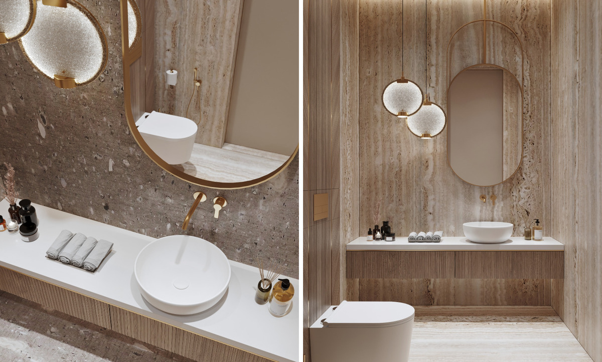
Gaps carry meaning. A board holding four images of walls and no mention of window treatment leaves curtains undecided, and curtains change a room profoundly. A palette with no metal named leaves ironmongery, tapware, lighting bodies and joinery handles unresolved, and mixing metals badly undoes a scheme faster than almost any other error. Boards silent on flooring transitions, skirting profile and door leaves have deferred three decisions that will surface at the drawing stage anyway. Our approach is to name the deferrals openly on the board itself, listing what remains open and when each will be resolved, so an owner approves with a clear picture of what has actually been settled.
How rooms relate across a set of boards
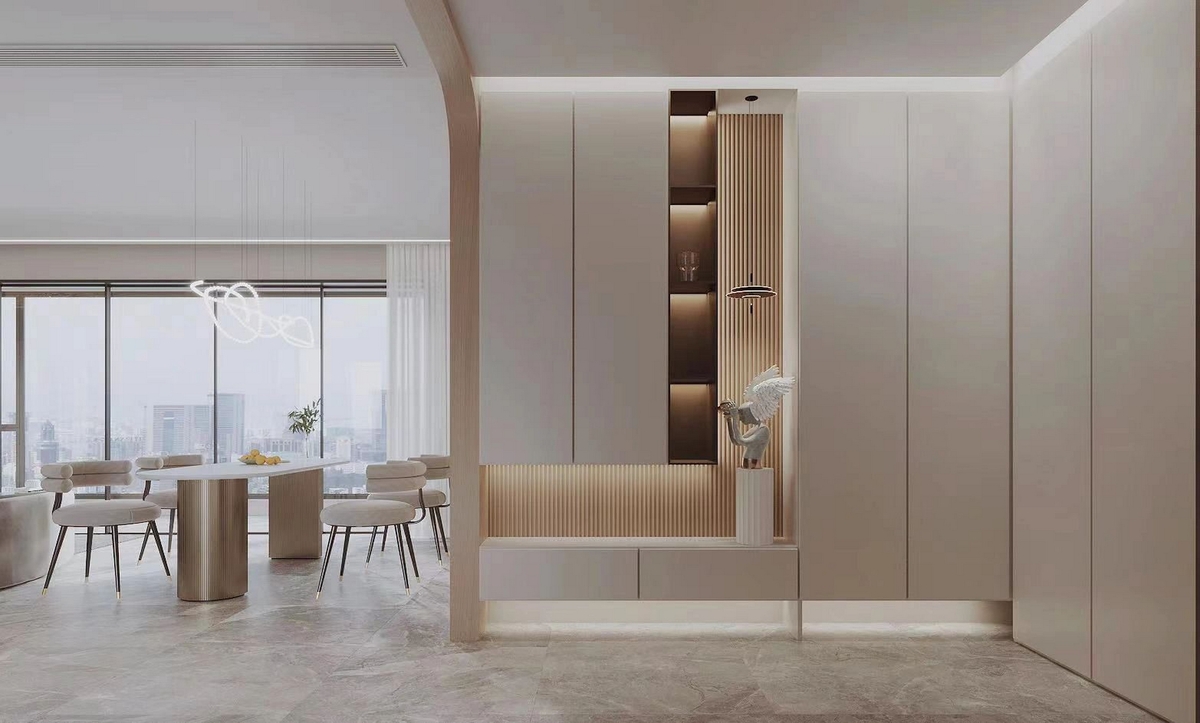
Most projects generate several boards, one per room or zone, and the relationships between them matter as much as any single composition. A home reads as coherent when a few threads run through every space — a repeated timber, a consistent metal family, a colour that shifts in intensity from public rooms to private ones — while each room retains its own character. Compare your boards side by side and look for those threads. Sightlines deserve particular attention: rooms visible from one another share a field of view, so a salon and an adjoining dining room ought to be judged as one image rather than two. Our studio composes the set with sightlines mapped, and clients reviewing the boards on one large surface catch relationships that a sequence of emails hides.
Villas, apartments and the boards that suit each
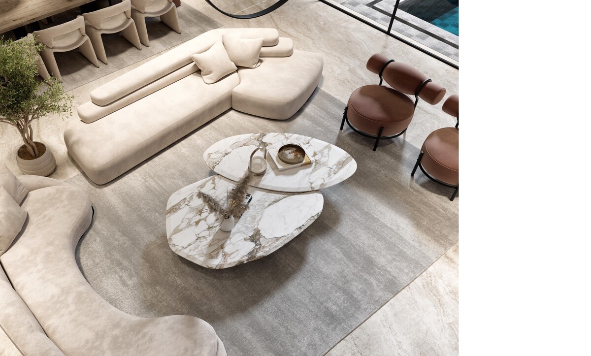
Property type changes what a board must do. A villa board carries exterior relationships — garden views, terrace materials, the transition from stone paving to interior floor, the way afternoon light crosses a double-height space — along with the interior palette. An apartment board concentrates on compact proportion, storage integration, acoustic comfort between neighbouring homes, and the single dominant view that most Istanbul apartments possess. Duplex and mezzanine homes add the vertical dimension, since a board approved on the lower level must survive being seen from above. Owners at the earlier stage of choosing a direction for a house rather than a flat find our guide to settling on a scheme for a Turkish villa a useful companion to the board itself.
Giving feedback a designer can act on
The most valuable client responses identify the element and the reason. "The stone feels too busy for the volume of the salon" produces a considered revision within days. "I dislike it" produces a week of exploratory questions. Four habits improve any review: point at specific images rather than the board as a whole; separate colour reactions from material reactions from proportion reactions; say which single element you would keep if everything else changed; and describe the feeling you want the room to produce rather than the product you imagine producing it. Our designers welcome strong reactions of every kind, since a firm objection early is worth more than a polite approval that resurfaces as doubt during joinery fabrication.
Approving a board and what happens next
Approval carries weight in a professional process. The board becomes the reference against which design development, technical drawings, procurement and site supervision are measured, and the specification hardens around it: the exact stone from the exact quarry block, the veneer cut and its sequence, the plaster system and its number of coats, the paint reference in its final sheen. Changes remain possible after sign-off, though their cost rises through the programme — a swap at design development costs a drawing revision, the same swap after fabrication costs a joinery unit. Our practice is to hold a formal approval meeting with samples on the table rather than accept a message of agreement, so everyone leaves the room certain of what was decided.
The board and the finished home, side by side
The genuine test arrives months later when the styling is complete and someone holds the original board up against the room. Our designers do exactly that on every project, and the comparison keeps the studio honest. A well-read, well-approved board and a carefully administered process produce a home that resembles its first image closely enough to feel like a promise kept — the same light, the same weight of material, the same quiet. Clients who spent an unhurried hour with their board at the beginning almost always recognise their home at the end.
Talk to our designers about your own board
Our Istanbul studio prepares moodboards as working documents, with annotated proportions, physical samples, maintenance notes and a clear list of what remains open. Explore our villa interior design services to see the boards resolved into finished rooms.
Ready to begin? Fill in the contact form on our project enquiry page with a few details about your home, and one of our design consultants will get back to you shortly with a first conversation and, soon after, a board of your own.
ALGEDRA Turkey — Phone and WhatsApp: +90 533 701 89 71 · Email: info@algedra.com.tr